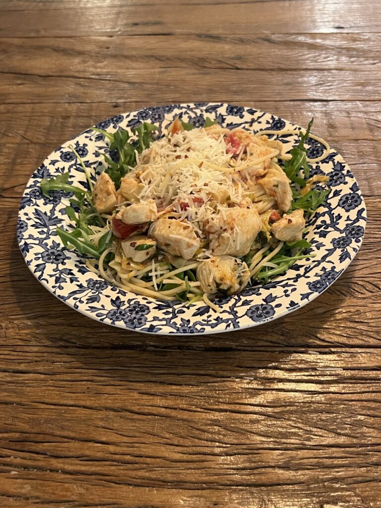
Chicken Basil with White Wine and Artichoke Hearts

I’ll never forget my first meeting with a real estate agent. I was 25 years old and looking to buy a small bungalow in Rumson when the middle-aged been around the block a few times agent leaned his paunch over the desk, shook his index finger vigorously in my direction and proclaimed: “There are three things that matter in real estate, location, location, location.”
Even though the guy was a bit of a plonker, what he said is nonetheless true, which is why Fair Haven NJ is such a coveted spot. Sure you can buy a larger house, or get a bigger yard for less money in a neighboring Monmouth County town. And those towns probably have just as good schools and equally safe and scenic environments, but what sets Fair Haven apart is its network of closely-knit neighborhoods that are incredibly child friendly. Where else do most kids ride their bikes to school, stroll out to lunch at local restaurants, or cycle themselves to baseball (football, tennis, soccer) or even sailing practice?
So, when they found out they were expecting twins, it was a no-brainer for our clients, a couple, who had met and bonded in NYC, to look for a home in Fair Haven which is just around the corner from the Jersey Shore town where one of the moms had grown up. Add grandparents at the ready, plus only a 40-minute ferry ride to the city to the whole family-centric vibe, and the deal was sealed.
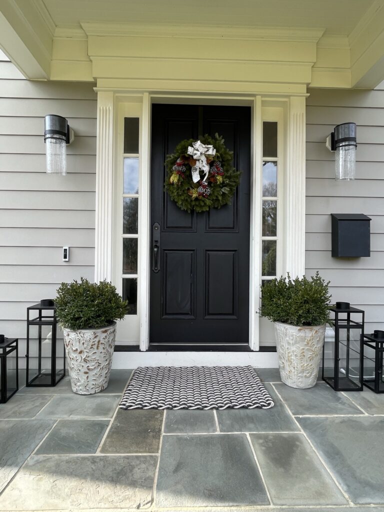
Fortunately, in an extremely tight market, they managed to score a four-bedroom home on a lush corner lot with hardwood floors, custom millwork, and a fairly modern kitchen. At the time they were a bit underwhelmed by the interiors, all in off-white, creamy monochromatic tones that screamed suburban torpor. But, in barely 8 months, they have managed to not only get those babies born (and sleeping through the night) but also introduced a design-driven, maximalist flair to their home.
You will probably guess from these photos that one of the owners is a professional interior designer just by the mix of design elements that blend more than match, a stylistic achievement often sought after but rarely accomplished. And her partner is no slouch either with a few remodels in her past and probably design in her DNA if we take her –full disclosure–longtime British Cottage customers–and very talented, decor-driven parents into consideration.
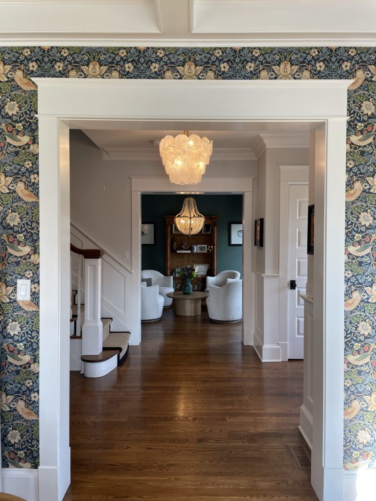
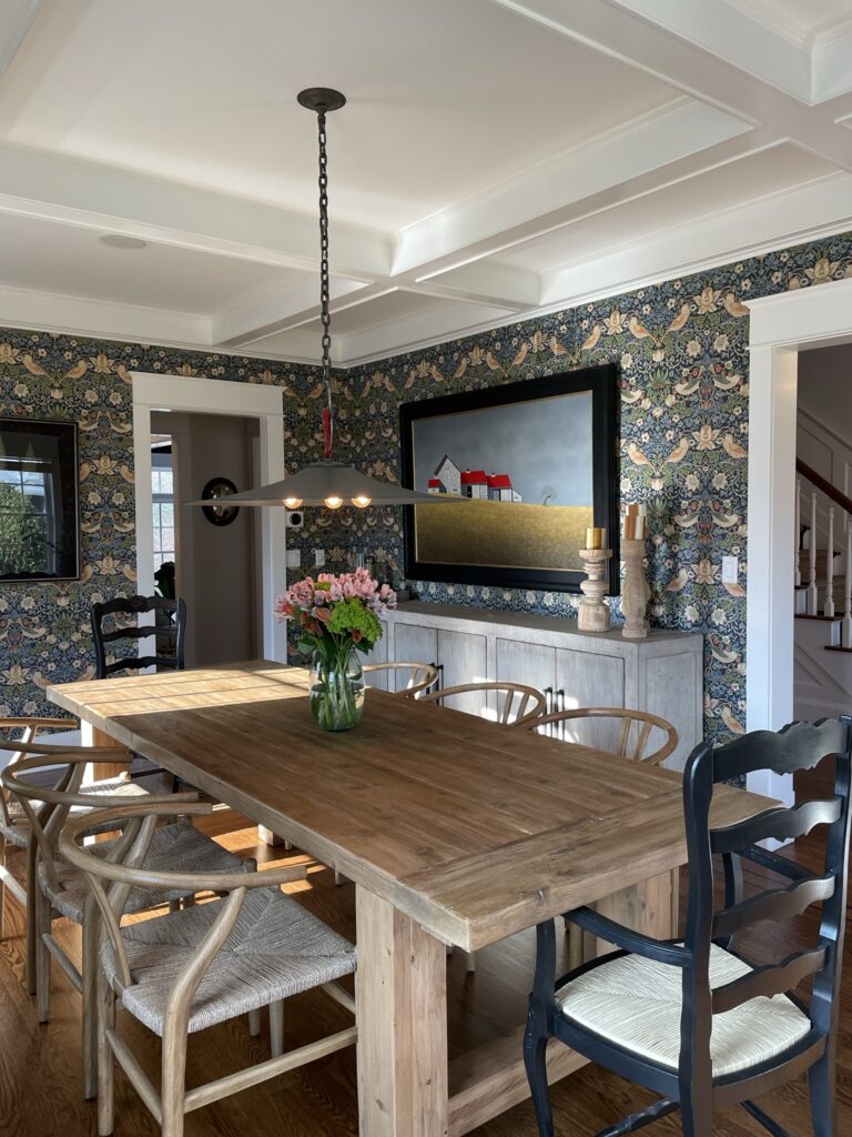
I mean just take a look at this dining room. From the robust, reclaimed pine farm table and whitewashed sideboard from British Cottage, to the startling realism of the painting, the architectural pendant, and the iconic William Morris Strawberry Thief wallpaper there’s tons to catch the eye. The fact that nothing matches but the room with all its variety is still balanced and harmonious is a decorating trifecta. The table grounds the profusion of print, while the painting by Michael Fratrich provides a focal point demonstrating how a fabulous piece of art can anchor a space.
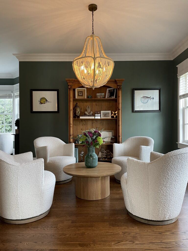
Across the way in what they call the adult living space, the walls are painted in the same dark green with a hint of blue hue you see in the wallpaper. The color is called Weekend Upstate and the manufacturer is one I am not familiar with, Backdrop Paint an online find that clearly panned out. Often the idea of four chairs placed in a grouping seems like a better idea than it looks but in this case the size of the chairs is in proportion to the rest of the room. I love how their curved shapes are repeated in the lighting fixture and coffee table–even the round bellies on the fish prints from yours truly.
(So is the bookcase but that was a local estate sale purchase–evidently, the secondhand market in British Cottage wares is excellent).
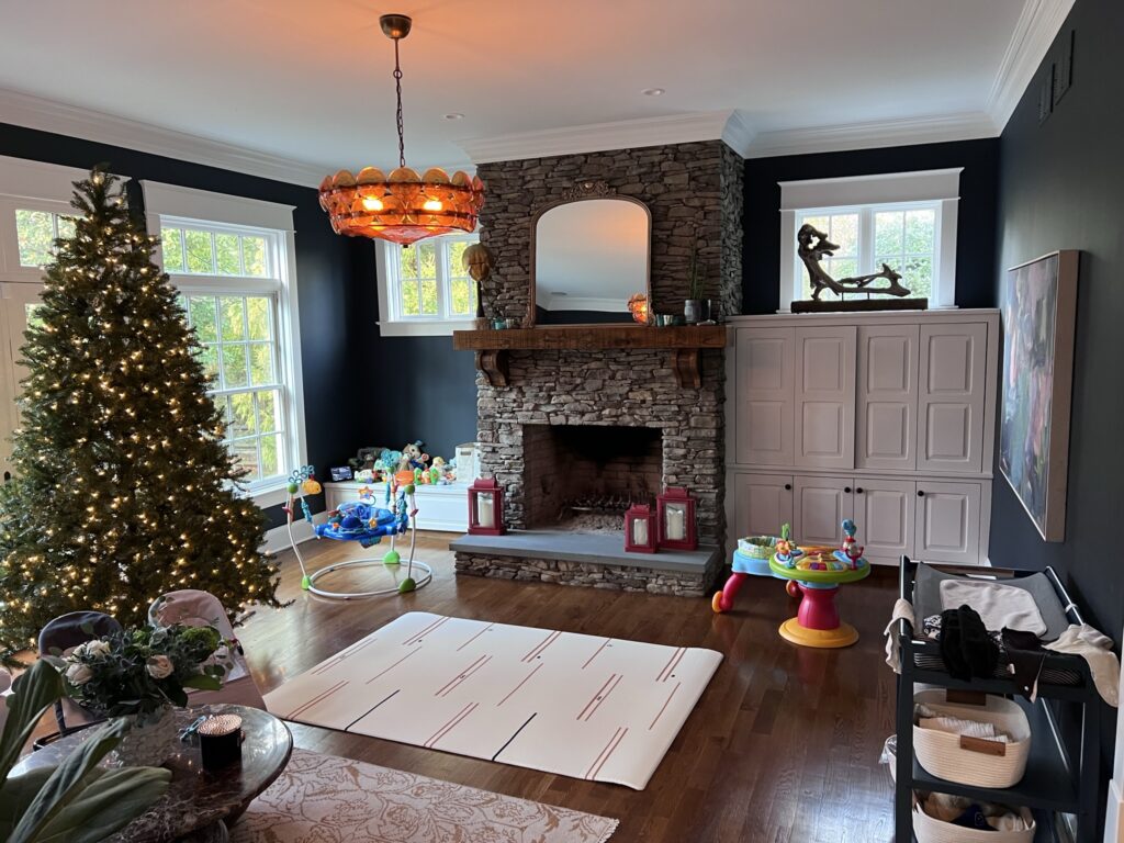
Although we all love our adulting areas, more often than not you will find this busy couple cuddling up in the family room with the children. If you look under the layer of toys you’ll find a healthy splash of Hale Navy (by Benjamin Moore) on the walls, an awesome stacked stone fireplace, serious art, and a stunning lighting fixture that lets you know this is one room to be reckoned with.
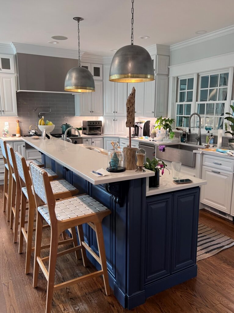
Lately, the all-white kitchen (still my personal favorite) has been taking a bit of criticism but I think the highlighting of the island with that pop of navy goes a long way to appeasing the naysayers. Also, note how fab these updated pendants look–they’re relatively simple and contemporary and give the space some added depth.
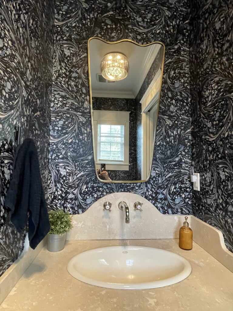
And it is important to remember when fearfully confronting a large white box that wallpaper is your friend. And the best place to start may well be the powder room. See how they used this dynamic wallpaper to totally transform a ho-hum space into a visual delight and major design win.
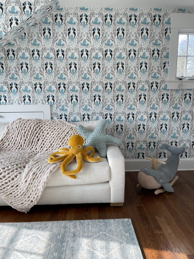
Meanwhile, who said playrooms had to be a train wreck? Once again a sure hand with wallpaper proves to be a solid design move by adding a blast of pattern that gives the room (one that we would usually might rather not see) a ton of visual interest.
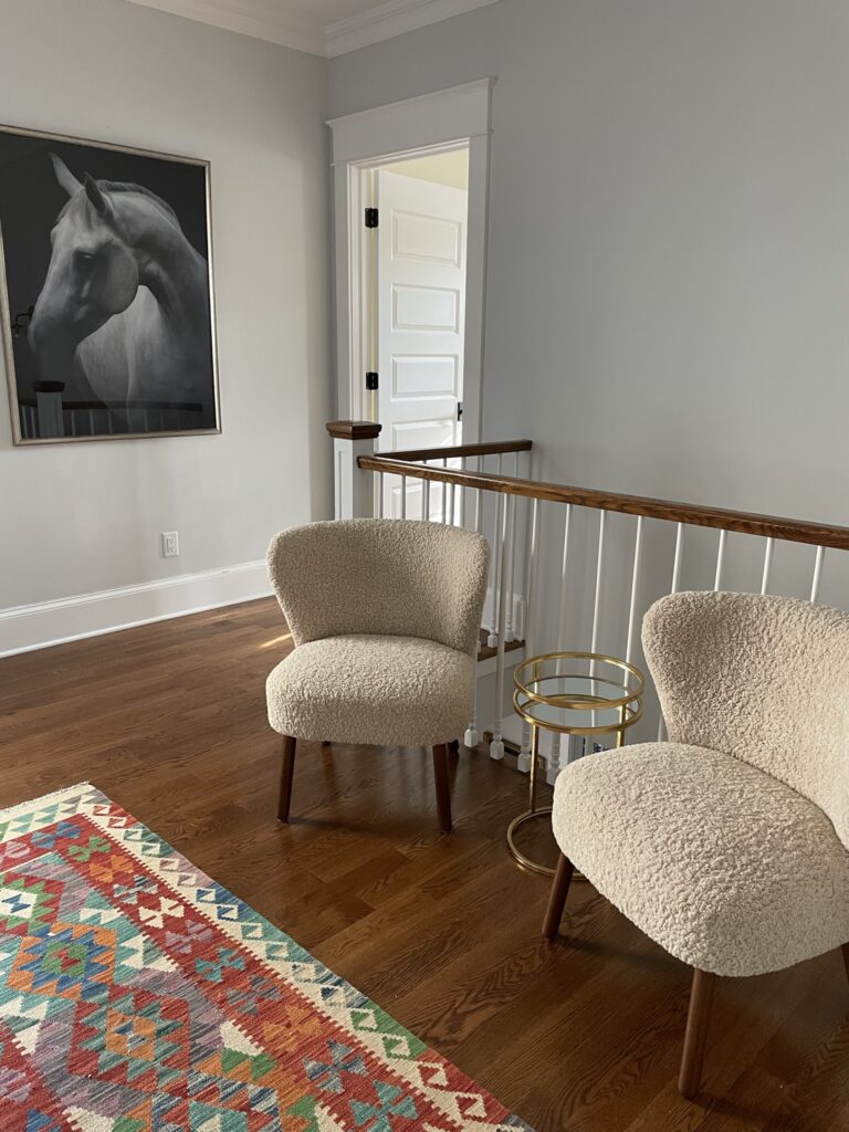
Sometimes, just a striking photo (another British Cottage find) is all you need to make things interesting and anchor a space–in this case, the upstairs landing.
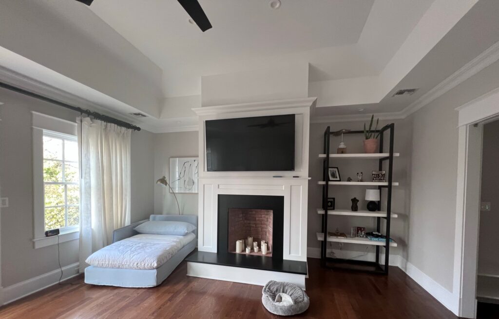
Our clients are not afraid of quiet moments. Clearly, with twins and full-time jobs, it is essential to have a bedroom that exudes calm and fosters serenity. With its comfy, oversized chaise lounge for naps, the transitional shelf unit from British Cottage to corral the collections, and a ton of natural light, this spa-like setting makes you feel like you are on vacation and not the momager for a minute–or two.
The only thing out of place was little Olive’s bed, but that’s what happens when the first child has four legs and makes their own rules!

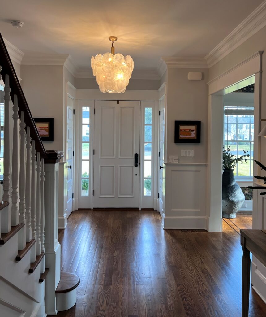
Finally, it was time to bid adieu–the babies were due to wake up from their morning naps and I had to get to work but stopped to snap one last photo. I loved the paintings by Guy Hembling, the Rumson artist and builder, (and big brother of a childhood friend of mine) and I have to find out where that chandelier came from. You’ll notice throughout this house there is quite a unique mix of antique and new, refined and rustic, pattern and none, and it is those juxtapositions that make this home so charming. It is sophisticated without being overwhelming and the perfect backdrop, in a great location, for the whole family to enjoy for years and years to come.
But I wasn’t leaving without a recipe. I think this one checks off all the boxes.
Seriously how can you go wrong with a chicken, basil, artichoke, and wine combo? I did add a pint of cherry tomatoes that had to be used up, along with some grated cheese but you could easily leave those out.
Chicken Basil with White Wine and Artichoke Hearts
Cook the pasta of your choice to just about al dente and put it aside.
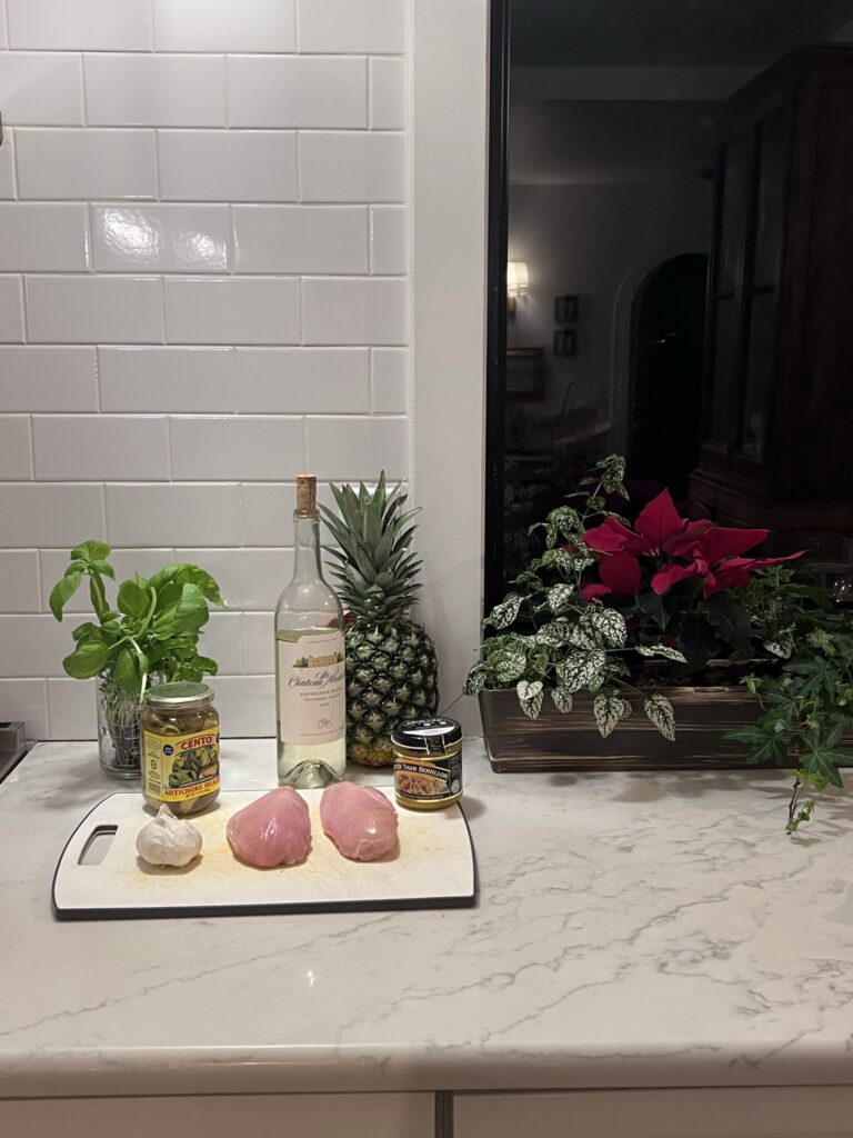
Heat a glug of olive oil and a healthy pat of butter in a large saute pan. Add a tablespoon or two of minced garlic and a pint of cherry tomatoes and cook on low for about five minutes. Then add one pound of boneless chicken breasts cut into 1/2 ” cubes, a teaspoon of chicken bouillon, a handful of minced fresh basil, and a large jar of drained artichoke hearts and cook on medium heat for a minute or so.
Then cover the mixture completely with dry white wine and cook on high until the bottom of the pan is slightly brown; be careful not to stray too far from the stove while doing this!
Cover again with white wine, add the al dente pasta of your choice and cook down for a minute or so. Top with more basil and grated parmesan cheese and serve.