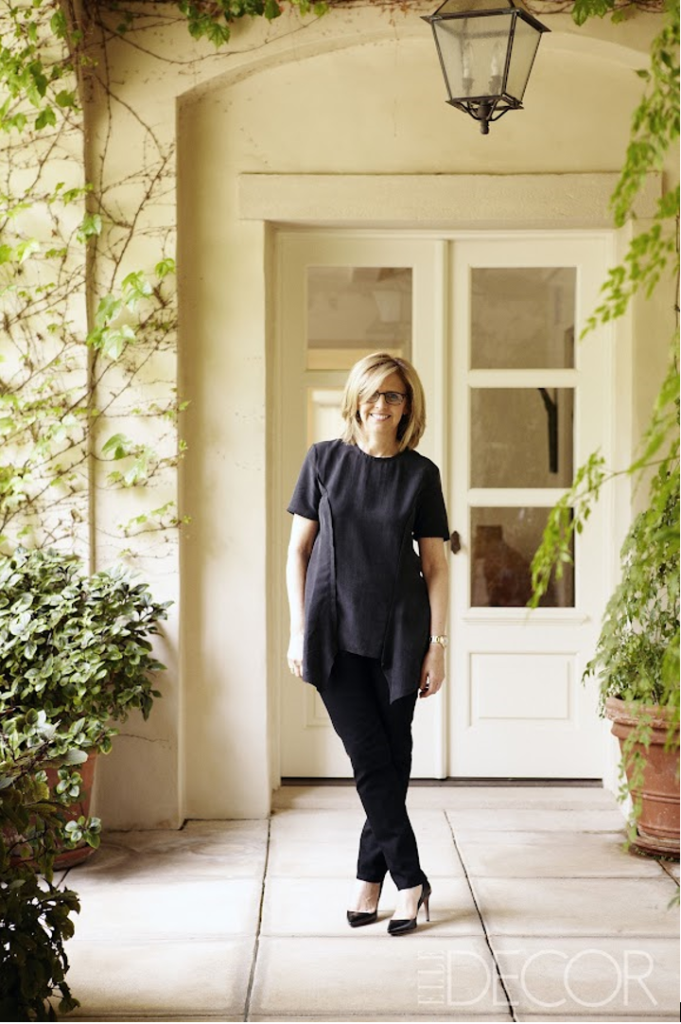
You are a nice Jewish girl who was raised on Philadelphia’s Main Line in the 1960s and you grow up to be:
- A Housewife
- A Schoolteacher
- A Divorced Housewife
- The Most Successful American Female Writer/Director/Producer in the History of Movies
If you guessed D then we are talking about Nancy Meyers, and you are absolutely correct.
There’s no doubt Nancy Meyers’ movies are phenomenally successful—the last four combined grossed over one billion dollars (2015 The Intern, 2009 It’s Complicated, 2006 The Holiday, 2003 Something’s Gotta Give), and her all-star filled casts are delightful, featuring such luminaries as Diane Keaton, paired with a feisty Jack Nicolson, and Robert DeNiro, who gave a heartfelt turn as the oldest, most junior employee on earth mentoring Anne Hathaway’s beleaguered chief executive.

While none of this is big news – there has been many a story and blog written about Nancy Meyers – for the final project for my INTD 150 class, Design Elements for Interior Environments, I used interiors from her movies to illustrate the Elements of Design. Possibly because the set designers and decorators employed to produce these movie sets are well schooled in these concepts, and any fabulous interior has to have these elements in order to be fabulous, it was easy to make the connections. While I should make it clear Nancy Meyers did not design these rooms herself, as their writer, director, and producer it is her vision and her version we see.
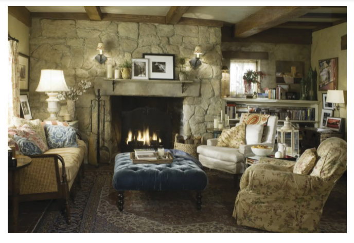
Briefly these are the Elements of Design: Line, Shape, Form, Color, Value–which actually refers to Light, Space and Texture. I think you could argue that line may be the most important element. Lines are created by the furnishings and architecture of a room and actually guide us through space.
As does Nancy Meyers. Erica Barry (Diane Keaton), the main character in the movie Something’s Gotta Give, is a divorced playwright in her mid-fifties. You only have to look inside Erica’s fabulous Hamptons home, glimpse the quality and beauty of the furniture and accessories to realize not only is she loaded (ergo successful) but she is classy and tasteful too… Note how the interior of the room pictured below speaks volumes about our heroine before even a single word is actually spoken.
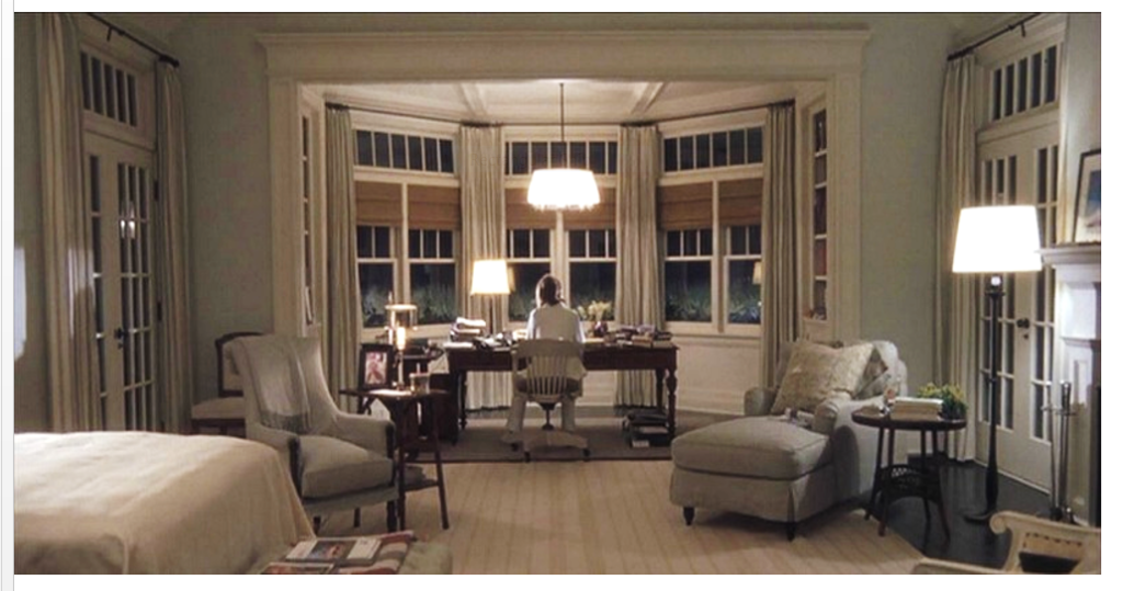
While we have all drooled over this bedroom and wished this was our desk overlooking the ocean, Meyers is sending us a message loud and clear. This bedroom and office combo shows us that Erica is a single, independent woman. She can work late, or whenever she wants, because this is a room of her own.
The stage is set; so how does line play a part in this silent dialogue with the audience? We can start with the vertical lines: from the trim around the office area, to the floor-to-ceiling drapes, onto the mullions in the French doors and the bay windows. They all direct our eyes upward adding considerable height and drama to the room. We’re impressed.
All these vertical lines are softened by the horizontal lines in the rug and the throw by the bed; their purpose is to ground the space, and enhance the expansive luxuriousness of the room. They give this room a tranquil and peaceful feeling–essential elements, one imagines, for an author. Then the curves (more lines) of the chaise and the upholstered armchair soften and unite those multitudes of vertical and horizontal lines. By placing the upholstery pieces on the diagonal our eyes focus inwards creating nearly a complete circle! Genius at work.
Shape
When lines come together they produce shapes…when you mix and match those shapes a designer, or in this case a movie director, creates a mood that showcases how your home—or movie set—feels.
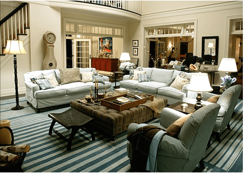
Erica’s living room has a variety of shapes starting with the Mora clock’s sensuous curves, a natural, organic shape that contrasts with the hard lines and and angular edges in the rectangular windows in the transoms and stair railings. Is Meyers trying to show us that there is more than one side to our heroine’s character? Soft on the outside and hard on the inside—or maybe just the opposite–hard on the outside and soft on the inside?
Form
Form is a three dimensional shape.
We’re going to switch movies and meet a new Nancy Meyers’ heroine. This bedroom belongs to Jules, Anne Hathaway’s character in The Intern.
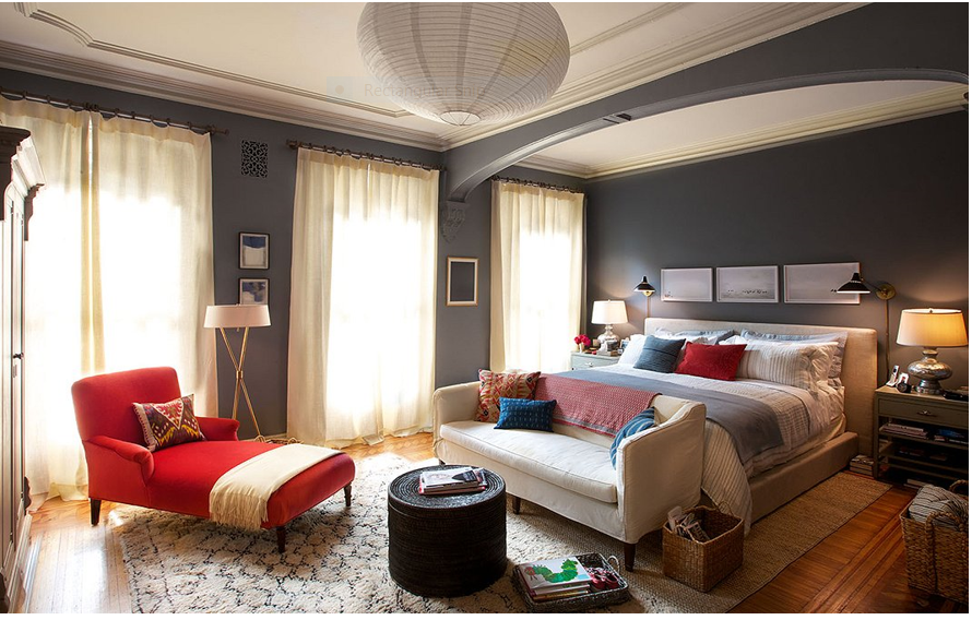
In interior design, form refers to the shape of the room, furnishings, décor—the three dimensional objects that occupy the space.
So what do these objects tell us about her character? An eclectic mix of mid-century and modern items, it’s trendy, transitional, and yes traditional—we can just see that armoire holding the tv in the far left hand corner of the room. So she’s hip, she’s young, and she’s cool. The bed is humongous, ship sized and clearly built for two. Anchoring that is a midcentury slip-covered sofa that keeps the bed in check. These forms bring strength and structure to the room, which is balanced by the rounded edges of that fabulous chaise and curved ottoman. This is someone who can break a glass ceiling–while wearing heels.
Color
Color, of course, is definitely one of the key elements of interior design. It is used to create aesthetically pleasing combinations and also works on a psychological level.
In It’s Complicated Meyers shifts west to California. Her character, our heroine this time, is 69-year-old Jane Adler, aka Meryl Streep. Long divorced with three, mostly grown children, she lives in a hacienda-ish home and owns and operates a thriving Parisian style patisserie in Santa Barbara.
While white slipcovers are a no-brainer these days, a predictable, washable option for a lived-in family room, Myers drops a bombshell when she accessorizes with intense orange contrasted with a pop of navy.
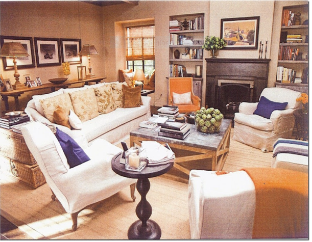
So what does this say about our heroine? Well, if we consulted Carl Jung, the Swiss psychiatrist who founded analytical psychology, about the properties and meanings of color in our lives—colors have qualities that elicit emotions and influence people in various ways. In this case the color orange demonstrates optimism, enthusiasm, self-confidence and agreeableness. Whew. That’s Jane to a tee.
So why that pop of navy? Because navy blue evokes feelings of power and authority–rather than the sense of relaxation and peace associated with lighter shades of blue. Darker shades of blue tend to denote authority and importance. No doubt who’s the boss here.
Value/Light
Lighting is a critical element of interior design. It can be used in dozens of ways to change the size and mood of a space and different types of lighting vary greatly in how they define the ambience of an area.
In the movies, lighting takes on a whole new dimension. It is a science and an art to make a room or a scene visible in a way that is not only illuminating, but also contributes to the “mood.” Without adequate lighting all the other elements would vanish.
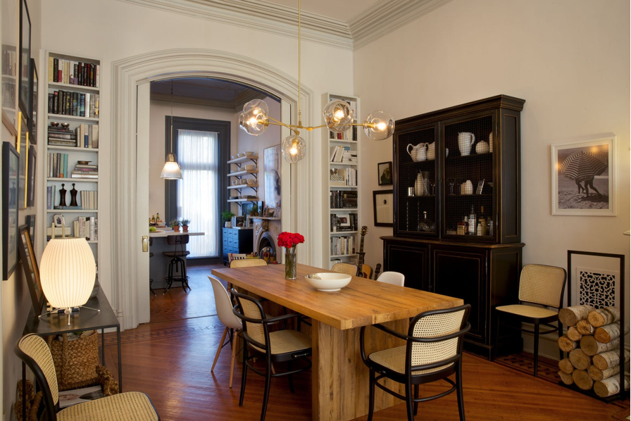
In this photo from The Intern we can see various forms of lighting from task—the kitchen pendant in the background—to ambient, the Lindsey Adelman light fixture that hangs above the dining table—to accent, where she uses a George Nelson Bubble lamp for illumination on the console. This is a design trifecta!
Space
Space is a fairly simple design element to understand—it refers to the physical boundaries of a room.
When you are Nancy Meyers you get to choose both the dimensions of the room you are filming and how to use that area’s space and layout to your advantage.
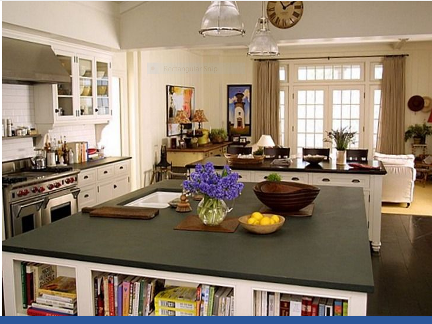
Meyers gets a lot of credit for the popularity of open concept floor plans. In an open concept plan the walls between rooms are removed—giving them a lofty or open feel—negative space, in contrast to the areas filled with décor, islands, sofas, and tables that represent positive space. I think that is a “What came first, the chicken or the egg?” situation, but there is no question that her kitchens are phenomenal and wide open. In Something’s Gotta Give note how the kitchen with its two massive islands opens into an equally massive family room.
Texture
Our final element of design is texture which is the feel, appearance, or consistency of a surface and can refer to rough or smooth finishes, glossy or dull surfaces, and soft or coarse textiles. Everything from fabrics and furniture to decorative accessories brings different textures into a space. Texture is often used to provide an added dimension to a space.
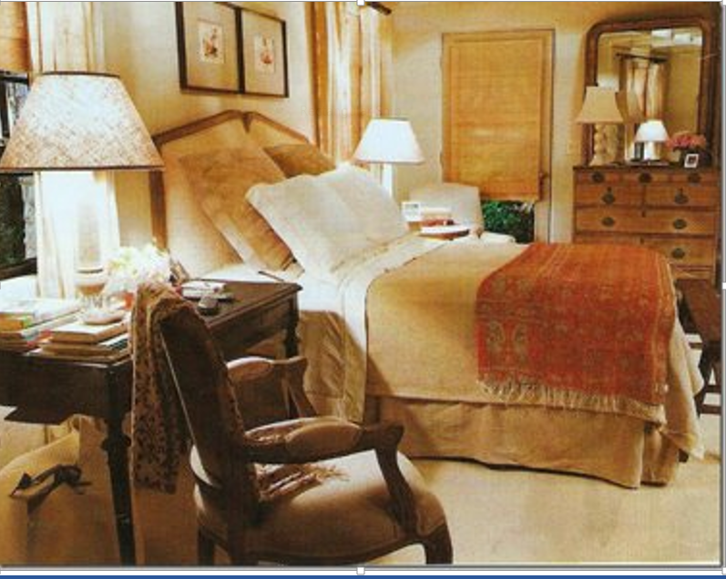
While some may bemoan the neutral palate of many a Nancy Meyers’ flick, she always makes sure to shake things up with a ton of texture: plush rugs, linens, velvets…you name it, she’s got it in there somewhere.
For example, in Jane Adler’s cozy bedroom in It’s Complicated Meyers showcases mixed and matched antiques and finishes with aplomb. Then there are bamboo blinds layered under linen curtains, an upholstered headboard layered with Euro shams and snow white sheets and pillows, and what looks like a homespun linen khaki coverlet layered with a knitted tangerine colored throw. The result? A cozy and warm haven. What woman wouldn’t want that?
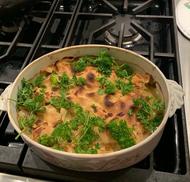
Meanwhile this woman had to come up with a new recipe for a Christmas Eve dinner that was easy to make but elegant to serve. Fortunately Melissa Clark, acclaimed food writer for The New York Times published this recipe just before Christmas and saved the day. And I mostly followed the recipe so it tasted amazing–it was meant to serve 8 and Keith and I nearly finished it off! Full disclosure I did not have fresh (or even dried) tarragon so I used a shake of thyme and we used regular pie crust instead of puff pastry because the latter was sold out. Next time (maybe New Year’s Eve even) I will make sure to have both on hand but honestly it was really good just the way I made it…
Feast of the Seven Fishes Pie
INGREDIENTS
- 6 tablespoons unsalted butter
- 2 large leeks, white and light green parts only, halved and thinly sliced (4 cups)
- 2 teaspoons kosher salt
- 1 garlic clove, minced
- 2 anchovies, minced
- ½ cup dry white wine or dry vermouth
- ¼ cup all-purpose flour, more for rolling out pastry
- ¾ cup chicken stock
- ½ cup clam juice
- 1 pound mixed mild fish fillets, cut into 1 1/4-inch thick cubes (such as cod and pollock)
- ½ pound large shelled shrimp (16 to 20 count)
- ½ pound large sea scallops, side muscle removed
- 1 cup frozen peas
- 1 tablespoon chopped tarragon
- 1 tablespoon chopped parsley
- 2 tablespoons drained capers, chopped
- 1 large egg
- 1 pound puff pastry, thawed
PREPARATION
- Butter a shallow 1 1/2-quart baking dish or casserole. Melt 2 tablespoons butter in a large skillet over medium-high heat, then stir in leeks and 1 teaspoon salt, and cook until soft, stirring frequently, 5 to 7 minutes. Stir in garlic and anchovies and cook 1 minute, until the anchovies dissolve. Add wine and bring to a boil, then let simmer until the wine evaporates almost completely. Remove from heat and scrape into a heatproof bowl.
- In the same skillet, melt remaining 4 tablespoons butter over medium heat. Whisk in flour and cook until pale golden, 1 to 3 minutes. Slowly whisk in chicken stock and clam juice, and bring to a simmer, whisking constantly. Simmer for 1 to 3 minutes until very thick (it will thin out as it bakes), then remove from heat.
- Pat the fish cubes, shrimp and scallops dry. Stir them into the sauce along with the sautéed leeks, peas, tarragon, parsley, capers and remaining 1 teaspoon salt. Spoon mixture into prepared dish.
- Chill uncovered, for at least 1 hour, and up to overnight.
- Before baking, heat oven to 425 degrees. In a small bowl, whisk together egg with 1 teaspoon water. On a lightly floured surface, unroll pastry dough. Roll it 1/8-inch thick. Use a fish cutter or paring knife to cut out a fish from the center of dough. (Alternatively, you can cut circles from the dough and overlap them on top of the pie to look like fish scales).
- Place pastry on top of pie and trim edges, but don’t seal them (sealing impinges on the puffing). Brush egg wash all over pastry.
- Place pie on a rimmed baking sheet and bake until crust is golden, 30 to 40 minutes. Remove from oven and let cool for 5 to 10 minutes before serving.
(Movie photos are the from the Warner Bros. Entertainment Inc. and Ratpac-Dune Entertainment)
