When the Covid lockdown basically cancelled shopping in 2020 and things at the store slowed down to a crawl, I suddenly had a lot of extra time on my hands so I signed up for a drafting course at Brookdale, our local community college.
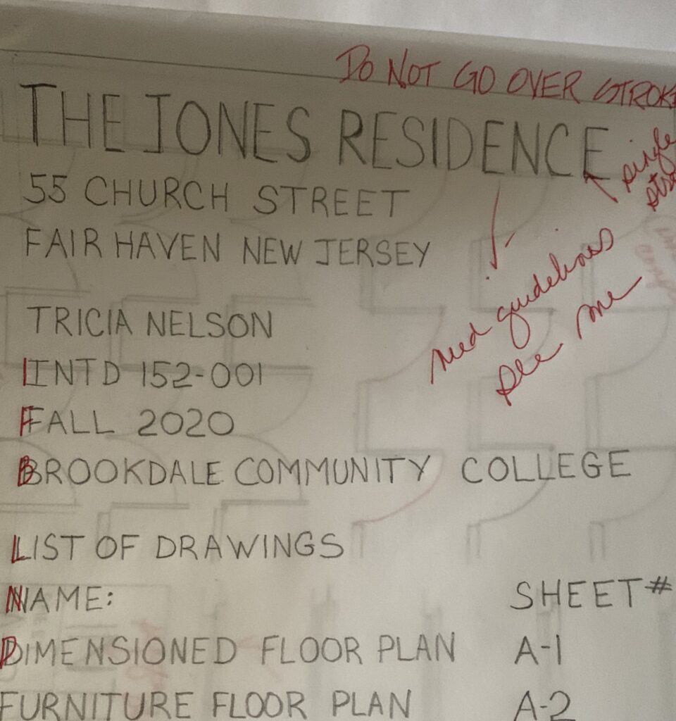
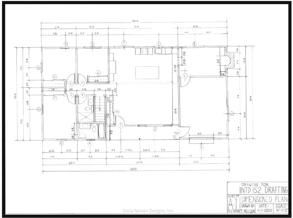
Clearly I was not a quick study! But I perservered. And perservered. After mastering printing (not easy) I eventually learned how to draw fairly legible dimensioned floor plans.
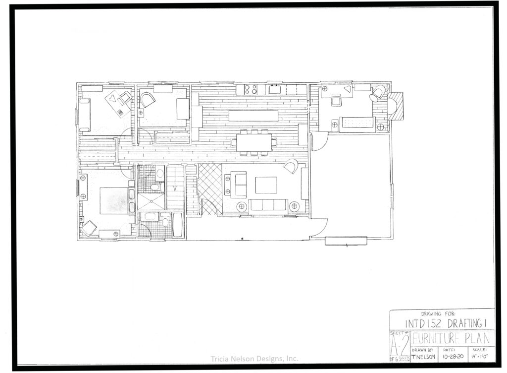
And Furniture Plans. A furniture plan is a 2D, top-down representation of a space, created to scale, that gives you an idea of how a room’s furniture can be laid out. These plans enable you to visualize what items can fit where, and see exactly how much space there will be for walking around in the room. (Before you buy even one piece of furniture you should always measure your space and make a plan to make sure it fits! Or ask me to.)
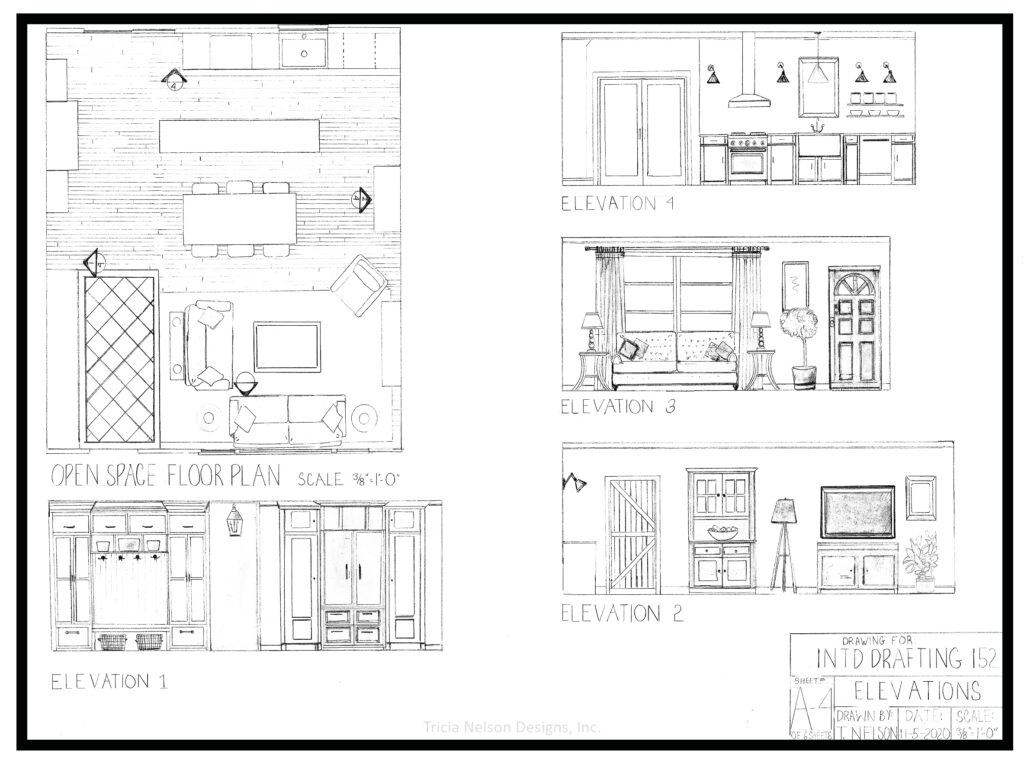
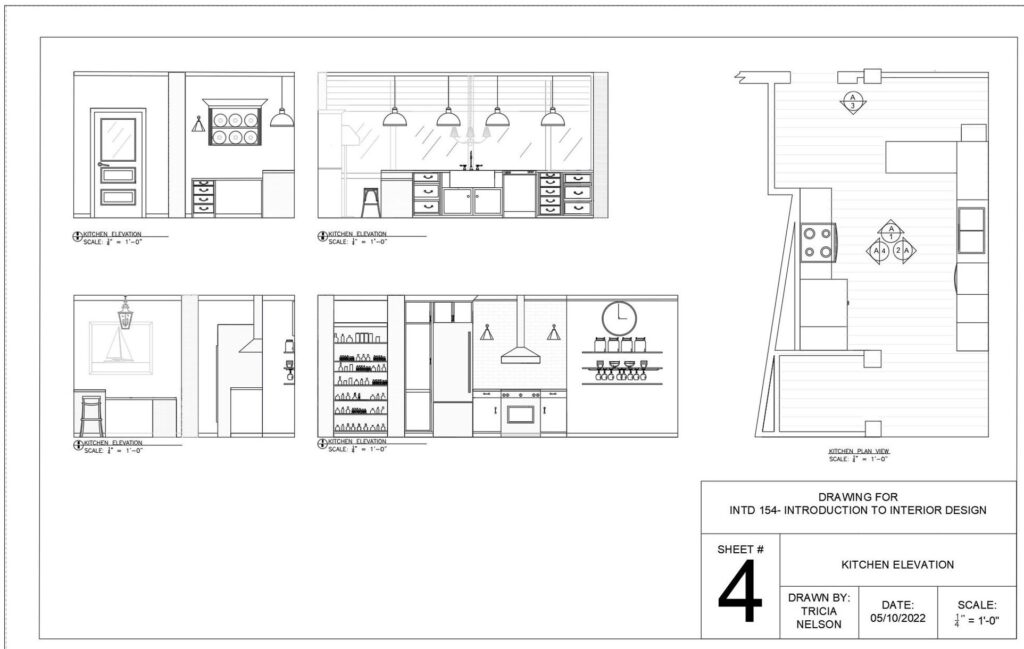
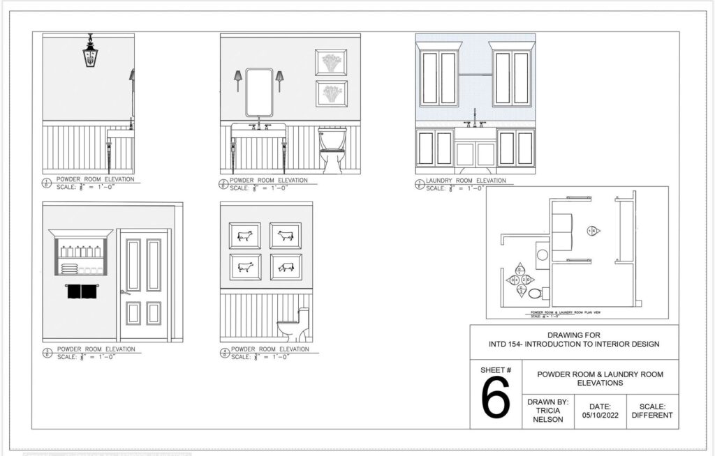
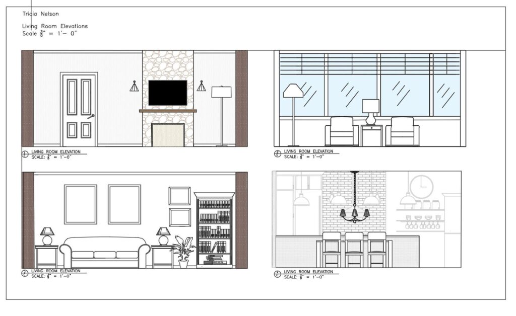
I also mastered how to make elevation drawings which are scaled two-dimensional representations of a three-dimensional space. When designing an interior, these drawings of a wall (or series of walls)–with varying degrees of detail–illustrate how your room will look furnished.
It was a huge amount of work to make all of these drawings by hand to scale, but I had to pass this course in order to take CAD–Computer Assisted Design.
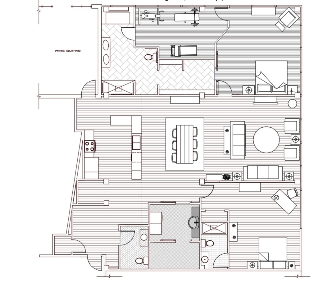
That wasn’t a walk in the park either but, oh my goodness, what a difference a computer made! Here is a floor plan I created in CAD for a senior living apartment project. Pretty cool huh?
And look at these elevations! Still drawn to scale but so much clearer in CAD.
This past sememster I really upped my game and took a Sketch Up class. Sketch Up is a widely used piece of software that in interior design allows you to transform 2D drawings into fully customisedable 3D models–you get to add all the furniture and accessories you can ever imagine.
Our final assignment was to take the barebones floor plan for an actual apartment at 130 William Street in the city and create a fully furnished home for an active family of three. This is what I started with.
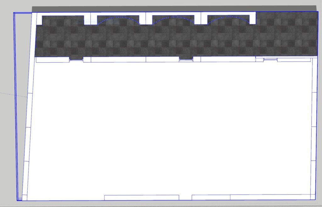
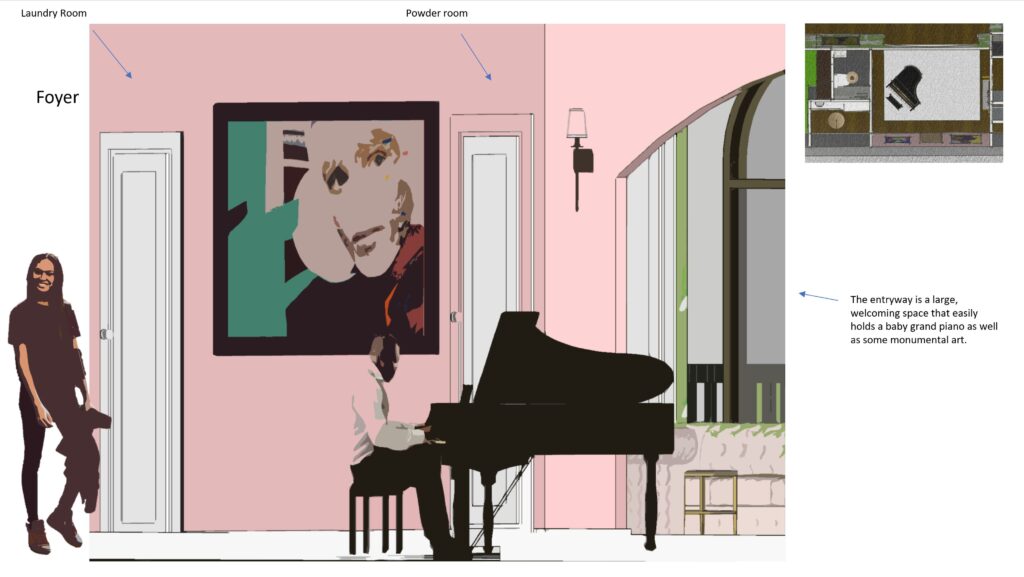
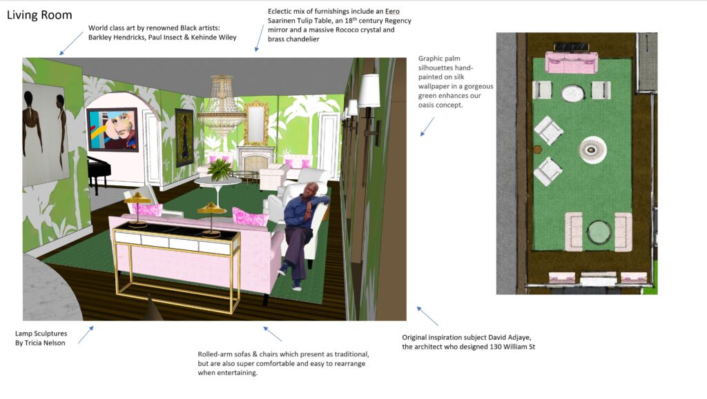
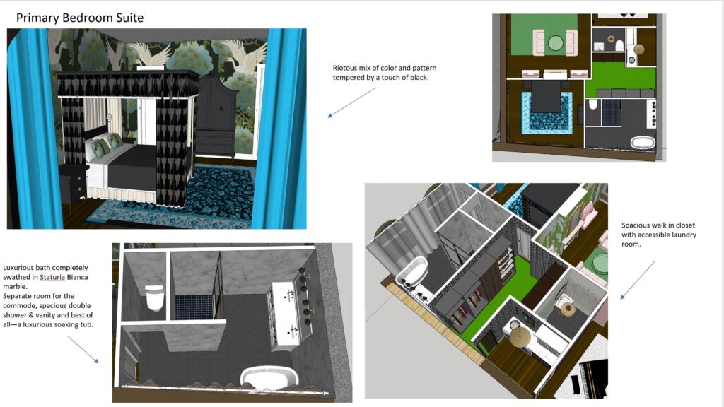
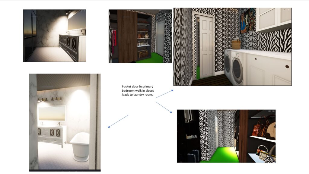
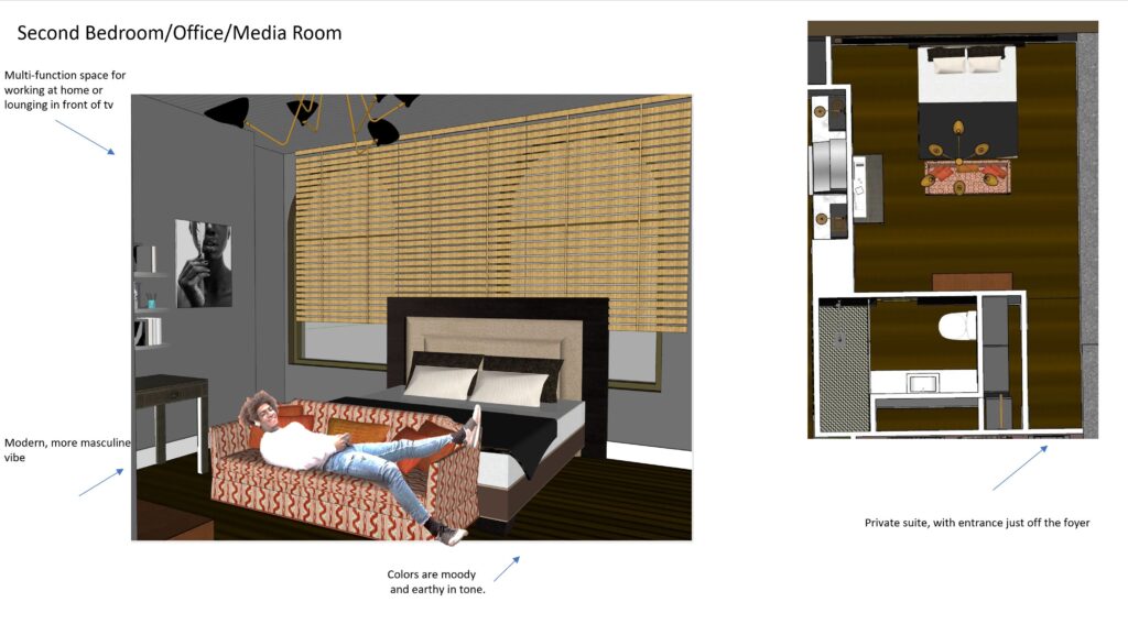
And this is where I wound up.
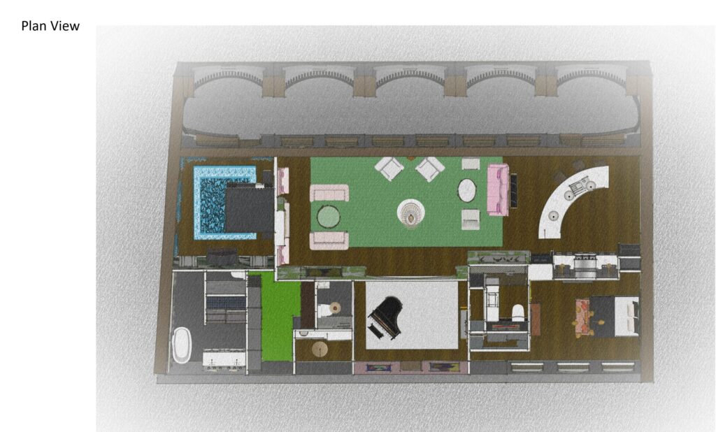
What’s really cool, is how you get to create actual three dimensional spaces, move walls, add millwork, create roofs, even if you can’t quite master the art of printing!
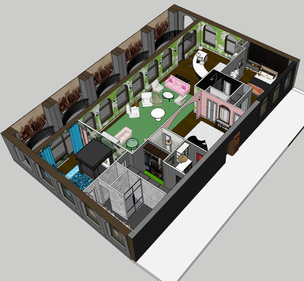
It’s like playing with a dollhouse–only better. With just a touch of the mouse you can change the paint color, add a chandelier, replace all the marble in the primary bath or add a sectional to the living room. The options are limited only by your imagination. For the final we were asked to make a video of the interior we created. How do you think I did?
To back up a little, I should probably mention the concept was to provide my (fictional) clients, a busy, very successful professional couple in NYC, with an Urban Oasis. In ecology, an oasis is a fertile area of a desert environment that sustains plant life and provides a welcoming habitat for animals.
In this case the idea was to create an environment with style and verve that would enhance and sustain the interests of both spouses (she the owner of a chic gallery in Soho, he a musician/composer) while at the same time shelter their teenager from the storms of upcoming adulthood. They were looking for a combination of traditional style with a splash of boho chic. Ultimately, they wanted an uber-sophisticated home with room for all to work—and play!
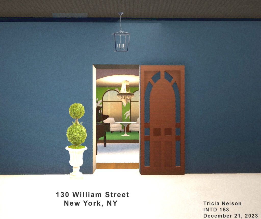
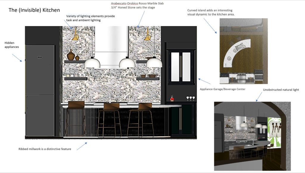
Usually I include a recipe at the end of my blogs, but in this case my imaginary couple made it quite clear that they were not moving to NYC, one of the restaurant capitals of the world, to cook. While the kitchen is highly functional, it is more for having a cup of coffee and a bagle than creating five course meals. So I will take a page from their book and trot on over across the street to the B-2 Bistro and enjoy someone else’s cooking for a change!
Happy New Year!
