Homing refers to an animal’s ability to return to a place after traveling far away from it. While I know Keith loves living in the United States (he’s been here over 40 years for heaven’s sakes!) there will always be an England in his heart. So it was brilliant to pop over the pond and soak up some real ale, visit with the relatives, and just be in that special British kind of groove for a couple of weeks this fall. First stop was in Surrey where we met up with Keith’s Auntie Pat. No proper English home is without a garden and Pat always has one of the best. Love her hanging basket and bold use of color, so warm and welcoming.
 Next stop was arguably one of the most famous gardens in the United Kingdom: Sissinghurst, in nearby Kent. Originally owned by Vita Sackville-West and Harold Nicolson and now the National Trust, it is a must stop for garden lovers and English lit majors the world over. Vita was a Bloomsbury Group original, lover of Virginia Woolf, and gardener extraordinaire.
In her own words: “My liking for gardens to be lavish is an inherent part of my garden philosophy. I like generosity wherever I find it, whether in gardens or elsewhere. I hate to see things scrimp and scrubby. Even the smallest garden can be prodigal within its own limitations… Always exaggerate rather than stint. Masses are more effective than mingies.” Trust me there are no mingies at Sissinghurst!
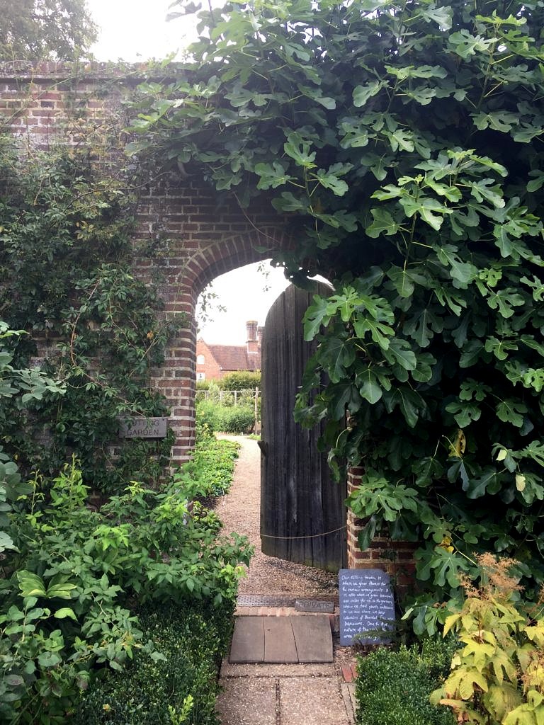
It wasn’t huge, as English gardens go, but with allees and walls and hedges and borders, vistas, large and small abound. And the totally famous White Garden, even in fall, was a masterpiece of design with a lush fullness and texture that belied its ostensible lack of color. Green is a color after all. 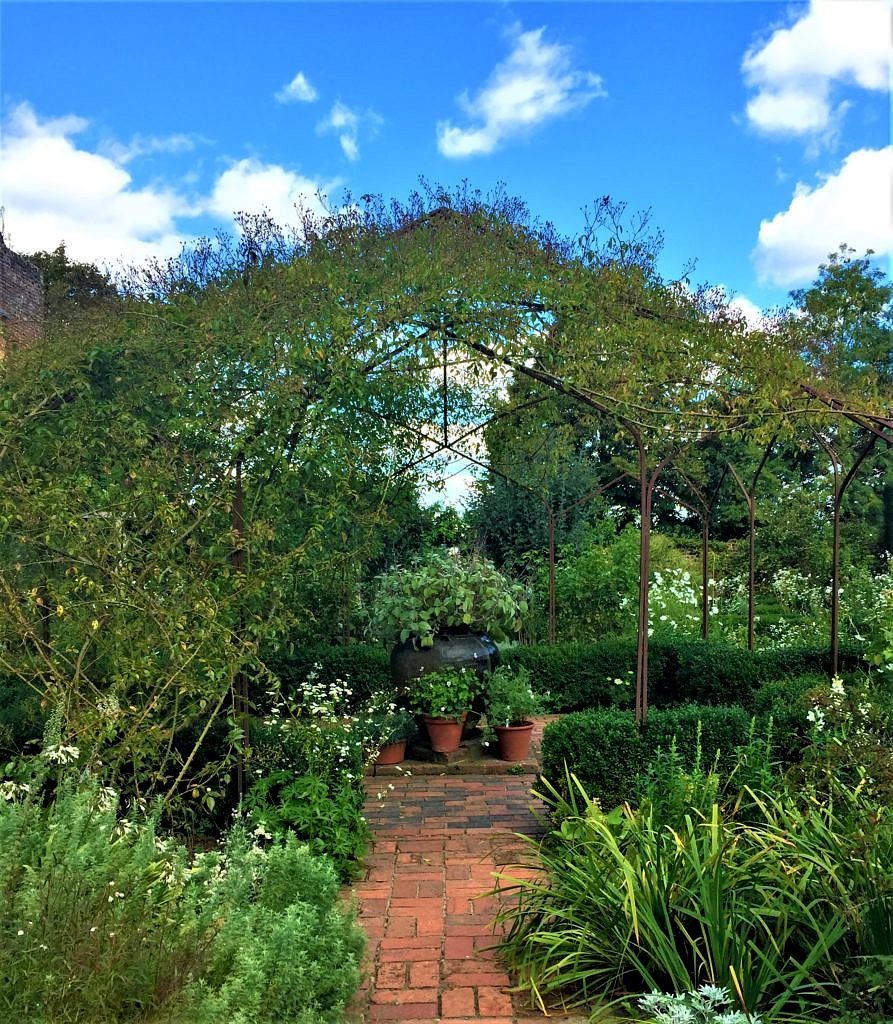 There was not a corner left untended–or unplanted and every turn brought another awesome vignette.
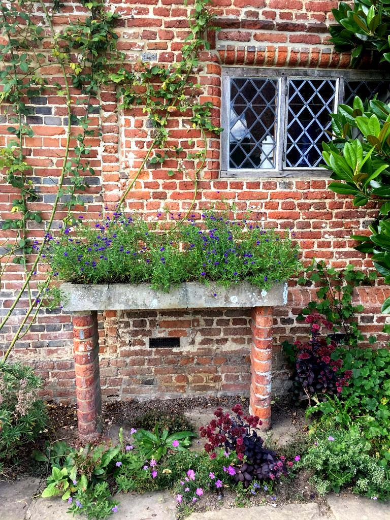
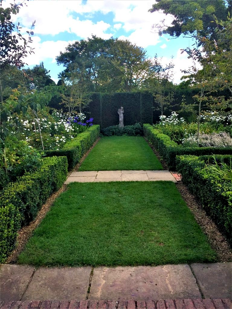 I probably took two hundred more photos; everywhere I looked there was a better shot. But, eventually cocktail hour approached and we were meeting a cousin at a fabulous pub and B & B in Tonbridge so it was time to get a move on.
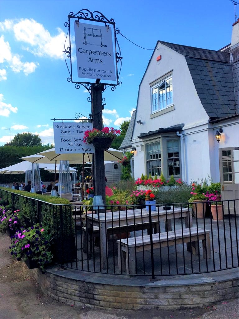 And time for a pint.
 Next we headed to Bognor Regis, a classic and classy seaside resort made famous by King George the V, and our home for the next few days while we enjoyed our niece Chantal’s wedding festivities.
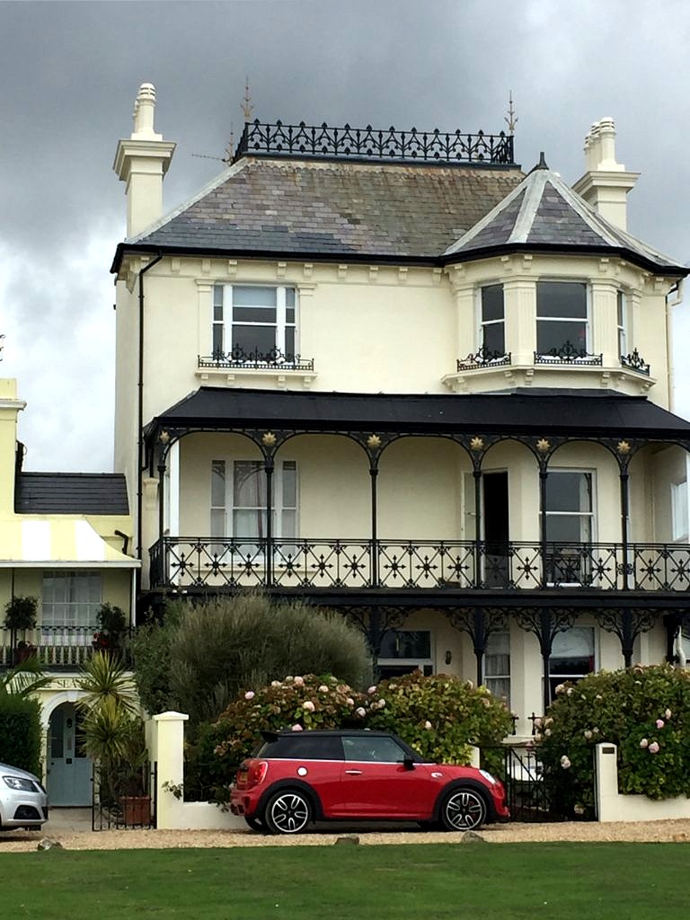 Between the seaside and the architecture Bognor Regis is a great place to stay so if you go to that part of the English coast give Brighton, the better known city just to the east, a miss–overcrowded and over-rated in my opinion–and stay in beautiful Bognor.
  The wedding was a civil ceremony in the town hall in nearby Chichester. Here we are with Keith’s brother and his partner. (I decided against the fascinator; tempting as it was I felt it best to leave that look to the natives). The reception was a double decker bus ride away at the groom’s parents nursery and garden center just outside of town.
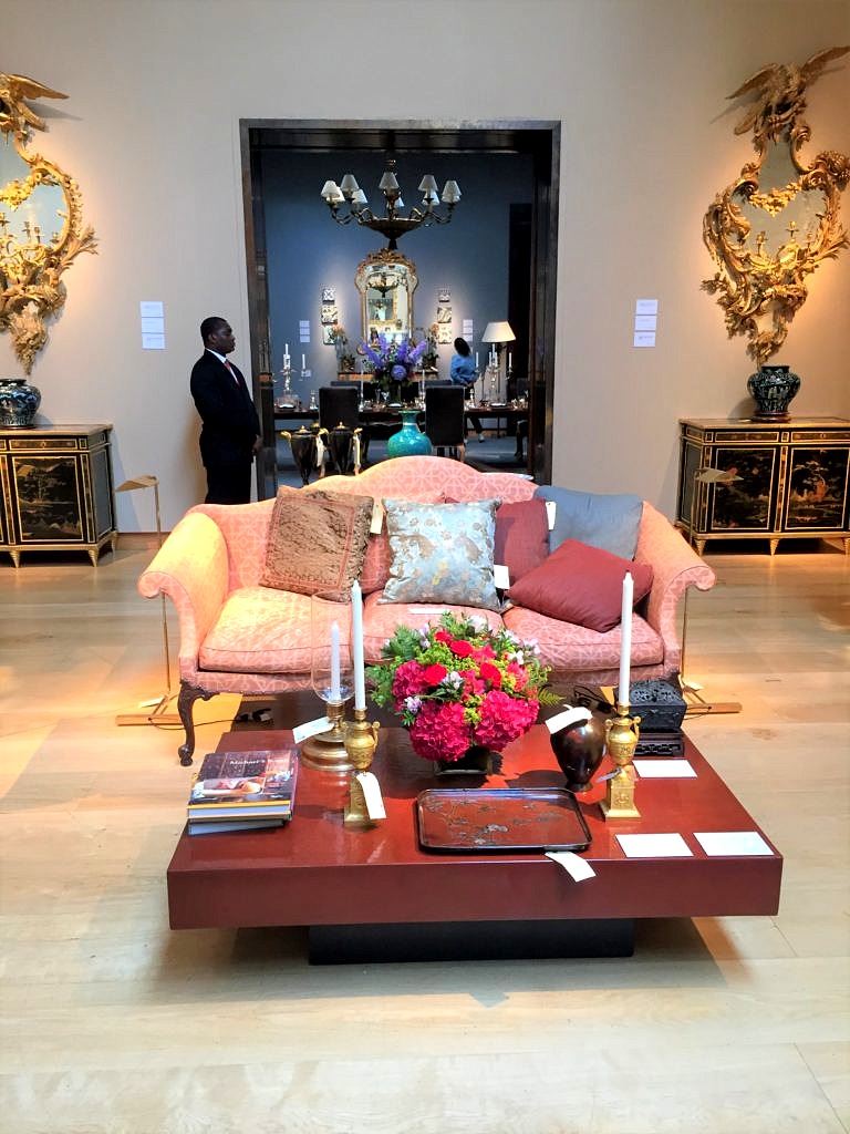
 Sadly all good things must pass, even weddings with six surfboard salutes; it was time for us to get to work. First stop, Christies Auction House in London to see how master U.S. designer Michael S. Smith curated that week’s sale. The brief was to show how antiques can be incorporated into everyday design–a no brainer except it seems for everyone under 40 these days.
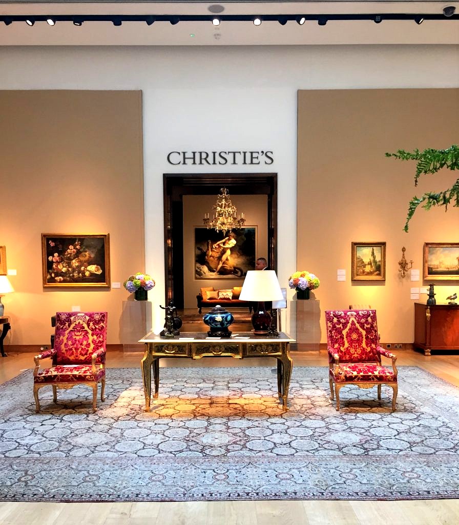 For probably around $10,000. (if the auction estimates were to be believed) you could furnish a living room–and dining room! Granted they were not period antiques, but who cares? Everything in the salesroom, whether antique or merely vintage, was well made, decorative and well worth the cost. We would have and probably should have and may well do in the future.
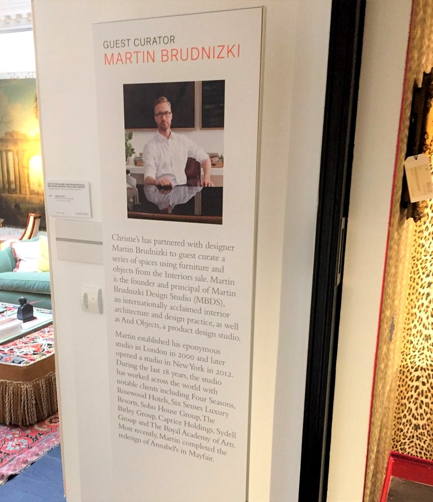
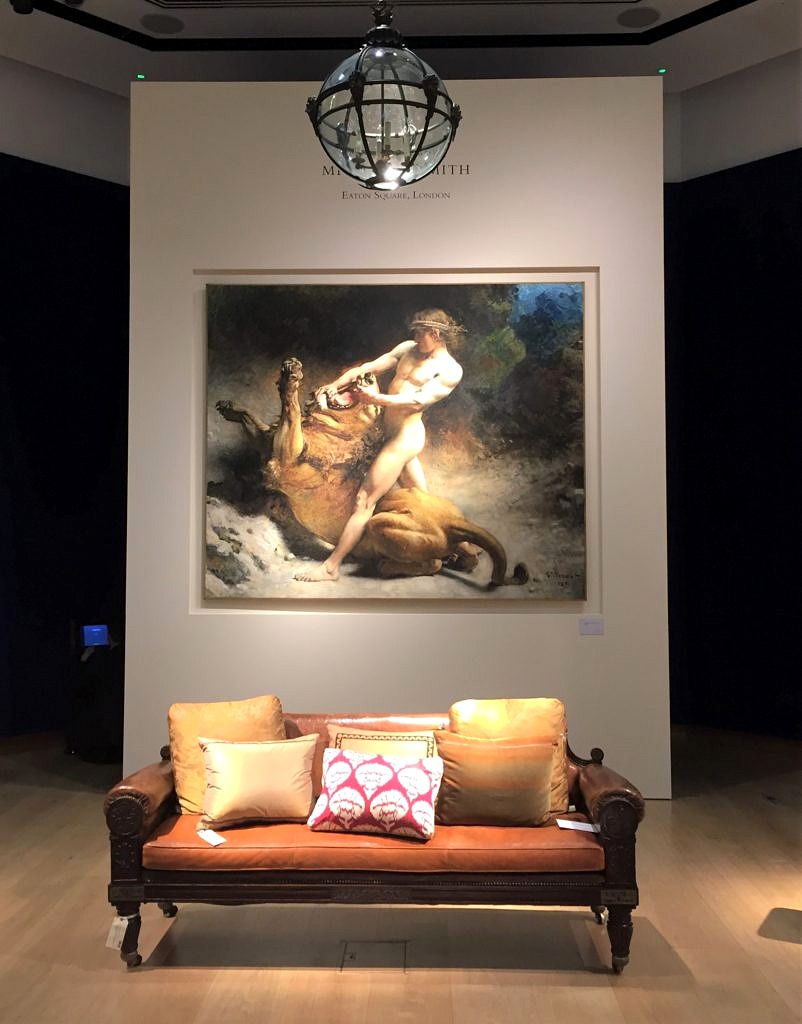 The other designer setting up the exhibition was Martin Brudnizki and his styling was to die for.
 Check this out.
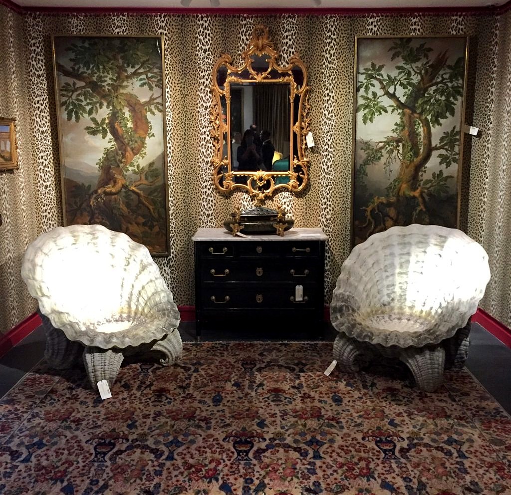 And this:
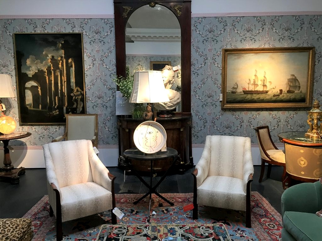 There was just a mad assortment of things old and new and what a great treat to see how these two design Ninjas put this with that and altogether came up with a whole room you just wanted to take home. Kudos to Christie’s for coming up with the idea to show objects in situ.
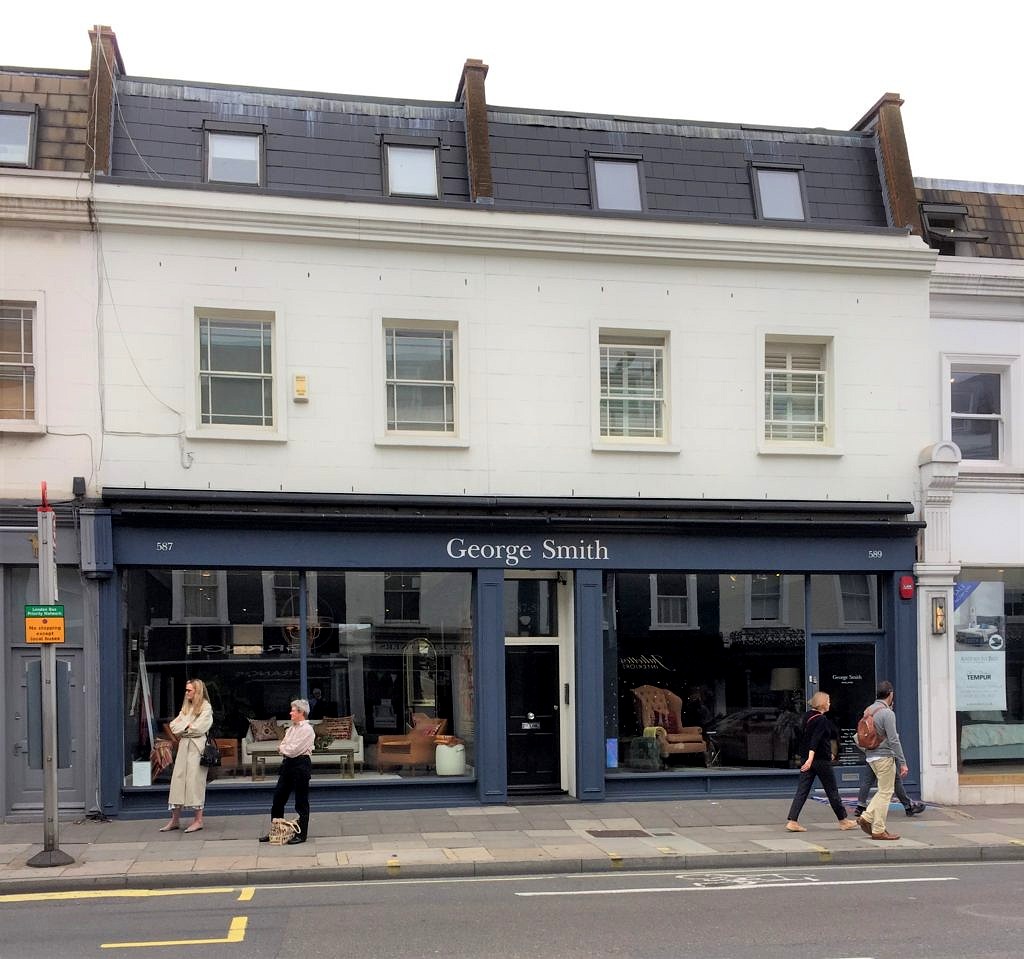
Our next foray was to Kings Road. Home to iconic shop after iconic shop, it is a little bit of heaven for anyone with a penchant for interior design. Osborne and Little were showing Nina Campbell’s new line.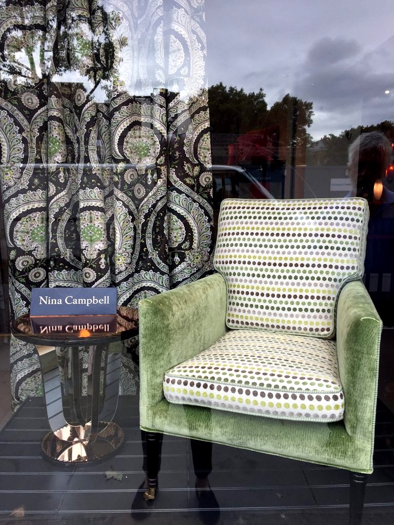 The latest from George Smith was on display.
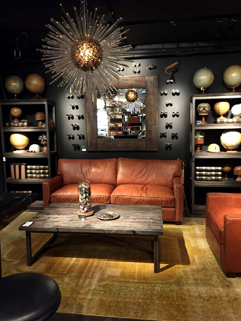
 Timothy Oulton (familiar to Americans through his RH connection) had just opened a new store called Bluebird. And clearly was channeling Michael S. Smith’s Christies vibe.
 Then we spent a long time at Trowbridge Galleries, the leading purveyors of art photography in England, and a vendor we are considering for the store.
 Next stop was the London Design Centre,Chelsea Harbour .
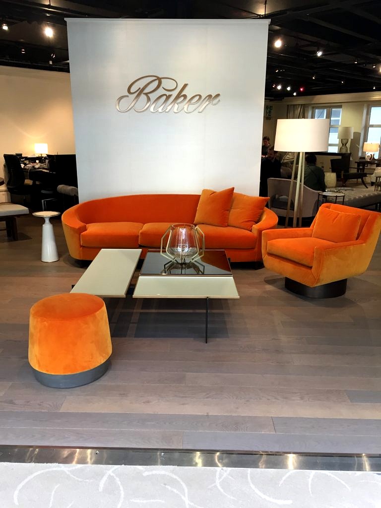 They were madly putting the finishing touches on many of the showrooms in preparation for the London Design Week. Loved the color of these sofas; clearly you can’t go wrong with pumpkin this fall.
 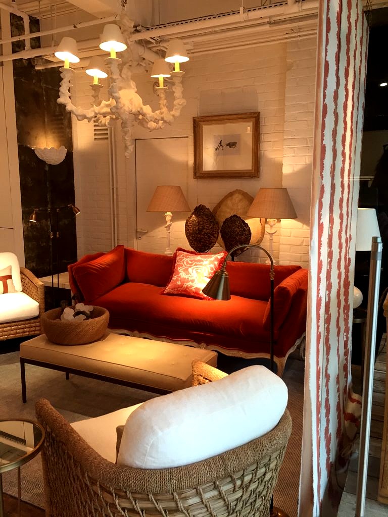 It was a great way to wind up our trip and a fabulous opportunity to see the latest in home decor from a whole slew of world-class designers and renowned retailers. But eventually all good things must end; it was time for us to go home.
Meat Pie
But I couldn’t stop thinking about the meal we had at Chantal’s wedding. Everyone was served a meat pie and then gravy, mashed potatoes, peas and carrots were placed on the tables family style. I can’t believe I ate the whole thing!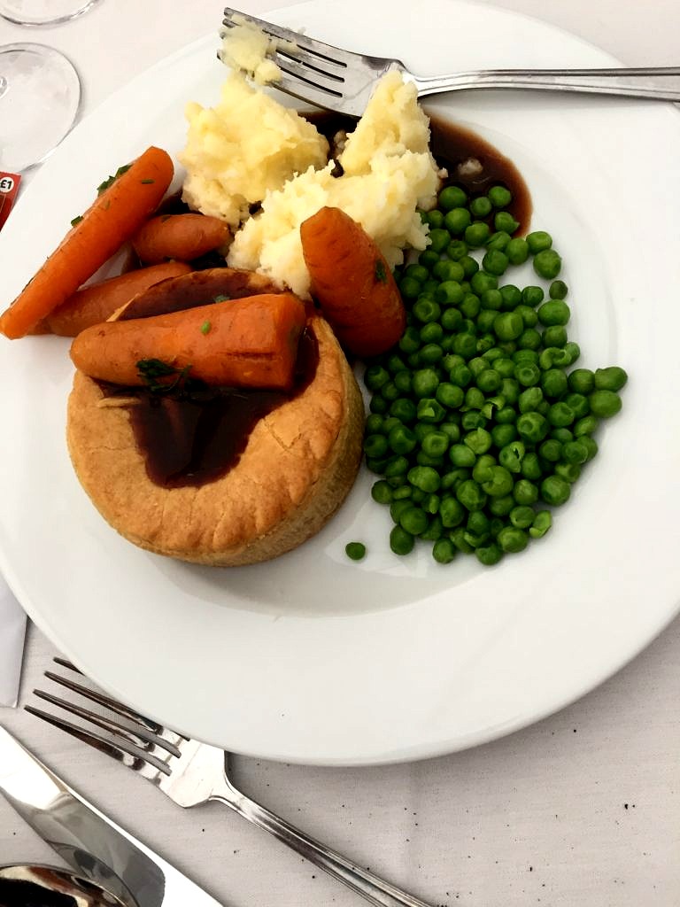 So I googled meat pies until I figured out how to do it. Here’s the Nelson Family version.
Meat Pie
First make your favorite beef stew. I delegated this to Keith and he made a Beef Bourguignon, using his favorite recipe from The James Beard Cookbook. The first night we had this in classic stew form, the next night we made meat pies. All you need to do is buy some puff pastry–it comes in your freezer section and thaws in the microwave if you forget, like I did, to take it out of your own freezer.
Using an inverted glass, cut circles out of the dough and place in greased cupcake tins. Fill with stew–a good trick I read and followed–is keep the filling on the dry side. Next top with a pastry lid, using a fork to press the dough around the edges to seal the pies shut. Cut two small slits in the top, and brush on some egg white. Cook in a pre-heated 390 degree for 30 minutes.
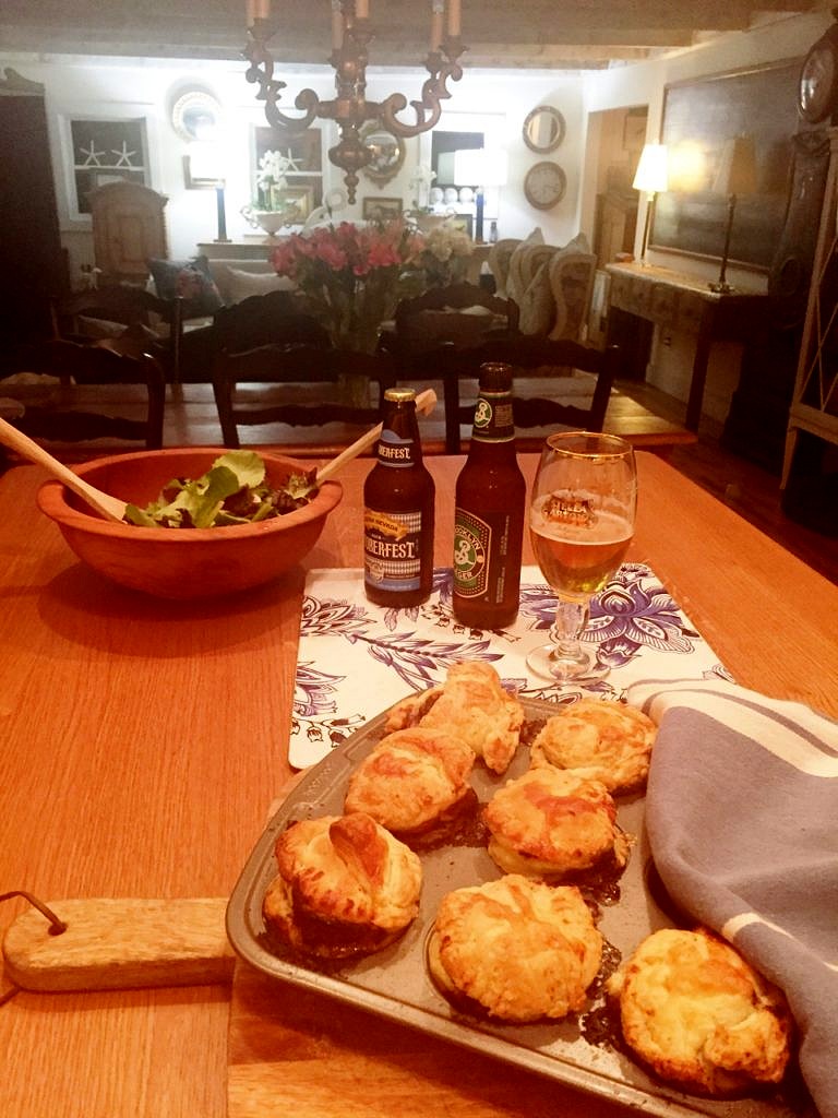 Not bad for a first try–easy as pie! Keith was happy to have a taste of home and now you can too.
11:43:33

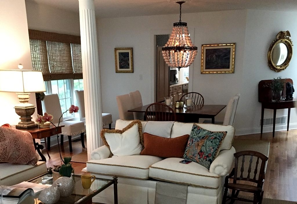
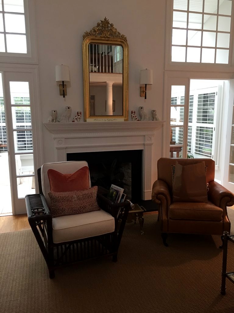 Then there is the Atlantic Highlands petite chateau where the owners have reclaimed their second story from their young son. And are in the process of transforming it from a playground into a sophisticated master bedroom suite and home office for the work at home most days professional mom.
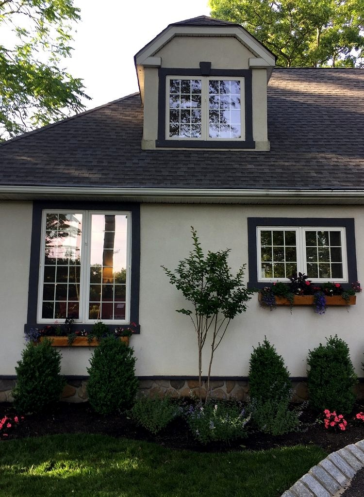
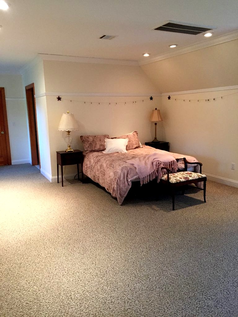 This is the before. You are not going to believe the after but because this is a work in progress we all have to wait for the wallpaper to arrive…
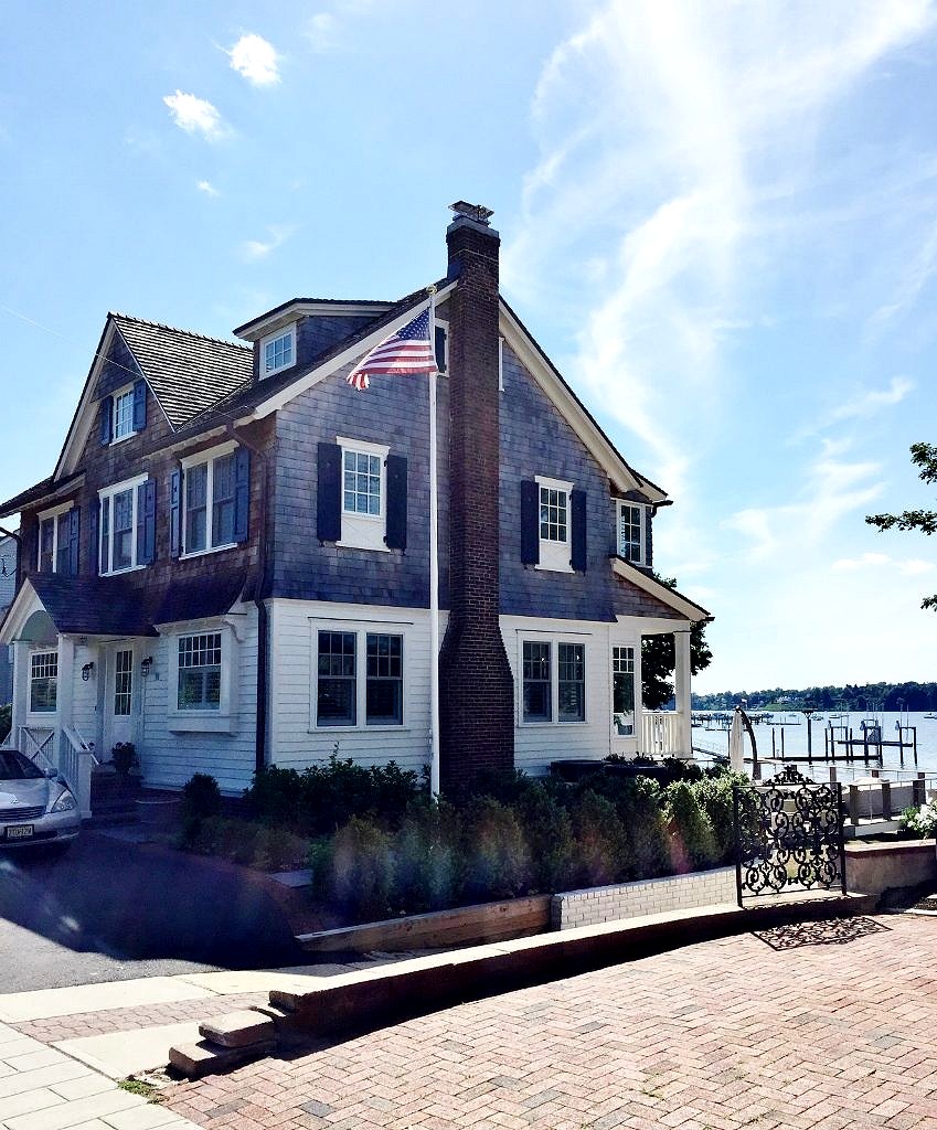
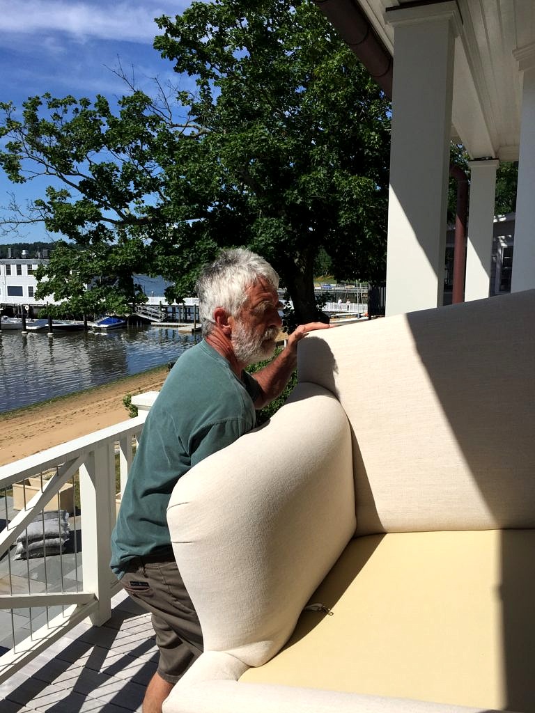
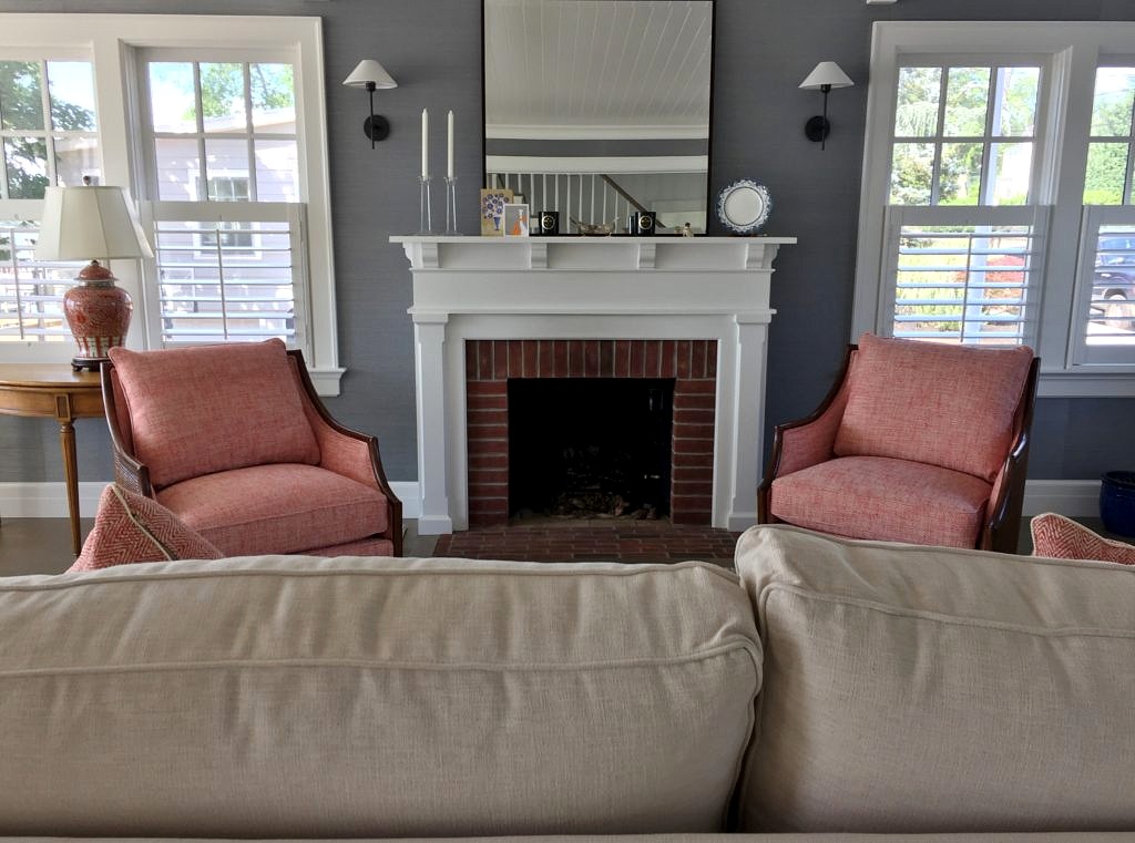 While we are not designers, after thirty years of shifting furniture around we’ve developed pretty good eyes and are usually happy to weigh in if asked. At the store we marry the new with the old, casual with chic, and farmhouse with modern every single day so we are well aware of the challenges you face. It is all about showing the things you love to their best advantage whether you are just starting out, or easing into retirement.
 For a while I’ve been off showhouses not being a huge fan of modern, slick interiors in garish colors, or the reverse, all grey minimalism. But this year’s
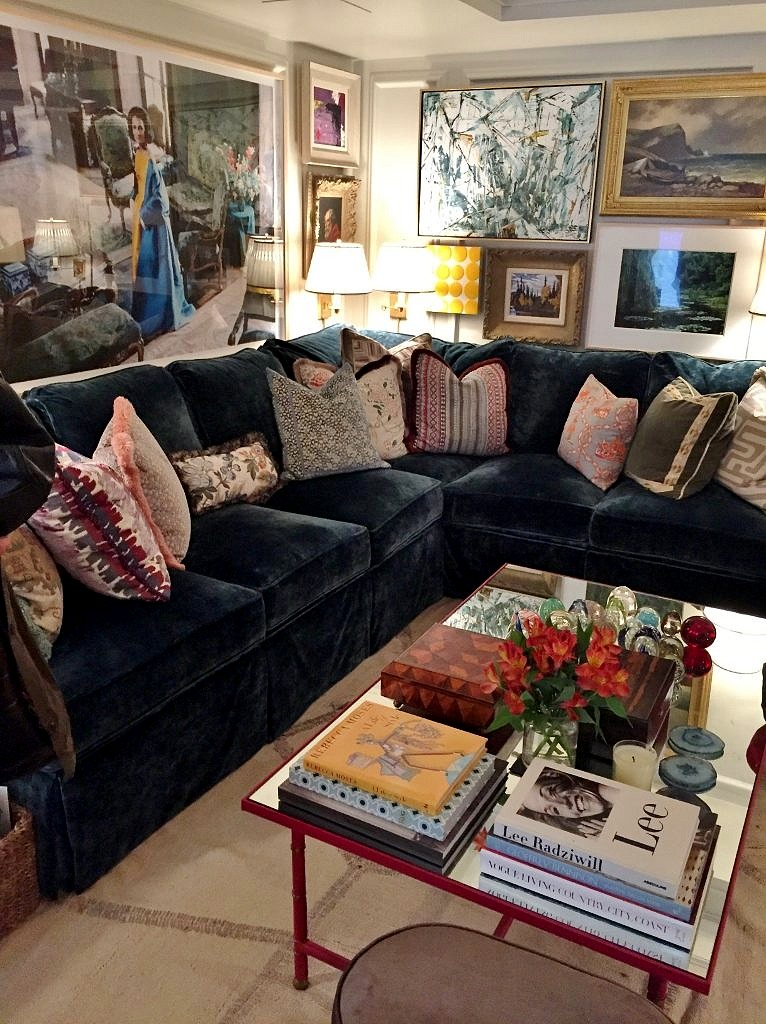
 Just when I had practically convinced myself that my days as a retailer were numbered because the upcoming generations don’t collect things, don’t want things, don’t need stuff–Philip Mitchell’s Drawing Room was the bomb. Anchored by a massive navy blue sectional festooned with a plethora of toss pillows bordered by a seemingly random selection of art, it was love at first sight.
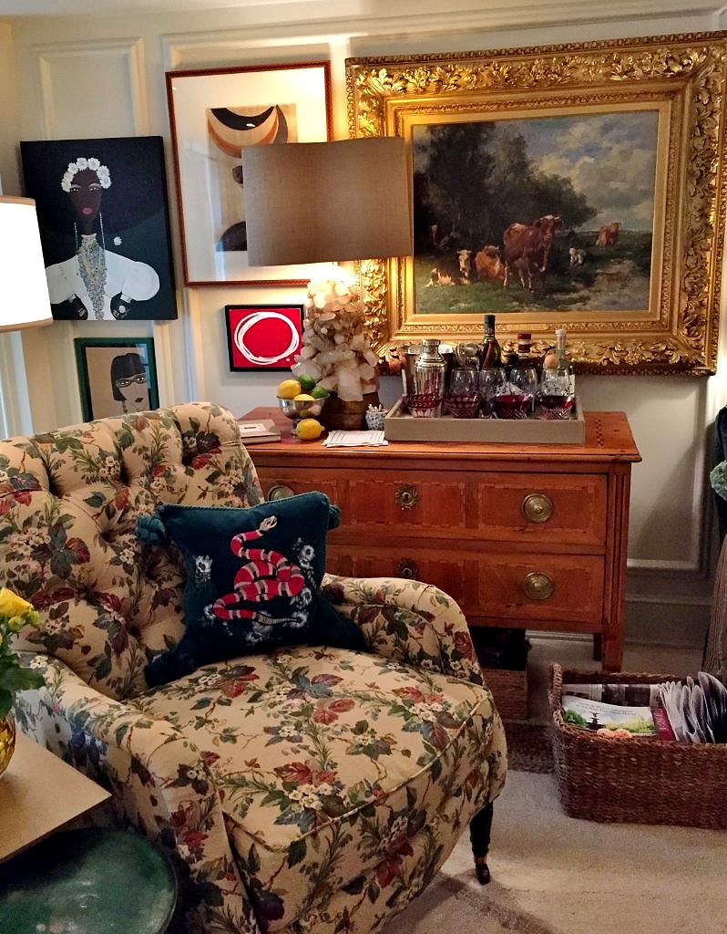 Coffee tables were all piled high with collections (note to self– take all unpolished antique brass candlesticks out of purgatory stat), more books, even plants. Who said orchids were so over? Note too all the stools and benches encircling the coffee table practically begging you to put your feet up and enjoy the flow.
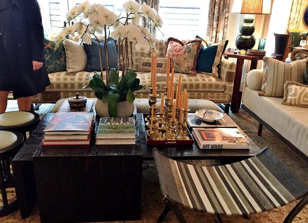
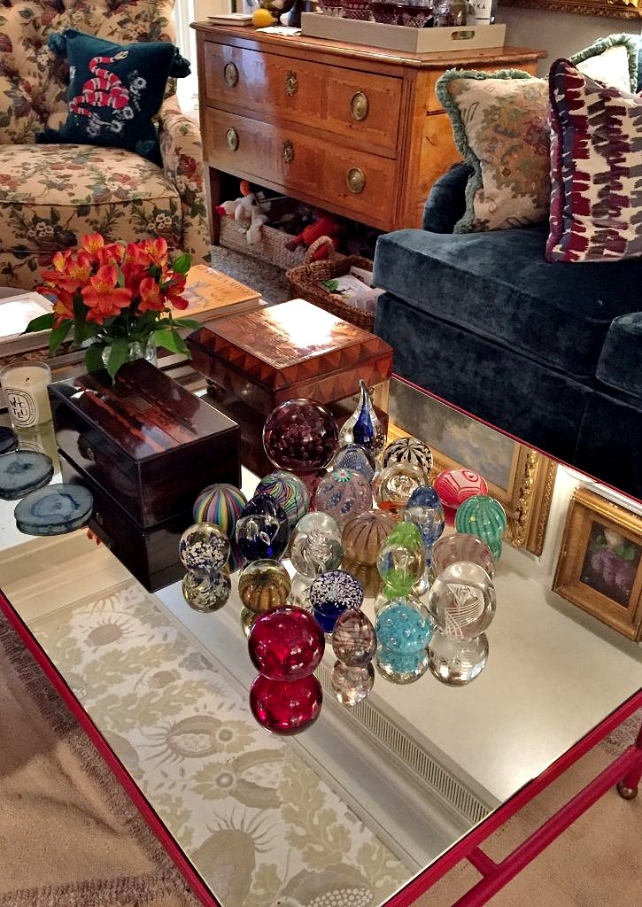 Everywhere you looked there was more to see and enjoy. Game table. Check.
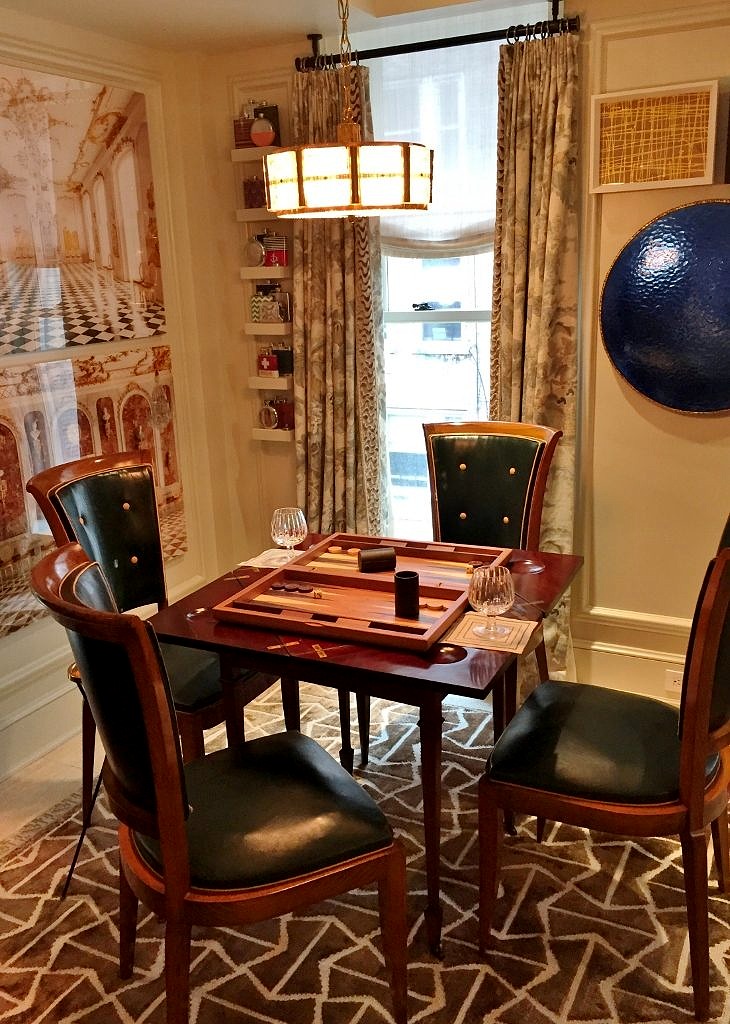 Cozy corner with wicker chairs. Check.
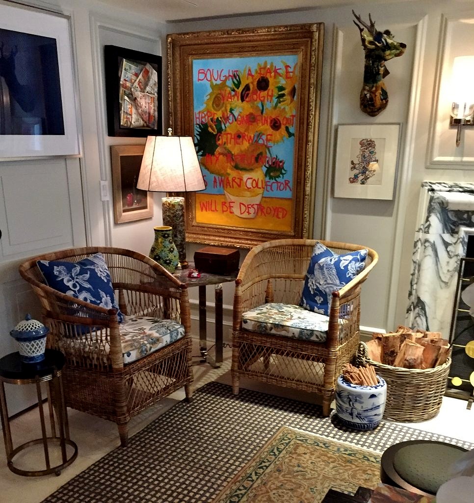 Tall shelf nestled in alcove filled with blue and white porcelain. Check.
 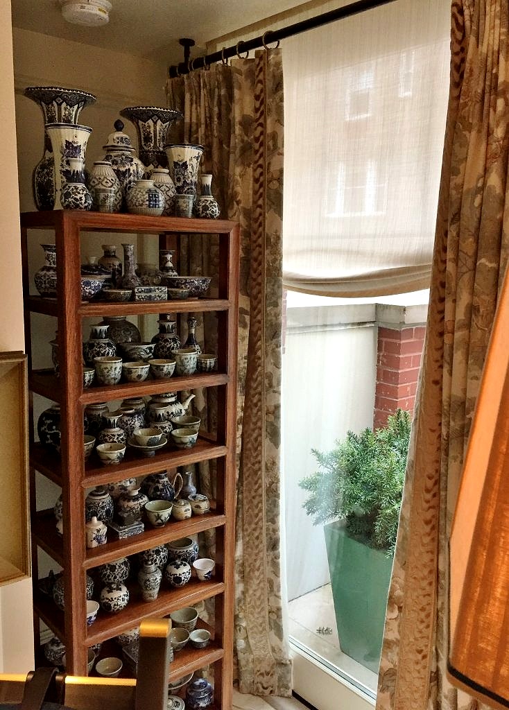 Vintage dog bed. Check.
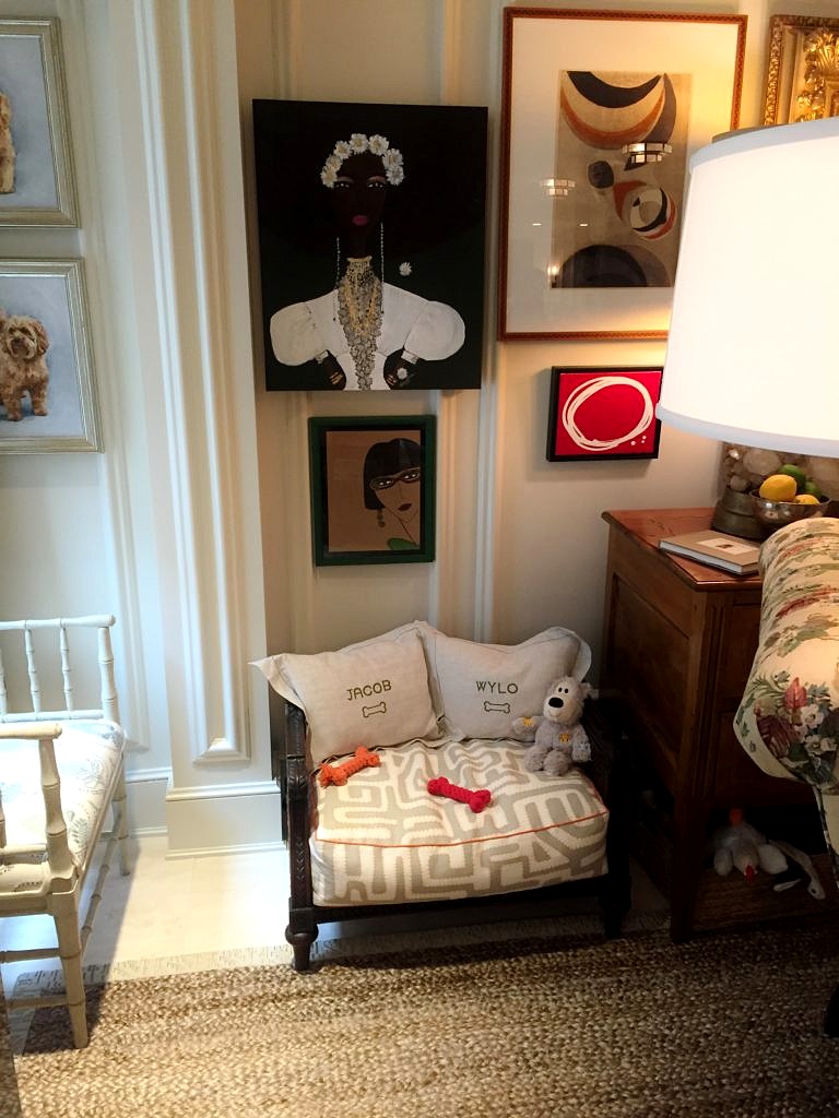 I could go have stayed there forever but there were seriously another twenty or thirty rooms left to peruse so off we toodled.
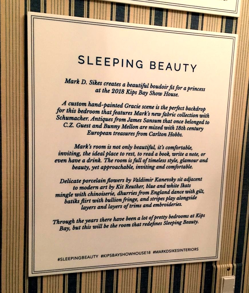
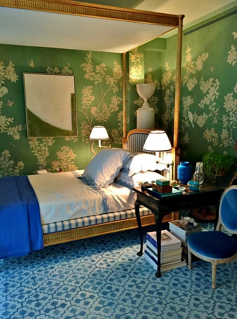 The four poster bed was gorgeous, and I love how the base is upholstered to match the headboard and footboard.
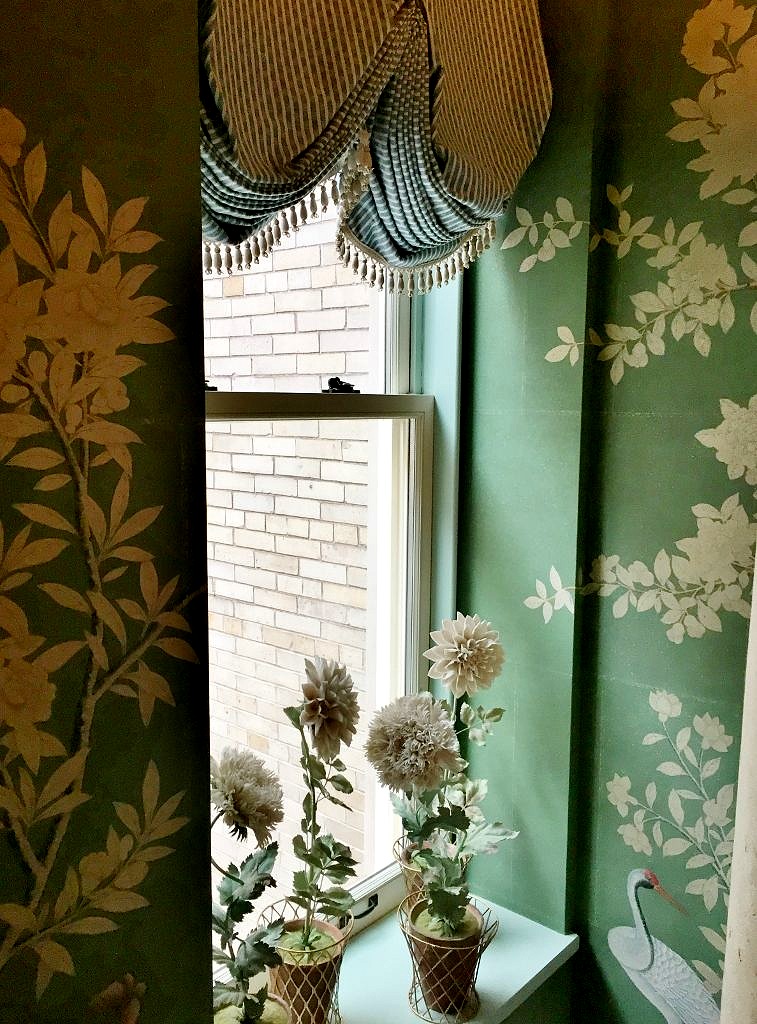
 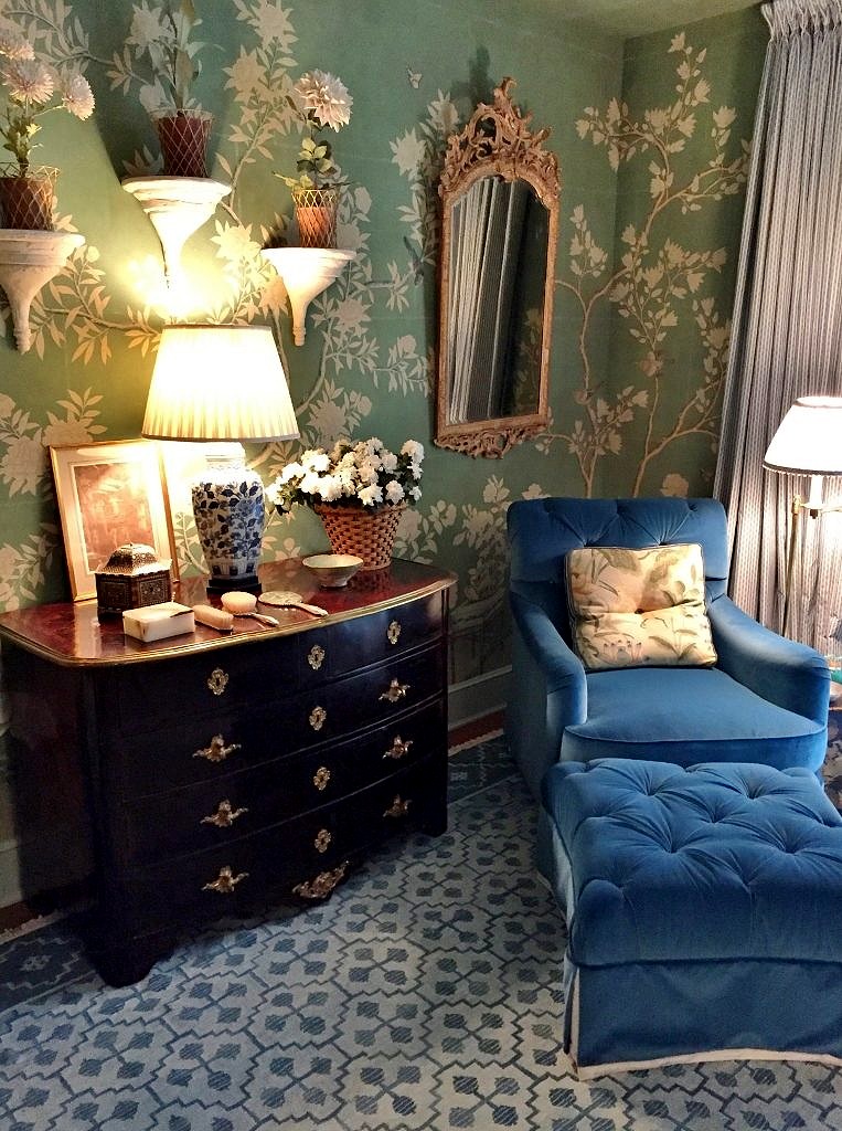 Pops of royal blue abound, and just imagine sinking into this upholstered velvet armchair after a glam evening out on the town. I’m not really a huge fan of complex window treatments but l was bowled over by this pinch pleat swag curtain that probably has a proper name–probably French–c’est tres jolie in any case.
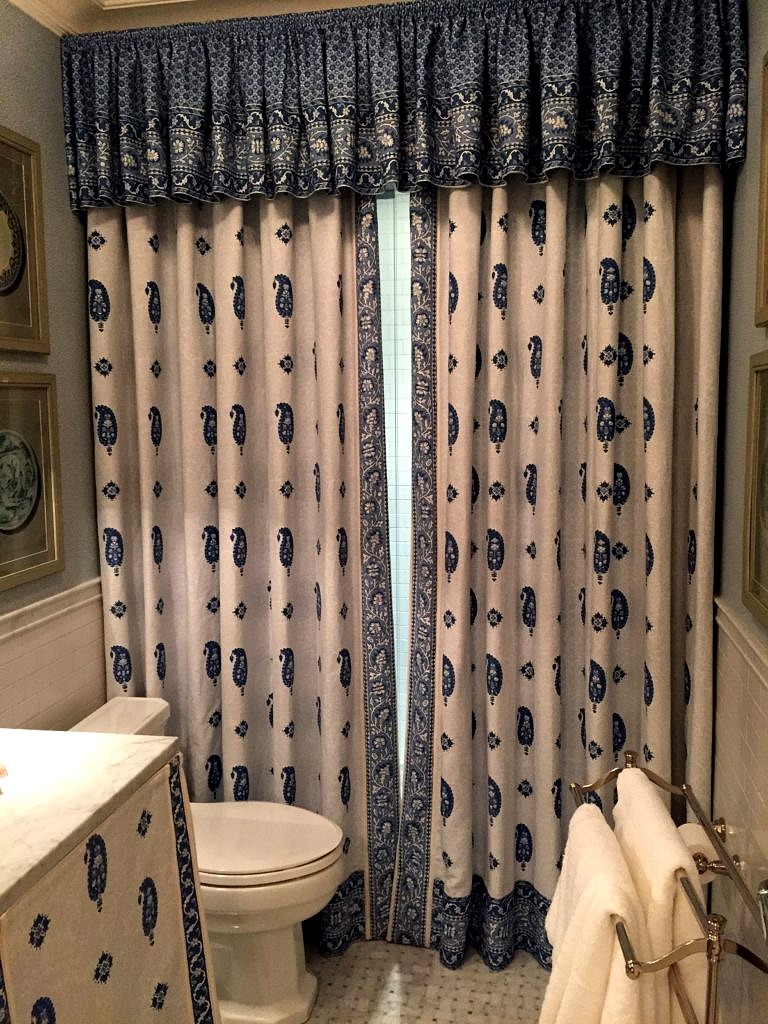
 Mark used a contrasting fabric as a shower curtain and skirt for the bathroom vanity which I gather is all part of his new fabric collection for Schumacher. Well done!
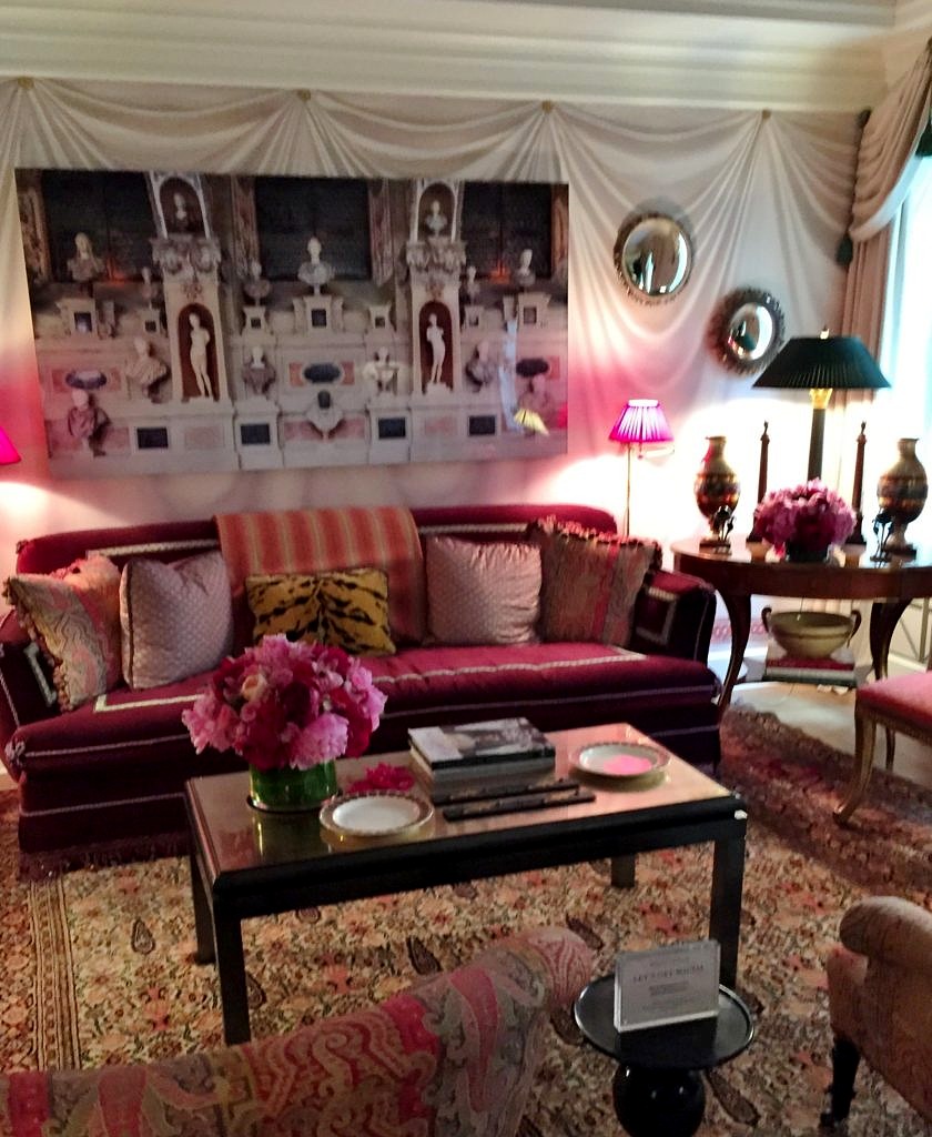
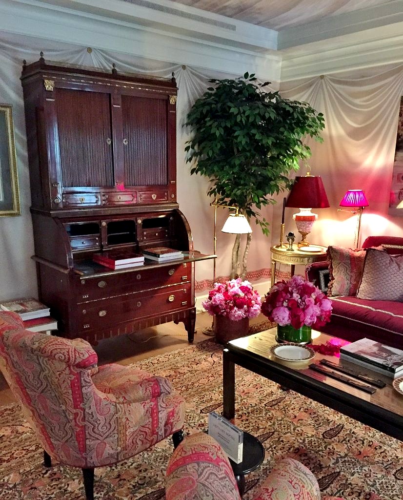
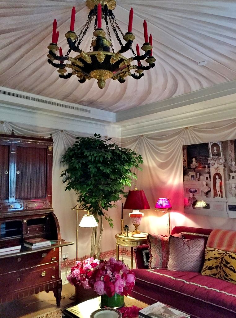
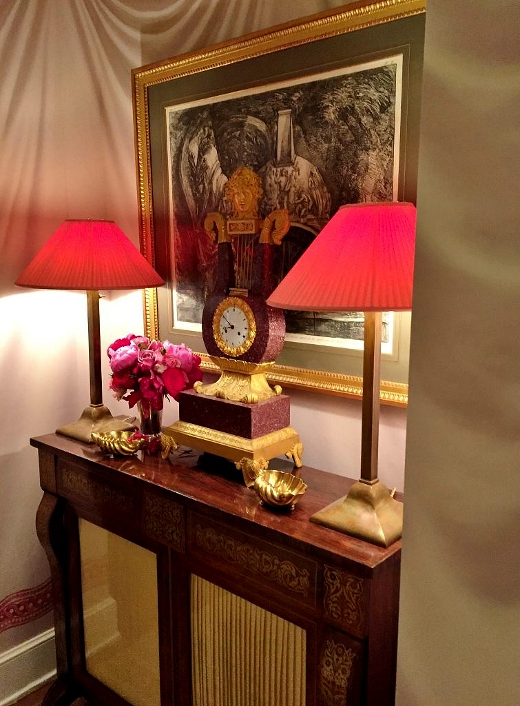 In the end it was all too fin de siecle for me–but I embraced the opportunity to see a master’s work. I had to marvel at the artistry that created the tromp l’oeil painted tented walls–and ceiling! And the vision and creativity of the designer to put this all together.
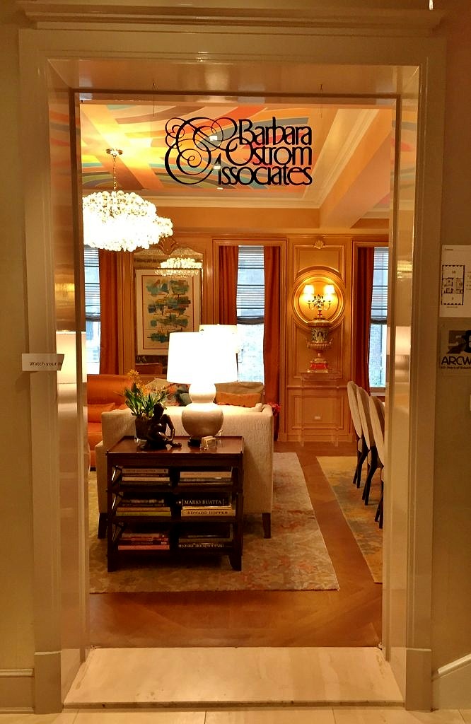
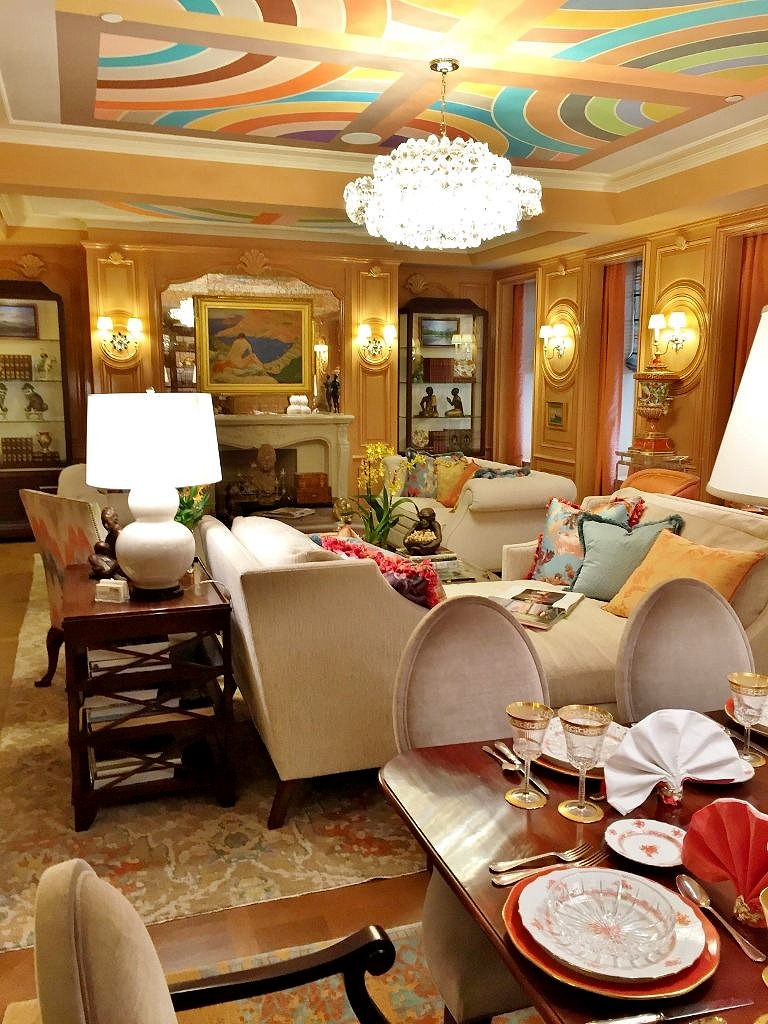 The dining section features a beautifully set table–another Barbara-ism. And note the Andrew Tedesco mural on the ceiling. Like many of the Kips Bay designers the ceiling was treated as a “fifth wall” and it was literally a highlight of the entire room.
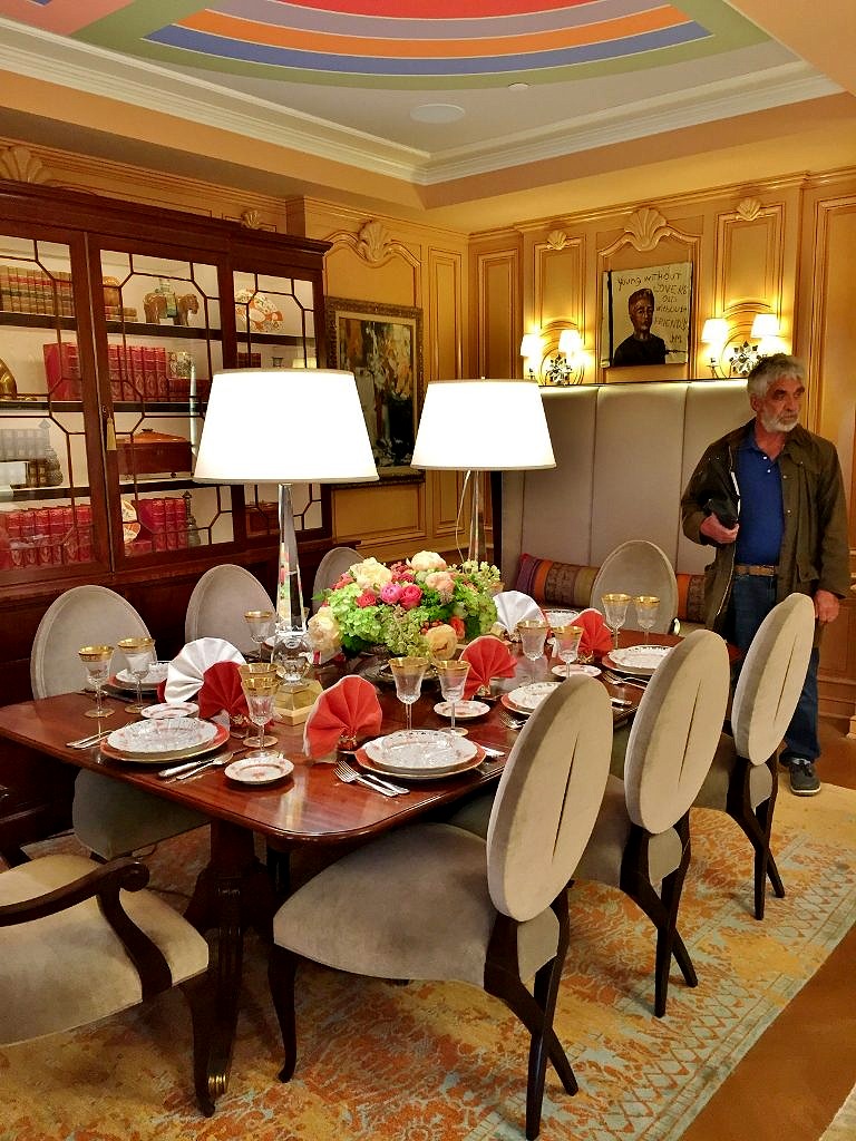 And speaking of stuff, Barbara is fearless when it comes to decorating a room. The paintings are from all periods, including one by John Mellencamp, while the bibelots range from the Han dynasty to the present day. As always the color palette is on the vibrant side; in this case high gloss peach from the Farrow and Ball archives.
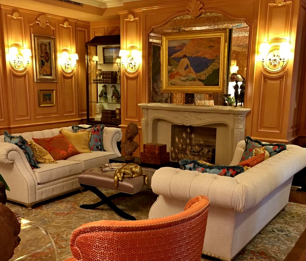
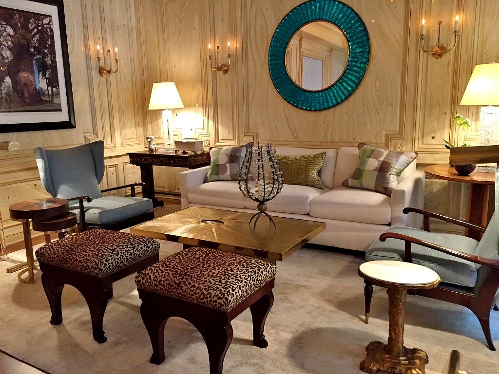
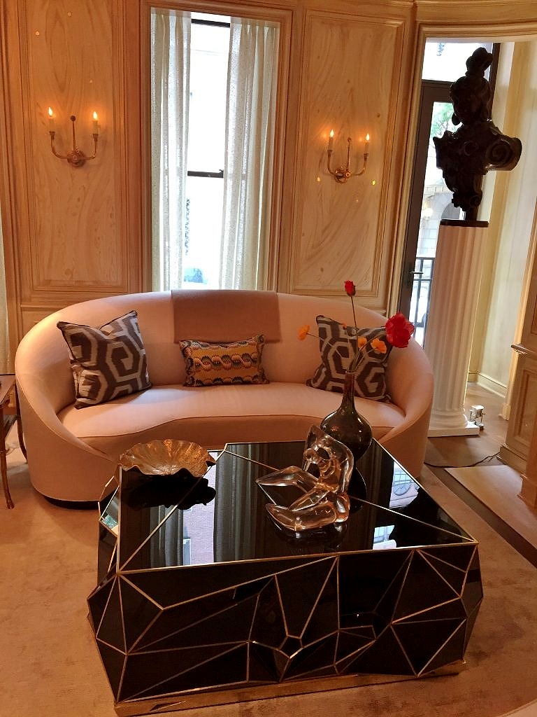 There were two comfortable seating areas, fabulous art on the walls, a mixture of antique and contemporary furniture and some pops of color but nothing too too.
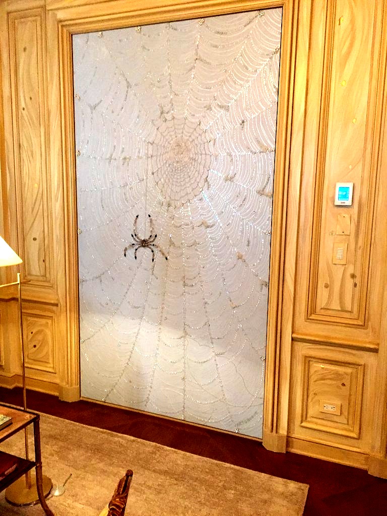 You can read about all the other fabulous Kips Bay Showhouse 2018 rooms here:
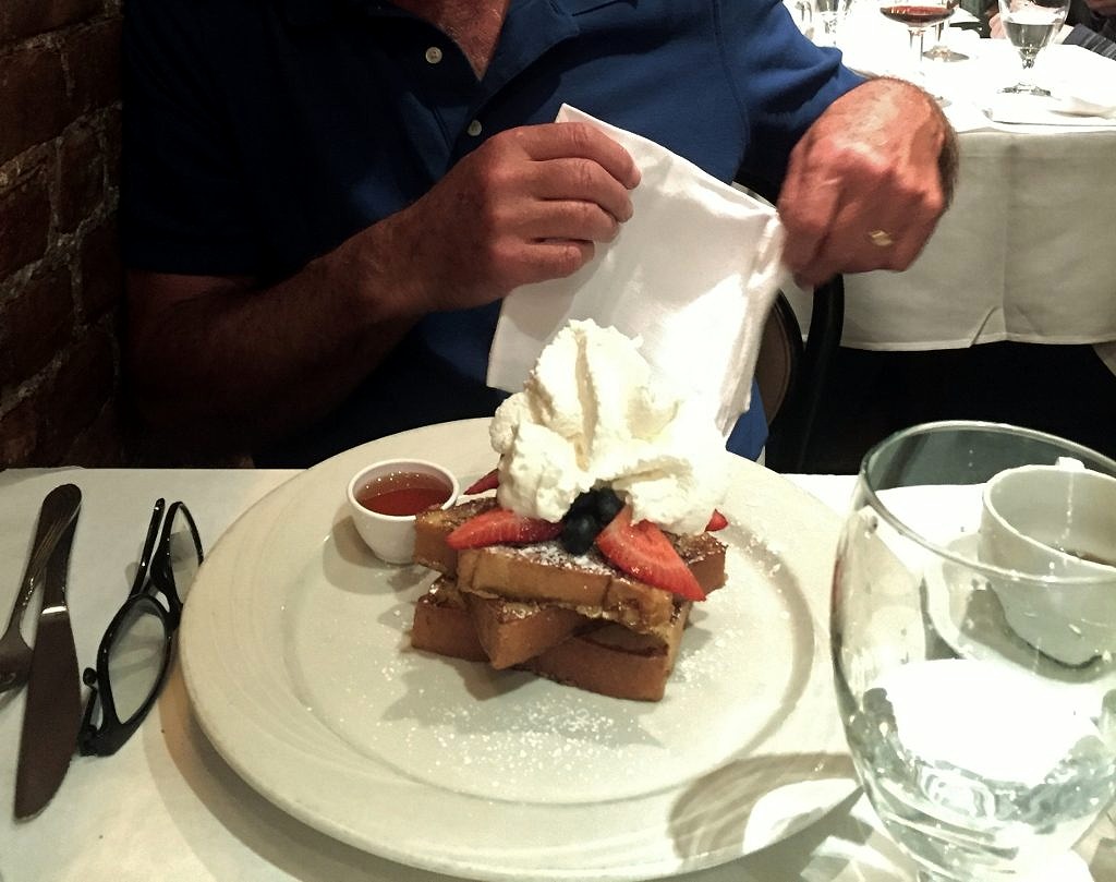
 B.Cafe (Belgian Brasserie)
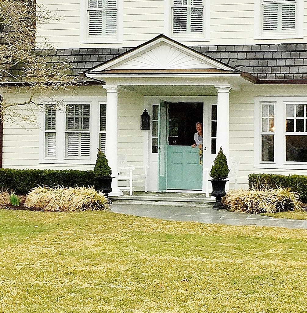
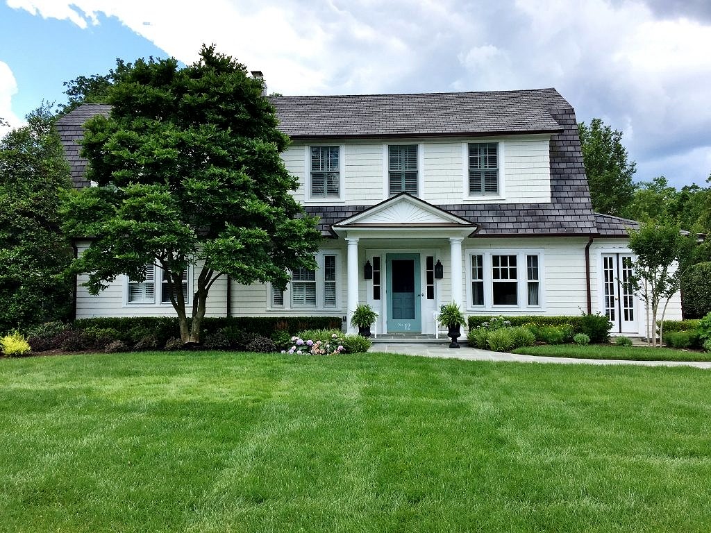 There are so many things to love about this house but my favorite might be the Dutch door. I have wanted a Dutch door my entire life and Bernadette’s is absolutely the most perfect shade of blue.
 It turns out to be