So last year at this time things, admittedly, were looking a little bleak. Locked up, locked down, whatever, so I made myself a Chocolate Mousse Pie for Mother’s Day and pledged to moved on. But not much happened…I didn’t write the great American novel, clean out my closets, or even my dresser drawers so in the fall I decided I would go back to college.
My BA is in English Lit but I’ve been importing antiques and selling furniture for the last 36 years or so and actively engaged in interior design all along the way: renovating 6 or 7 properties from studs to thickly settled, designing custom furniture for the store, and participating in a number of showhouses. (Below is a photo of the AndersonCampanella Potting Shed (be still my heart) we furnished for one of the VNA’s Stately Home-by-the-Sea Designer Showhouses at Sheep’s Run in Rumson. But I digress…)

It was in August when I realized that because there was literally nowhere to go, it was the opportune time to actually focus on the field that seemed to have chosen me. Fortunately there is a nationally renowned community college, Brookdale Community College , ten minutes from the store offering classes in Interior Design so I bit the bullet, took the plunge and signed up for:

I really wanted to take CAD, computer assisted drawing but this was a prerequisite. The good news was my class was held in the classroom. I’m fairly certain remote learning would have not have worked for me; zoom is not my friend.

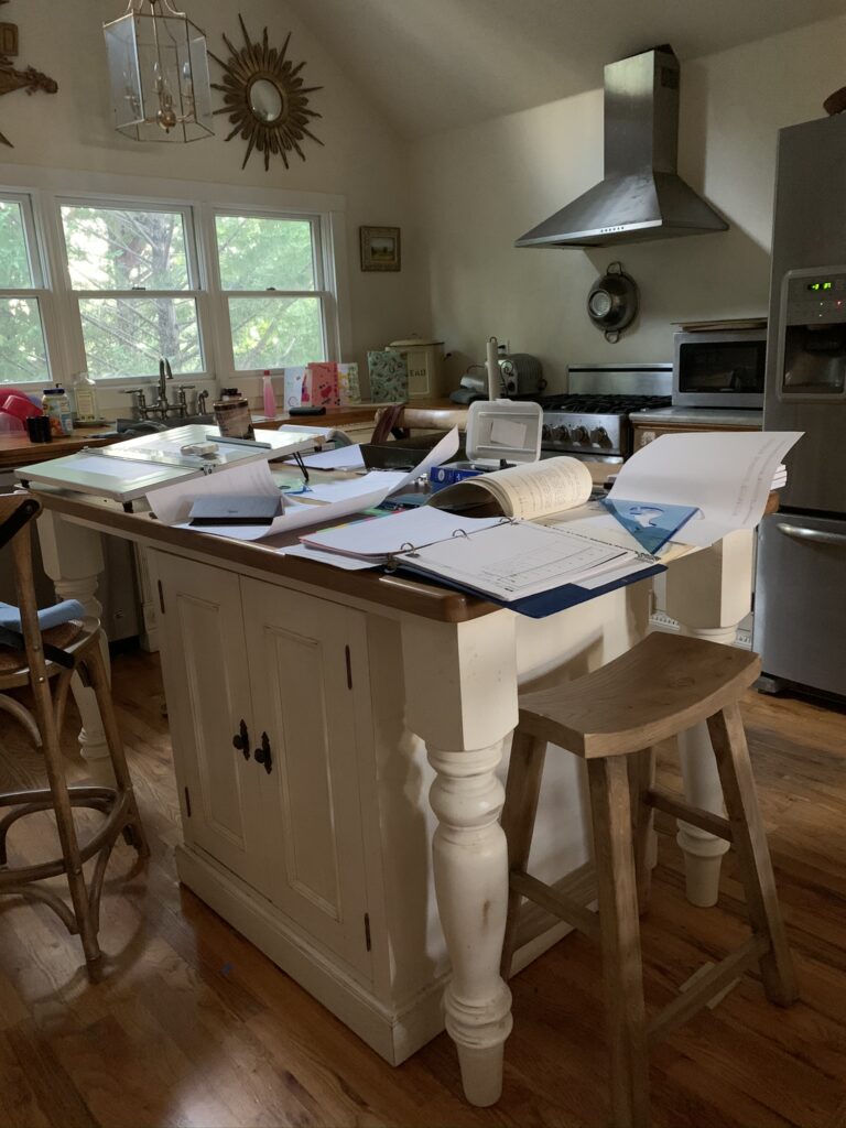
At first it did not go very well.
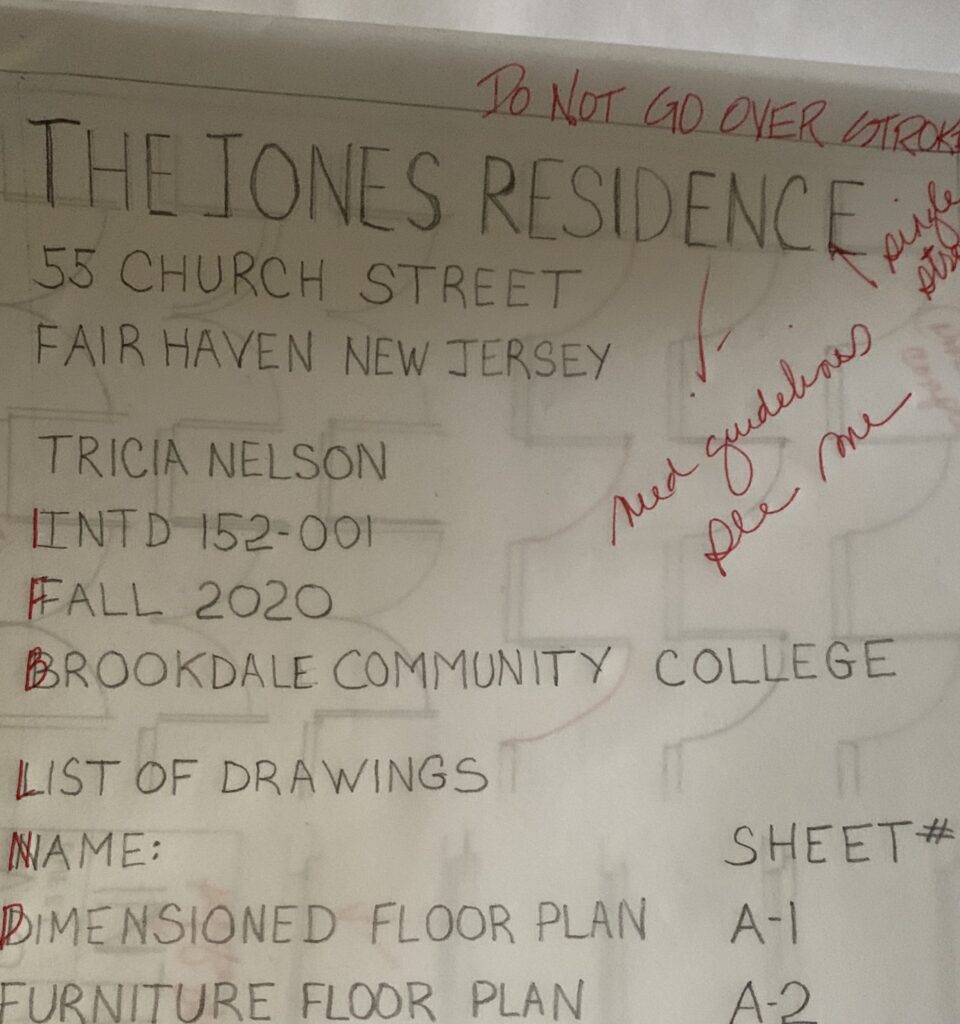
Printing has been my nemesis since first grade, but I persevered and learned more about creating a cohesive set of drawings that would convey an interior design plan than I thought was possible. There are multiple multiple factors and details to consider when designing a home, and I think we covered them all. No joke. Never cast aspersions on community college learning; this course was incredibly challenging.
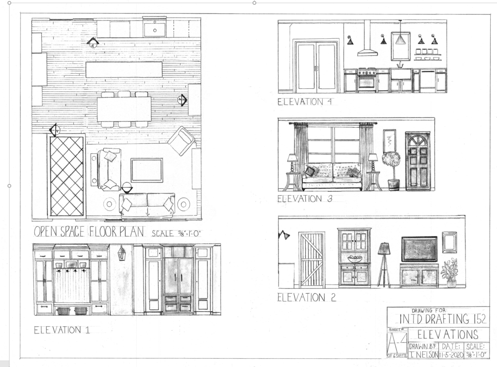
Below are the drawings for my final project which included an electrical plan, custom millwork and furnishings for a two bedroom house.



Phew, and did I mention presenting it all in Power Point? What was I thinking? Thank heavens my daughter, Laird, came home for a Christmas break and at the last minute walked me through the program; otherwise I would have walked into my final with a Mood Board and a bunch of samples and flubbed the whole thing.
But I got through it and even, thinking back, rather perversely enjoyed obsessively worrying about something other than Covid, the elections, the economy and my nearest and dearest scattered across the globe. So much so that I may have been the first in my class to sign up for the next semester.

Of course, after the first actual class, I was in total despair. At least I knew how to print, and read architectural drawings, and place furniture so figuring out the first semester was largely achieved by getting an eye test and new glasses (so I could see what I was doing) and concentrating on the task at hand, but this, this attempting to make my computer make a legible plan was insane. I stunk.
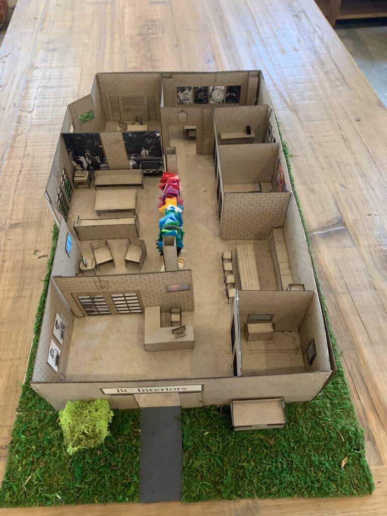
I won’t bore you with my trials and tribulations, but somehow, finally, I managed to figure it out. It wasn’t easy but here are the results. This time my final project was to design a 3200 square foot interior design office. Along with the electrical and furniture plans and millwork…
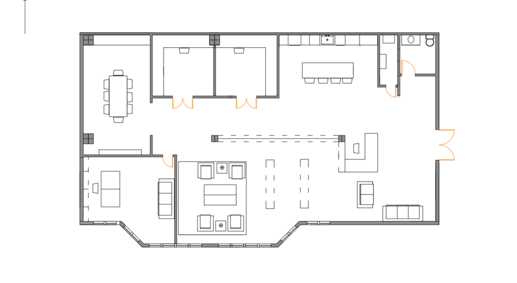
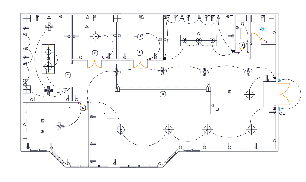
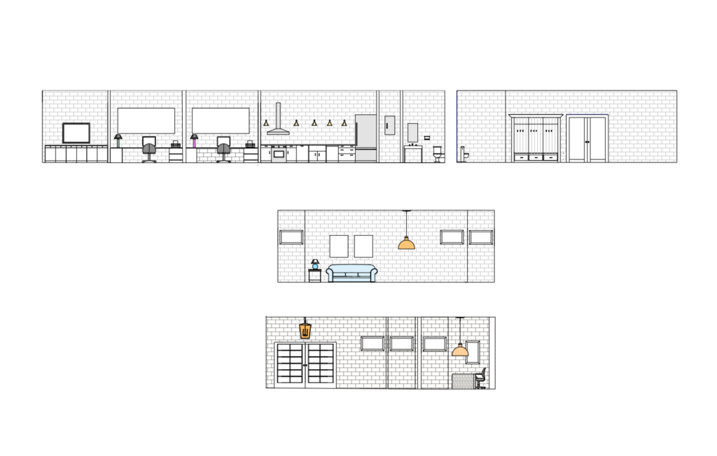
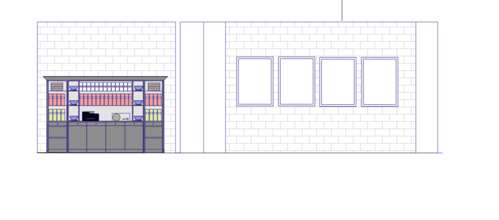
Then, the plans were uploaded into a laser printer and cardboard was cut into bits so the drawings created a scaled model, building, walls, floors, furniture, and all… Pretty cool huh?
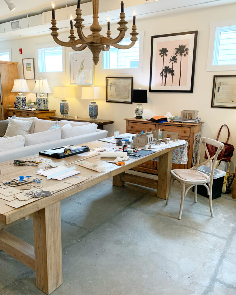
It was totally cool when it all came together exactly like I planned–amazing what a little technology and lots of Elmers Glue can do. I located my firm in a repurposed industrial building with 12′ ceilings, exposed brick walls and polished concrete floors. Not super huge at 3200 square feet, but spacious enough for three offices, conference room, complete kitchen and furniture showroom. Stay tuned…maybe I’ll build it someday!
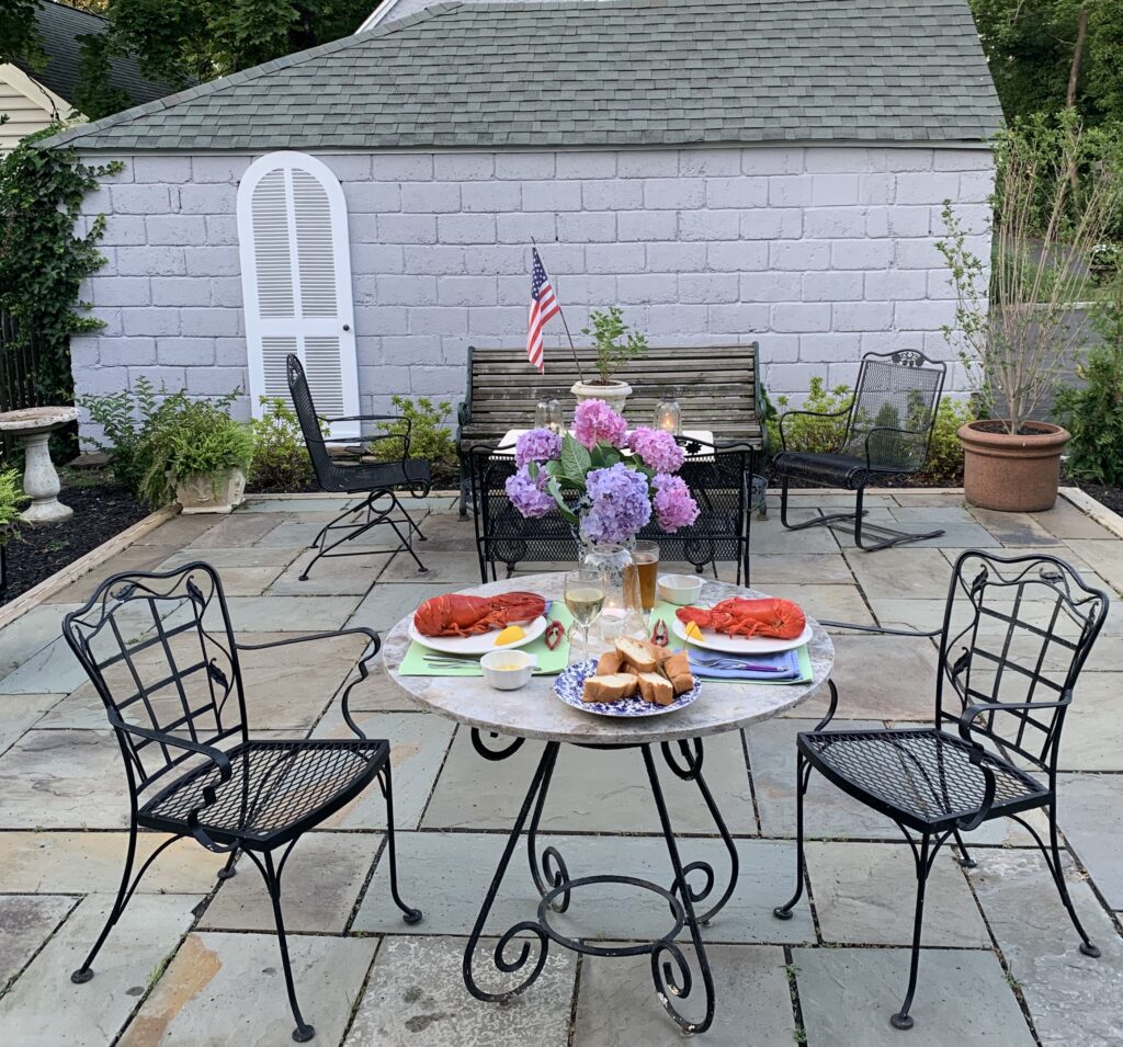
And now, here we are back to Mother’s Day and that eternal question, what should we have for dinner? This year I am voting for lobster from Doug Douty’s Lusty Lobster, and Chocolate Mousse Pie, of course.

 First stop was in Surrey where we met up with Keith’s Auntie Pat. No proper English home is without a garden and Pat always has one of the best. Love her hanging basket and bold use of color, so warm and welcoming.
 Next stop was arguably one of the most famous gardens in the United Kingdom: Sissinghurst, in nearby Kent. Originally owned by Vita Sackville-West and Harold Nicolson and now the National Trust, it is a must stop for garden lovers and English lit majors the world over. Vita was a Bloomsbury Group original, lover of Virginia Woolf, and gardener extraordinaire.
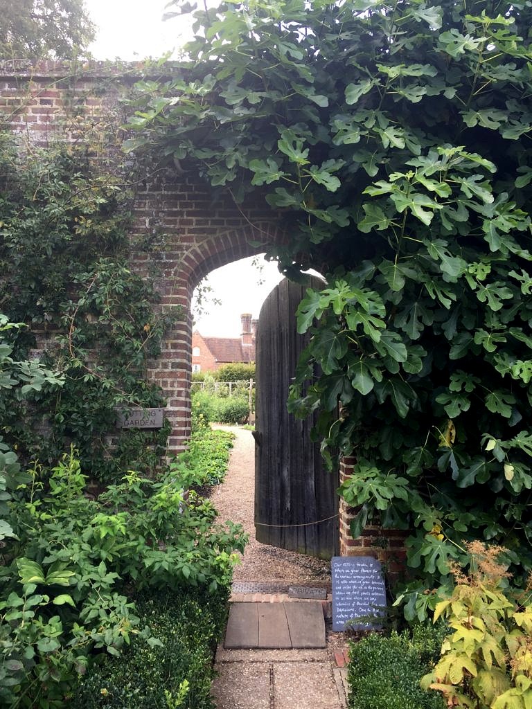
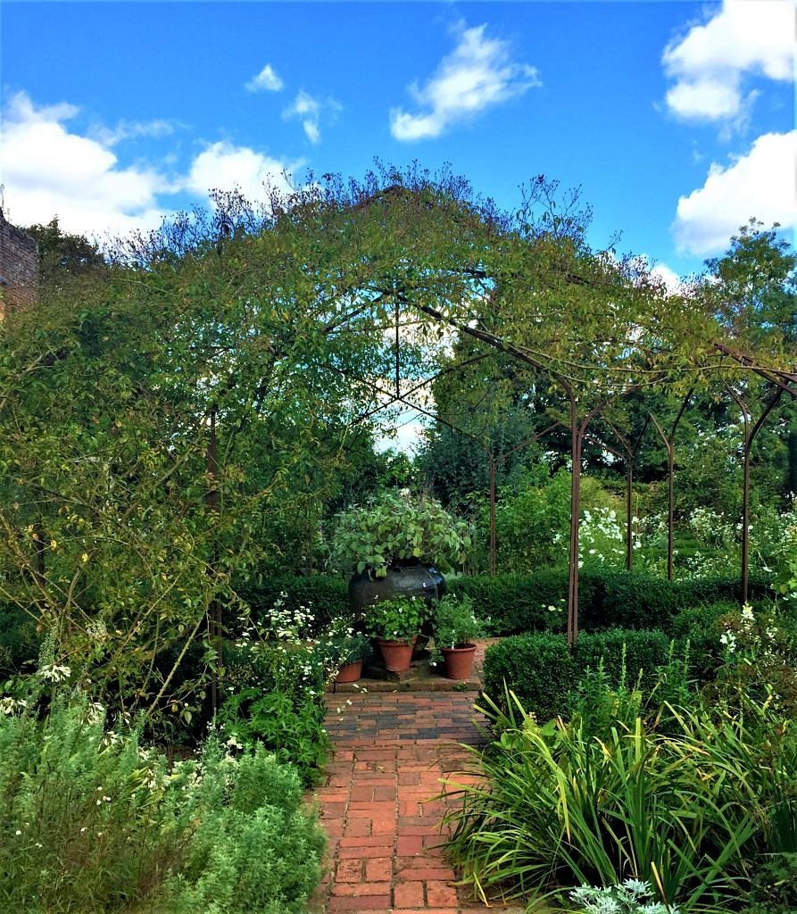 There was not a corner left untended–or unplanted and every turn brought another awesome vignette.
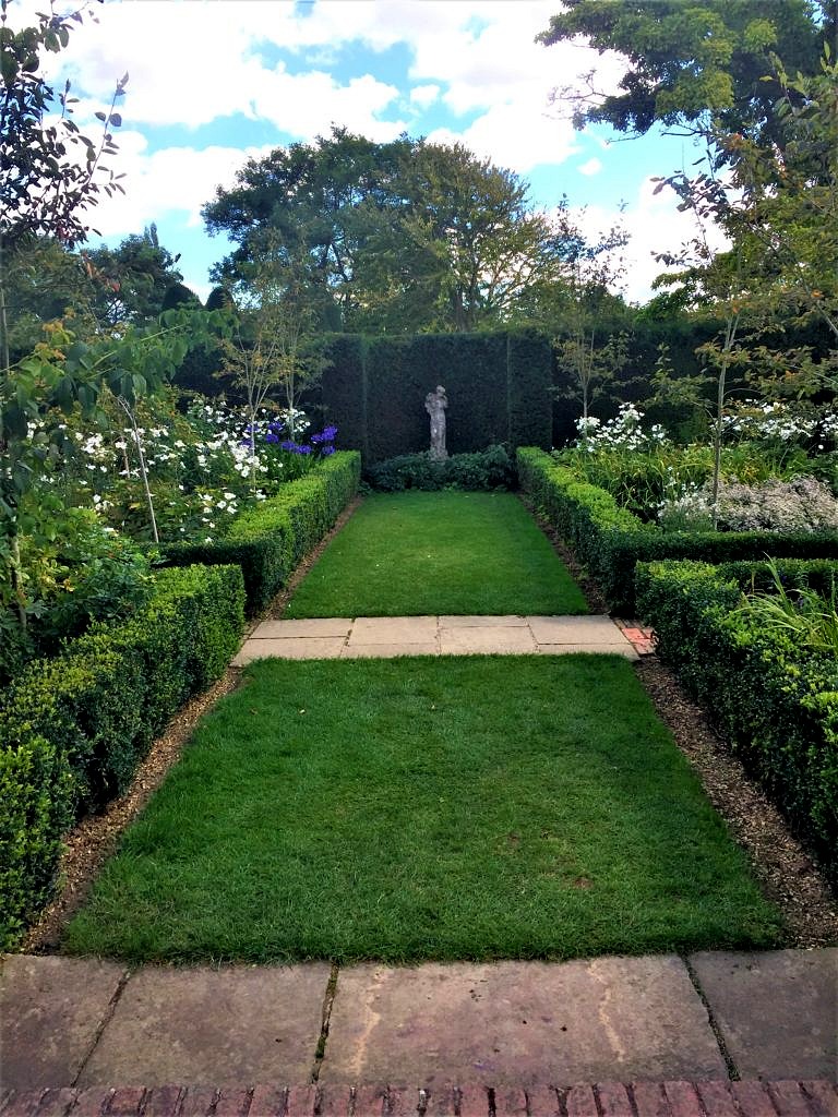 I probably took two hundred more photos; everywhere I looked there was a better shot. But, eventually cocktail hour approached and we were meeting a cousin at a fabulous
 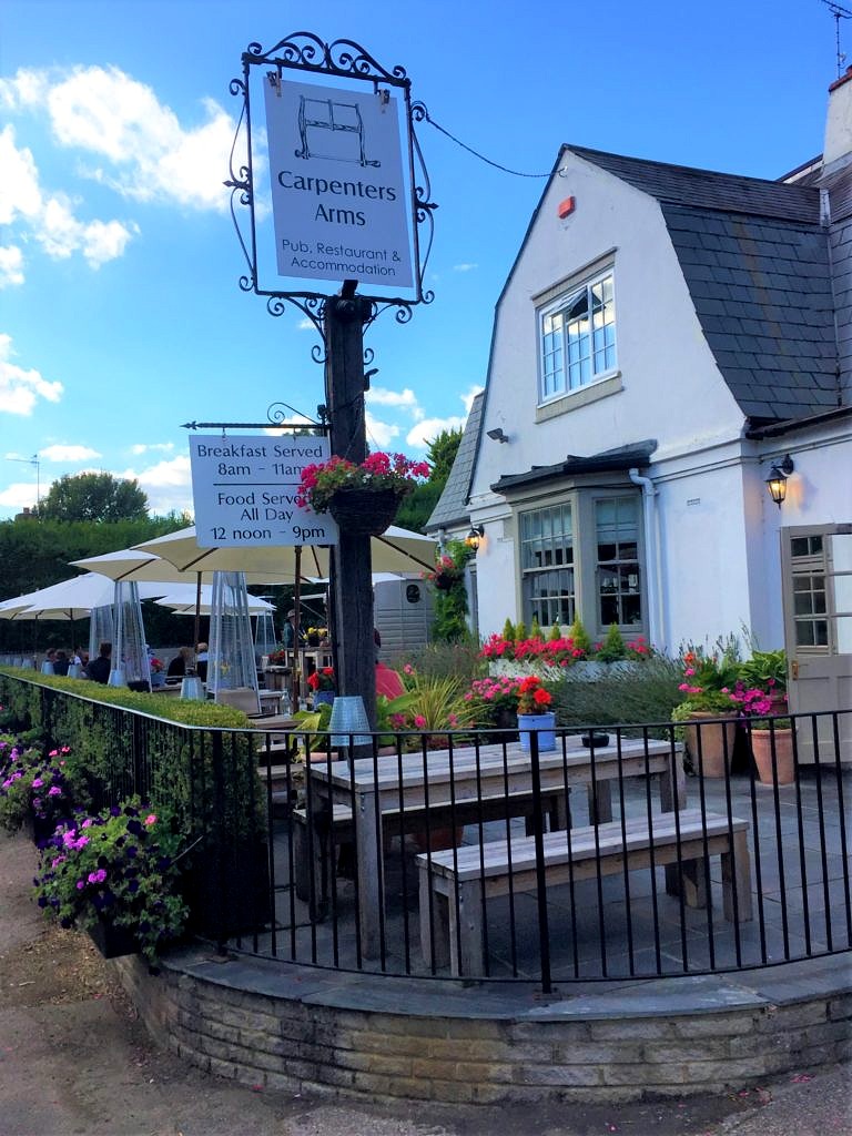 And time for a pint.
 Next we headed to Bognor Regis, a classic and classy seaside resort made famous by King George the V, and our home for the next few days while we enjoyed our niece Chantal’s wedding festivities.
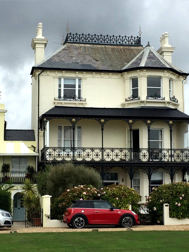 Between the seaside and the architecture Bognor Regis is a great place to stay so if you go to that part of the English coast give Brighton, the better known city just to the east, a miss–overcrowded and over-rated in my opinion–and stay in beautiful Bognor.
  The wedding was a civil ceremony in the town hall in nearby Chichester. Here we are with Keith’s brother and his partner. (I decided against the fascinator; tempting as it was I felt it best to leave that look to the natives). The reception was a double decker bus ride away at the groom’s parents nursery and garden center just outside of town.
 Sadly all good things must pass, even weddings with six surfboard salutes; it was time for us to get to work. First stop,
 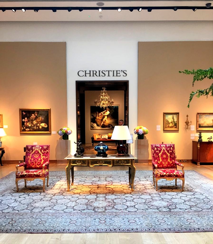 For probably around $10,000. (if the auction estimates were to be believed) you could furnish a living room–and dining room! Granted they were not period antiques, but who cares? Everything in the salesroom, whether antique or merely vintage, was well made, decorative and well worth the cost. We would have and probably should have and may well do in the future.
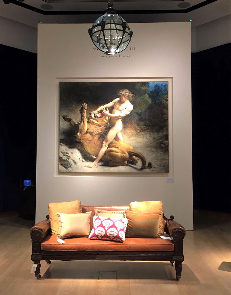 The other designer setting up the exhibition was
 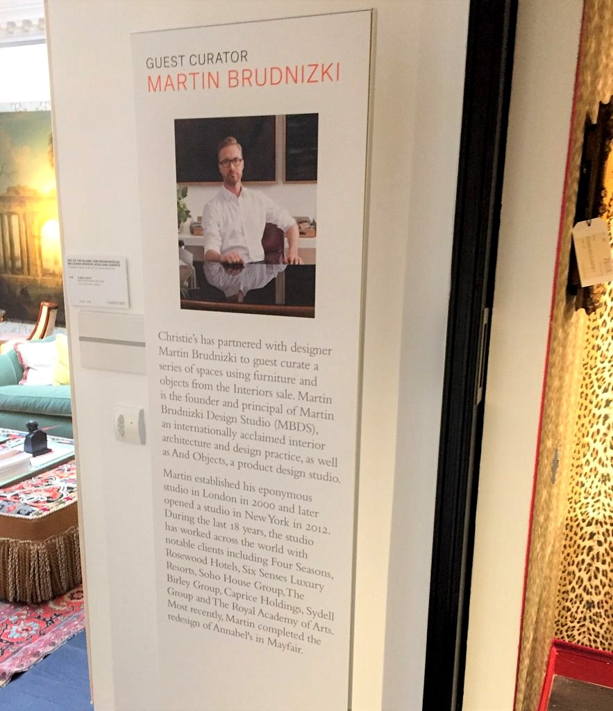 Check this out.
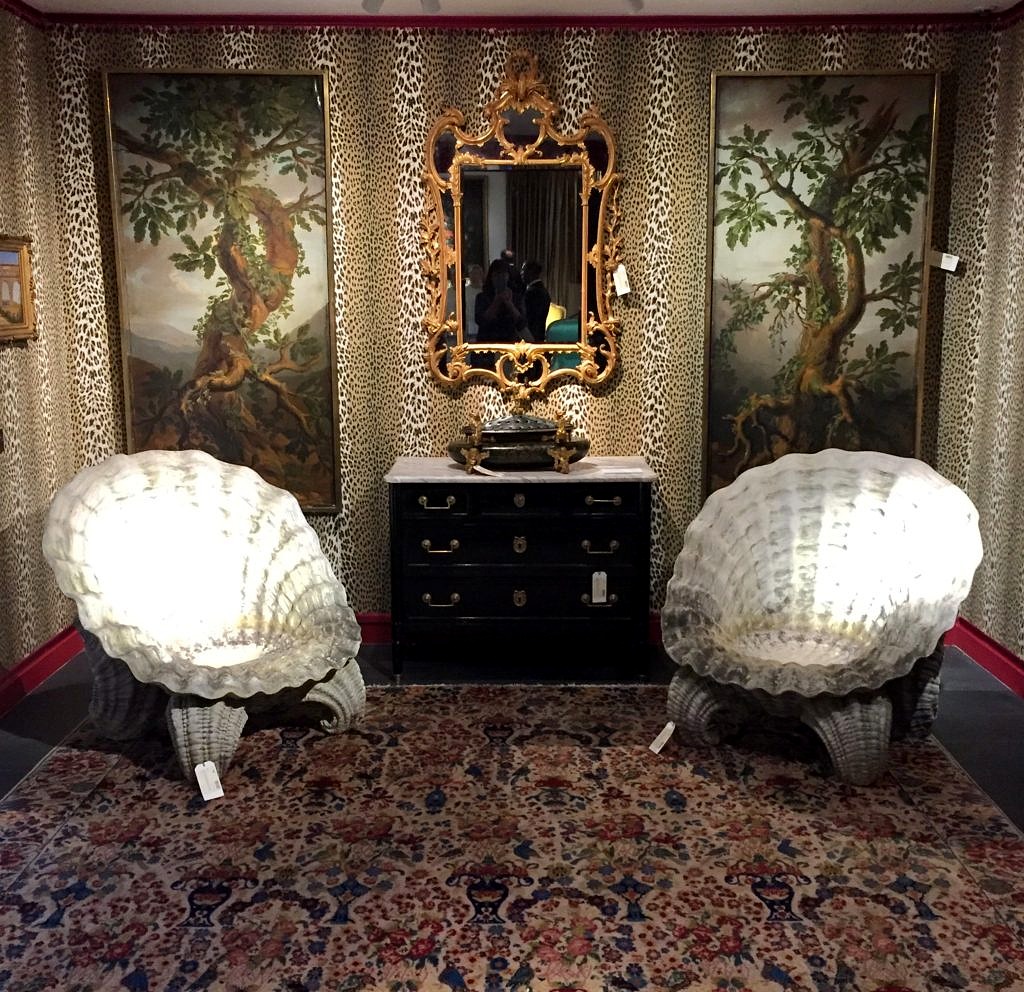 And this:
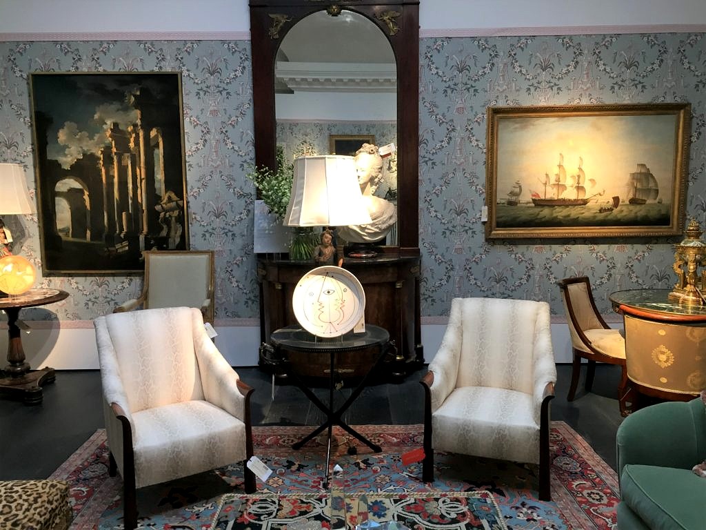 There was just a mad assortment of things old and new and what a great treat to see how these two design Ninjas put this with that and altogether came up with a whole room you just wanted to take home. Kudos to Christie’s for coming up with the idea to show objects in situ.
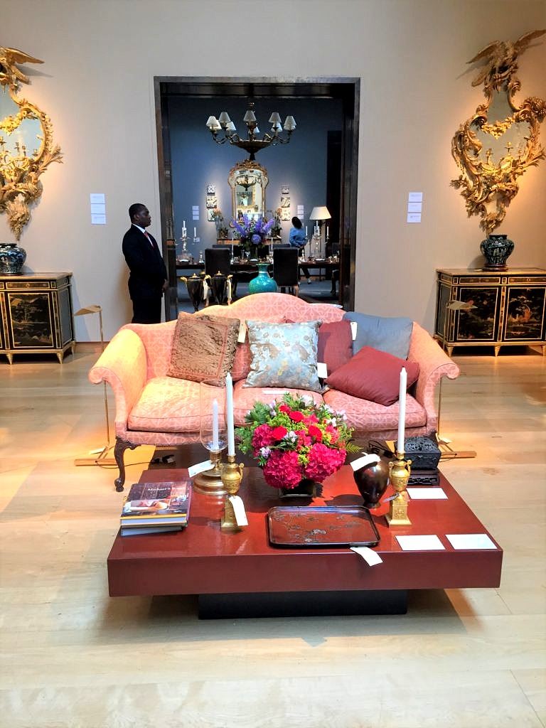
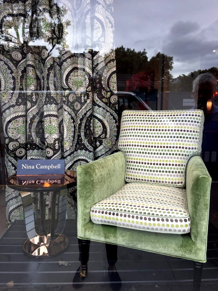 The latest from
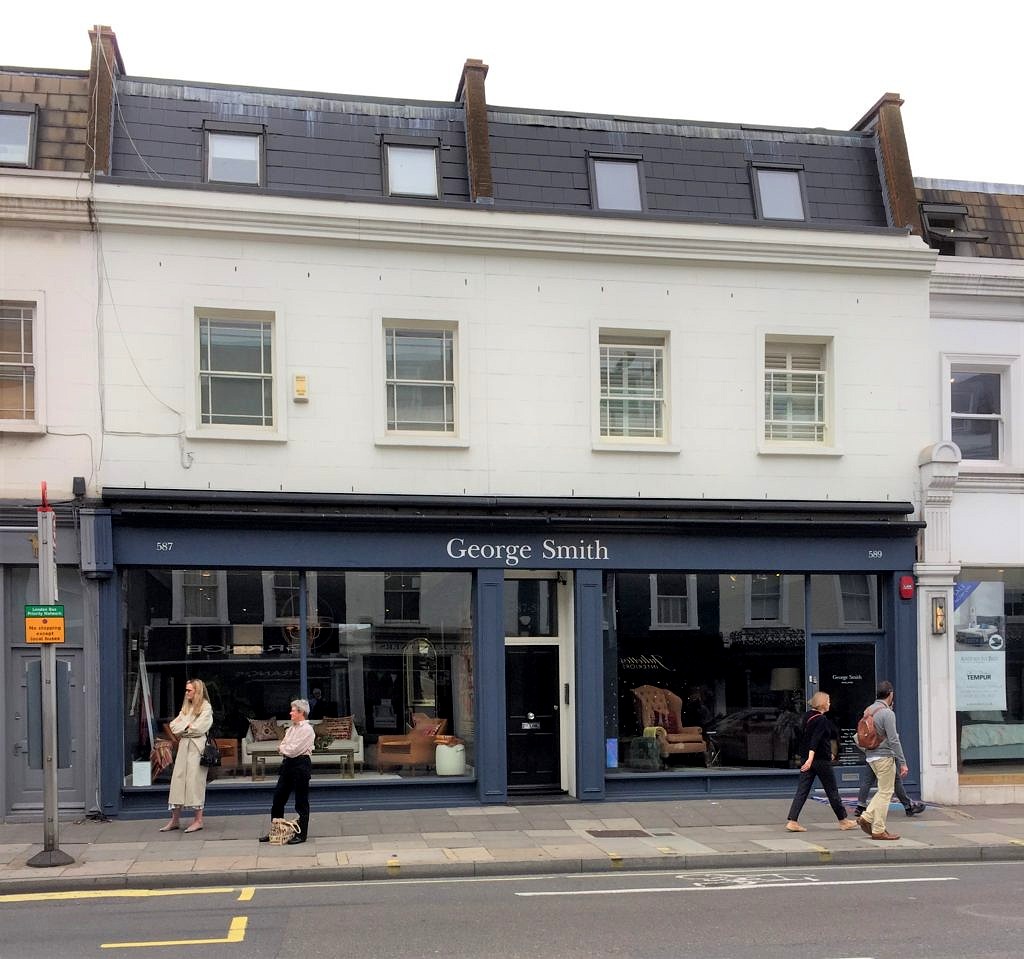
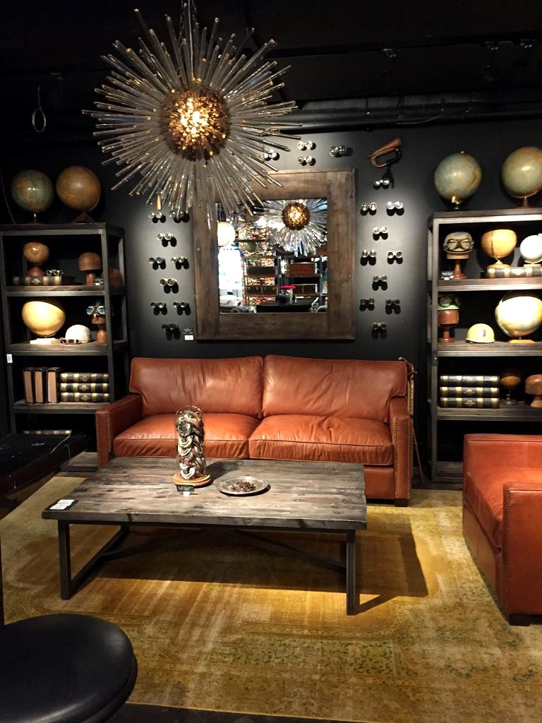 Then we spent a long time at Trowbridge Galleries, the leading purveyors of art photography in England, and a vendor we are considering for the store.
 Next stop was the London
 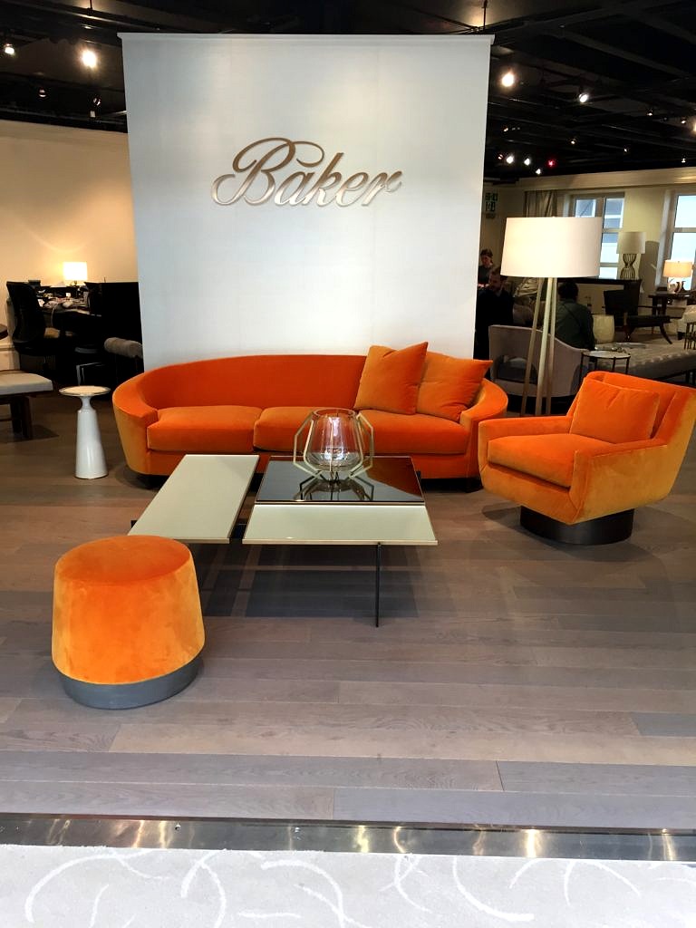 They were madly putting the finishing touches on many of the showrooms in preparation for the London Design Week. Loved the color of these sofas; clearly you can’t go wrong with pumpkin this fall.
 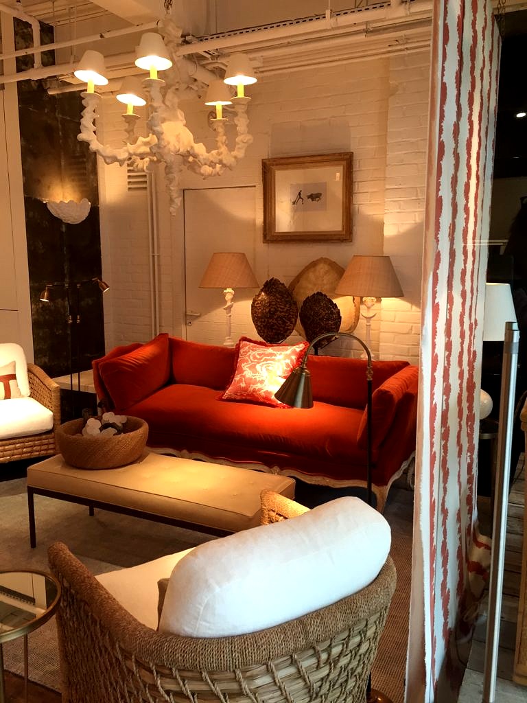 It was a great way to wind up our trip and a fabulous opportunity to see the latest in home decor from a whole slew of world-class designers and renowned retailers. But eventually all good things must end; it was time for us to go home.
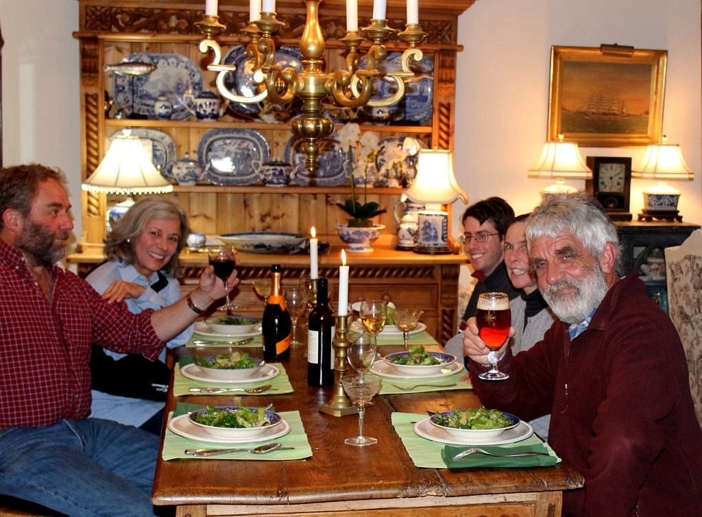
 So I googled meat pies until I figured out how to do it. Here’s the Nelson Family version.
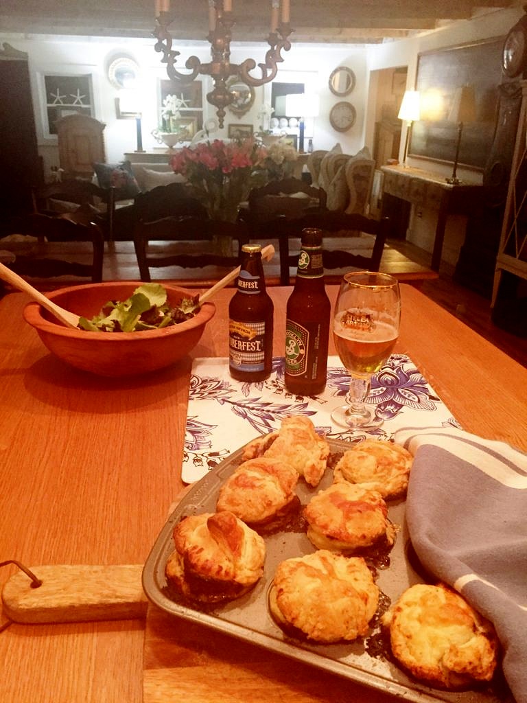 Not bad for a first try–easy as pie! Keith was happy to have a taste of home and now you can too.
 For a while I’ve been off showhouses not being a huge fan of modern, slick interiors in garish colors, or the reverse, all grey minimalism. But this year’s
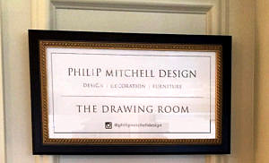 Just when I had practically convinced myself that my days as a retailer were numbered because the upcoming generations don’t collect things, don’t want things, don’t need stuff–Philip Mitchell’s Drawing Room was the bomb. Anchored by a massive navy blue sectional festooned with a plethora of toss pillows bordered by a seemingly random selection of art, it was love at first sight.
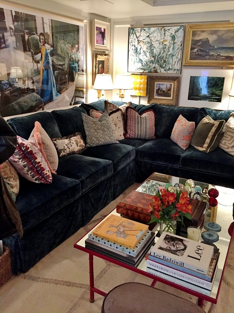
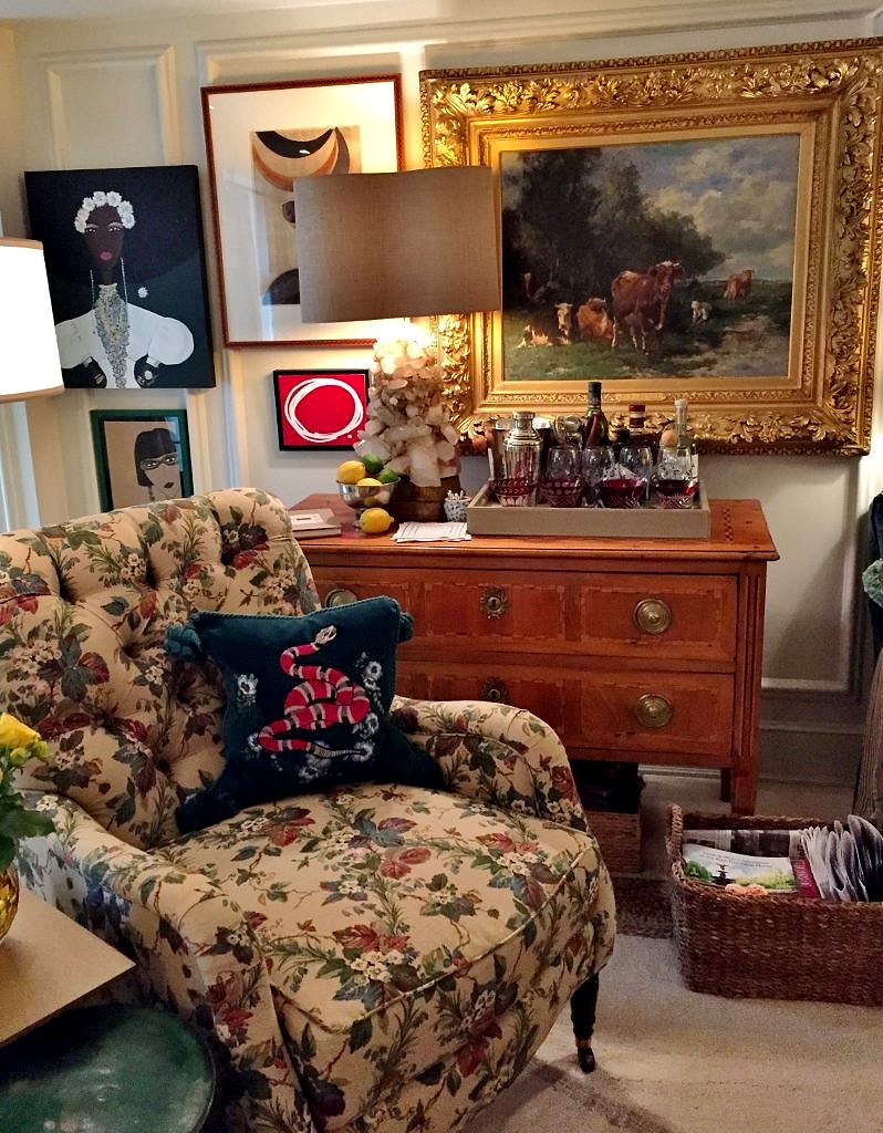 Coffee tables were all piled high with collections (note to self– take all unpolished antique brass candlesticks out of purgatory stat), more books, even plants. Who said orchids were so over? Note too all the stools and benches encircling the coffee table practically begging you to put your feet up and enjoy the flow.
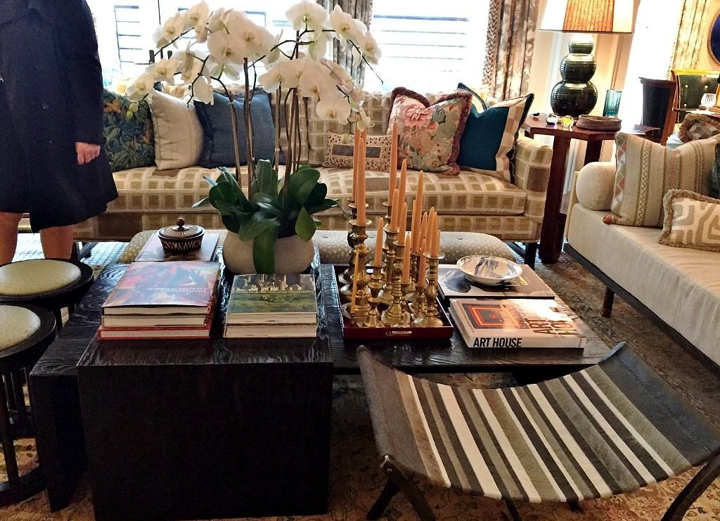
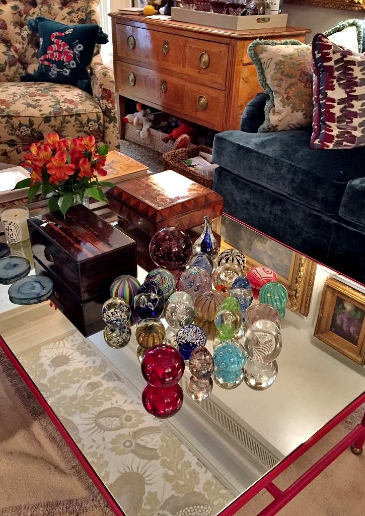 Everywhere you looked there was more to see and enjoy. Game table. Check.
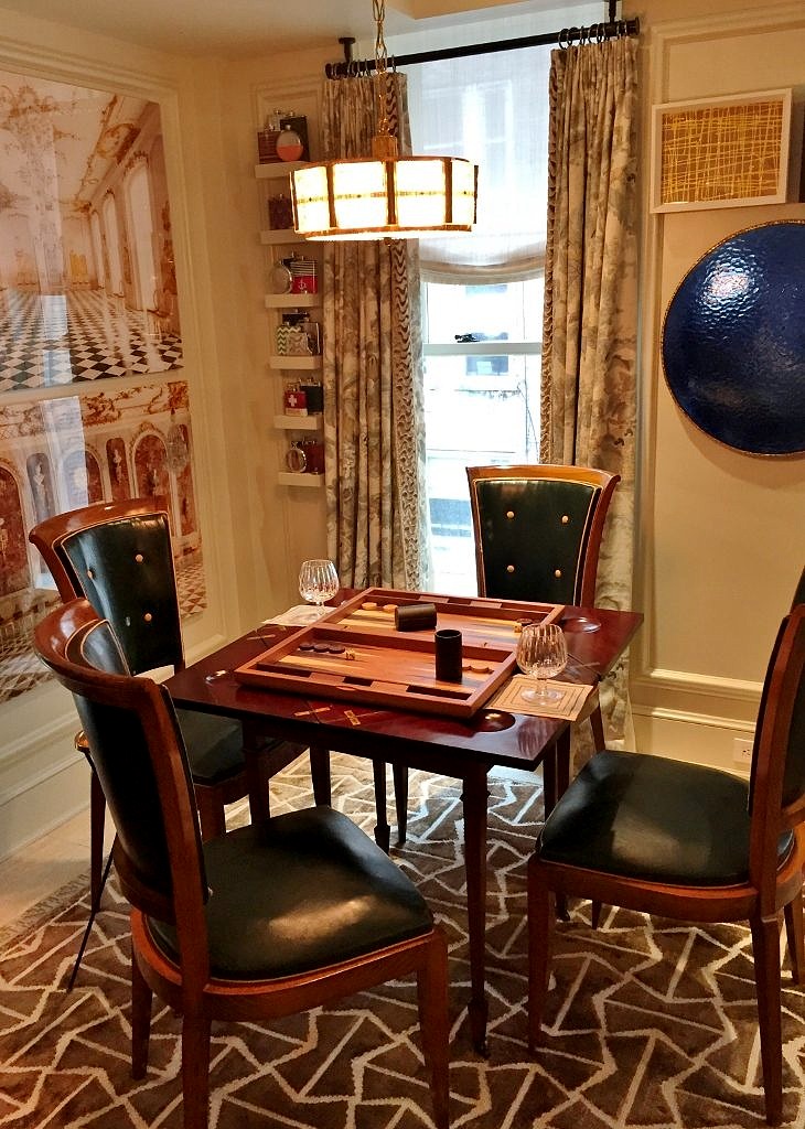 Cozy corner with wicker chairs. Check.
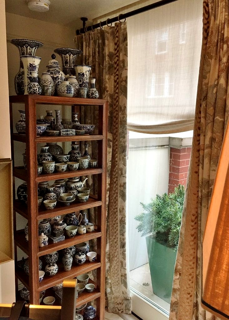
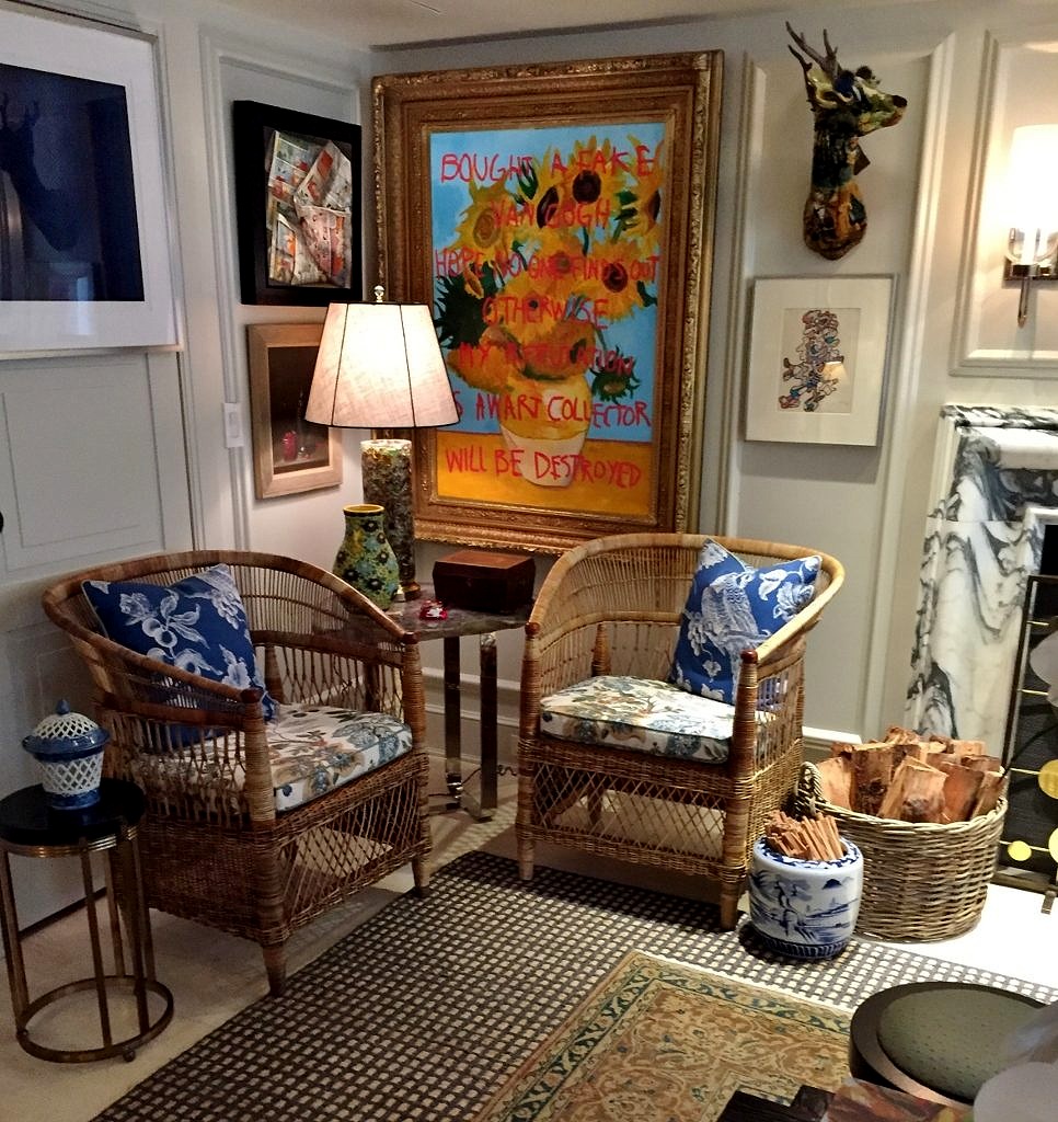 Tall shelf nestled in alcove filled with blue and white porcelain. Check.
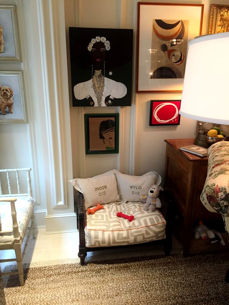
  Vintage dog bed. Check.
 I could go have stayed there forever but there were seriously another twenty or thirty rooms left to peruse so off we toodled.
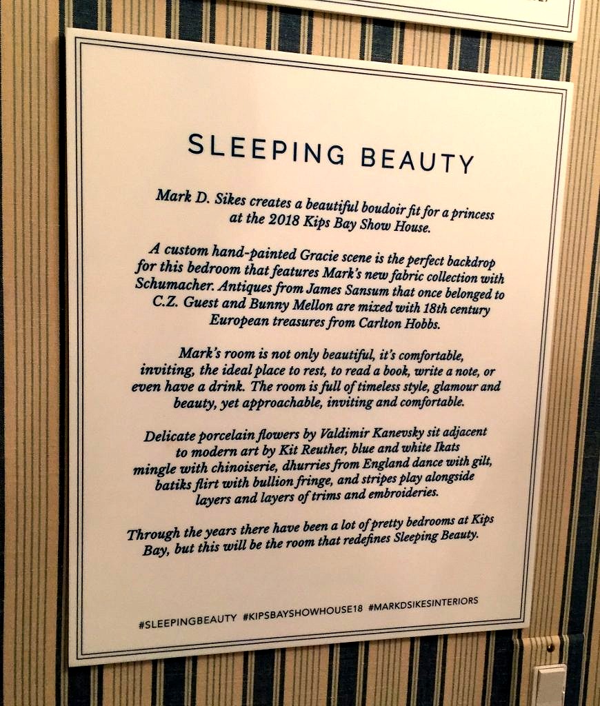
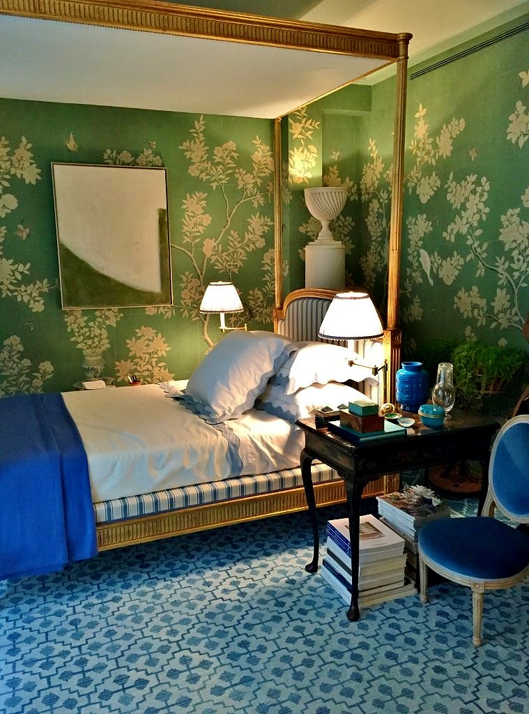 The four poster bed was gorgeous, and I love how the base is upholstered to match the headboard and footboard.
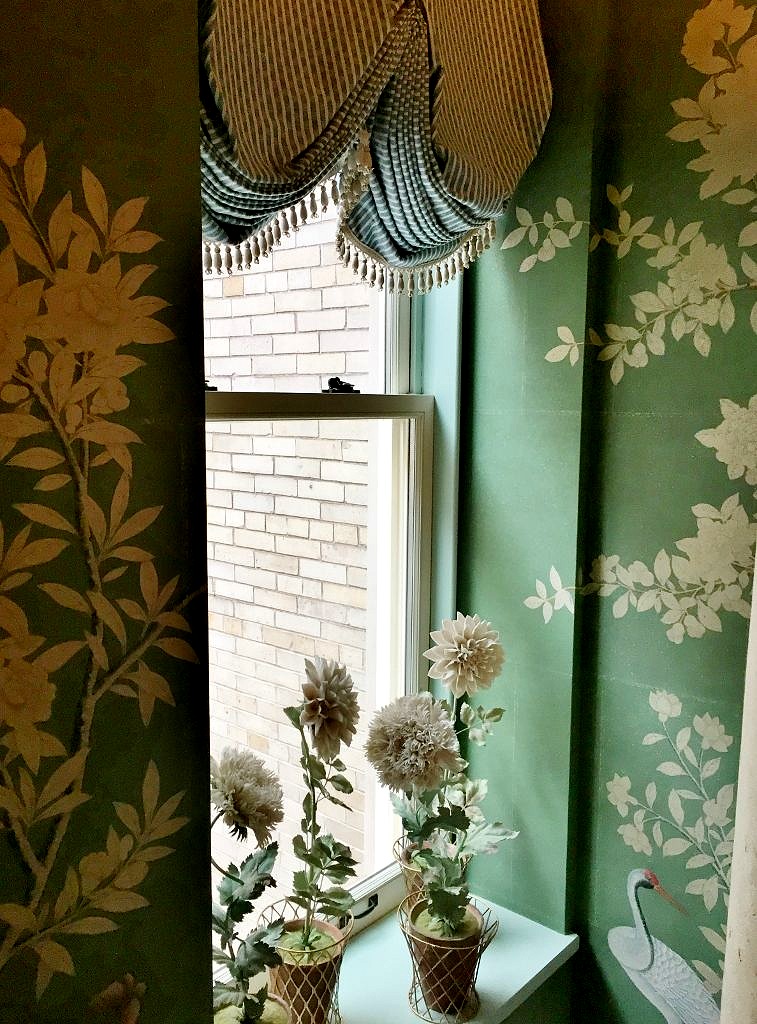
 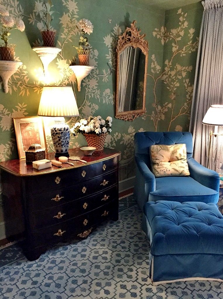 Pops of royal blue abound, and just imagine sinking into this upholstered velvet armchair after a glam evening out on the town. I’m not really a huge fan of complex window treatments but l was bowled over by this pinch pleat swag curtain that probably has a proper name–probably French–c’est tres jolie in any case.
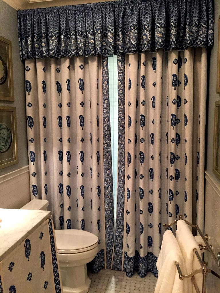
 Mark used a contrasting fabric as a shower curtain and skirt for the bathroom vanity which I gather is all part of his new fabric collection for Schumacher. Well done!
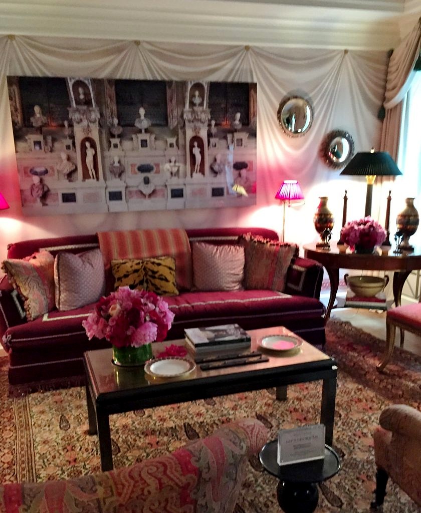
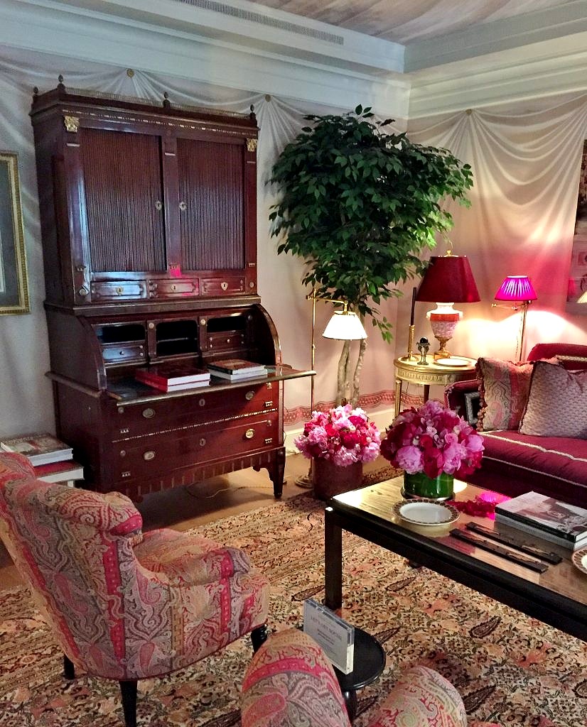
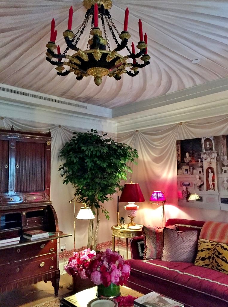
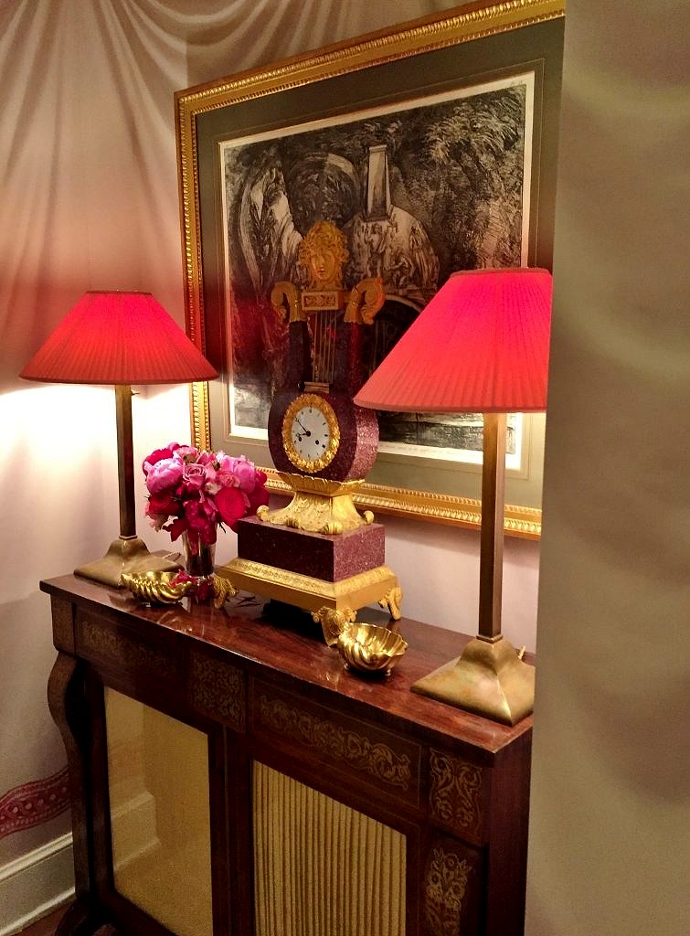 In the end it was all too fin de siecle for me–but I embraced the opportunity to see a master’s work. I had to marvel at the artistry that created the tromp l’oeil painted tented walls–and ceiling! And the vision and creativity of the designer to put this all together.
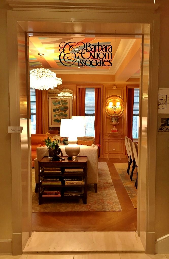
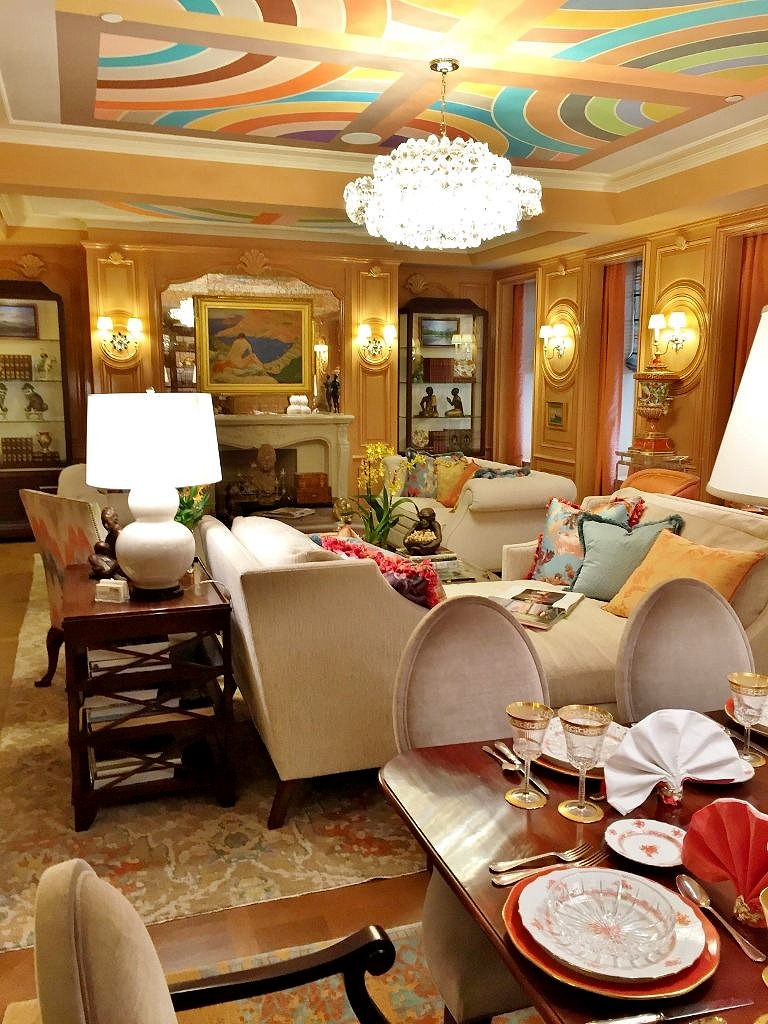 The dining section features a beautifully set table–another Barbara-ism. And note the Andrew Tedesco mural on the ceiling. Like many of the Kips Bay designers the ceiling was treated as a “fifth wall” and it was literally a highlight of the entire room.
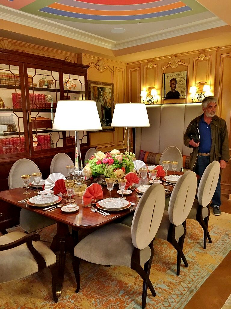 And speaking of stuff, Barbara is fearless when it comes to decorating a room. The paintings are from all periods, including one by John Mellencamp, while the bibelots range from the Han dynasty to the present day. As always the color palette is on the vibrant side; in this case high gloss peach from the Farrow and Ball archives.
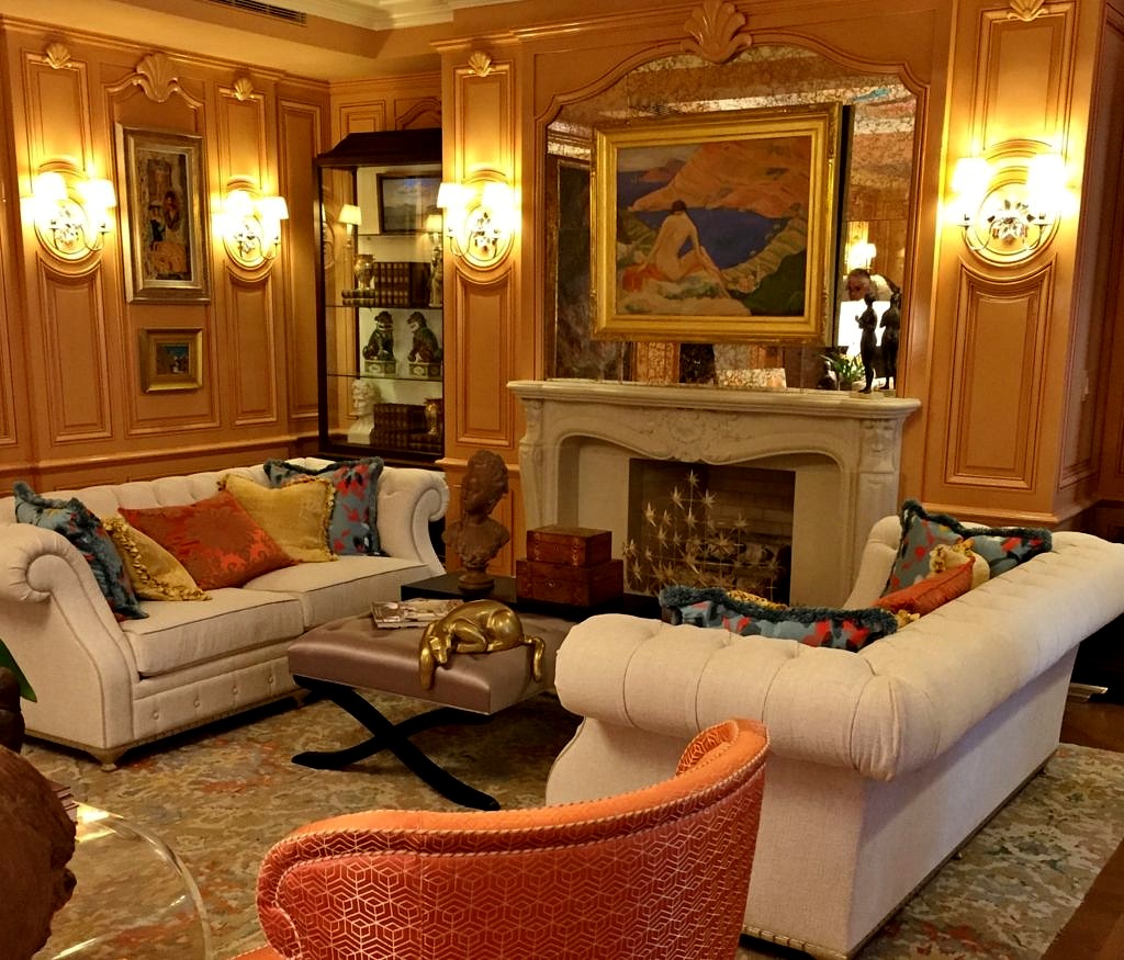
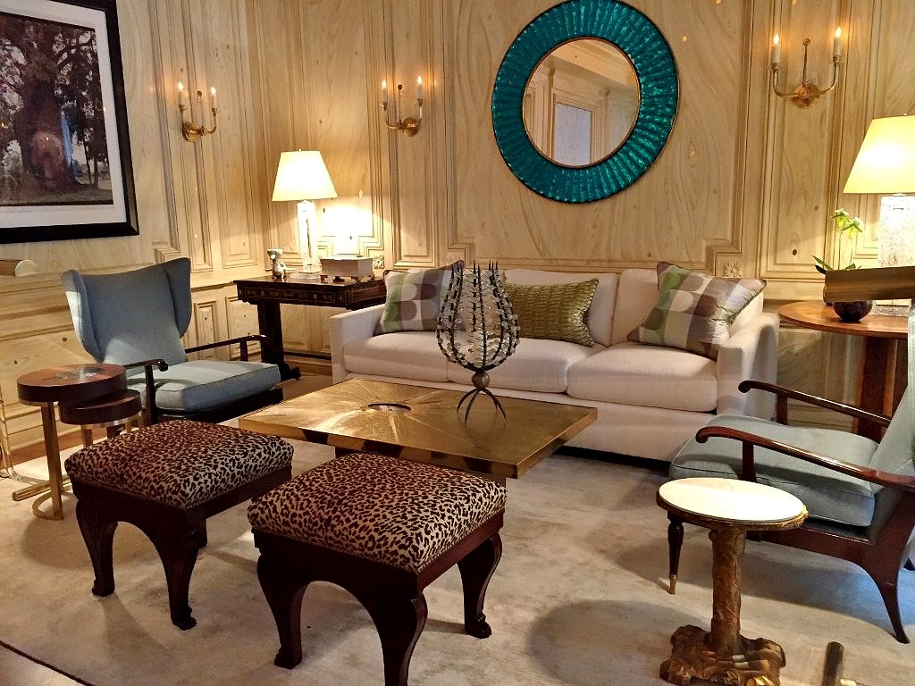
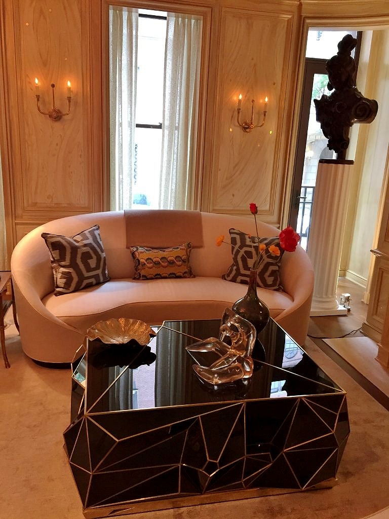 There were two comfortable seating areas, fabulous art on the walls, a mixture of antique and contemporary furniture and some pops of color but nothing too too.
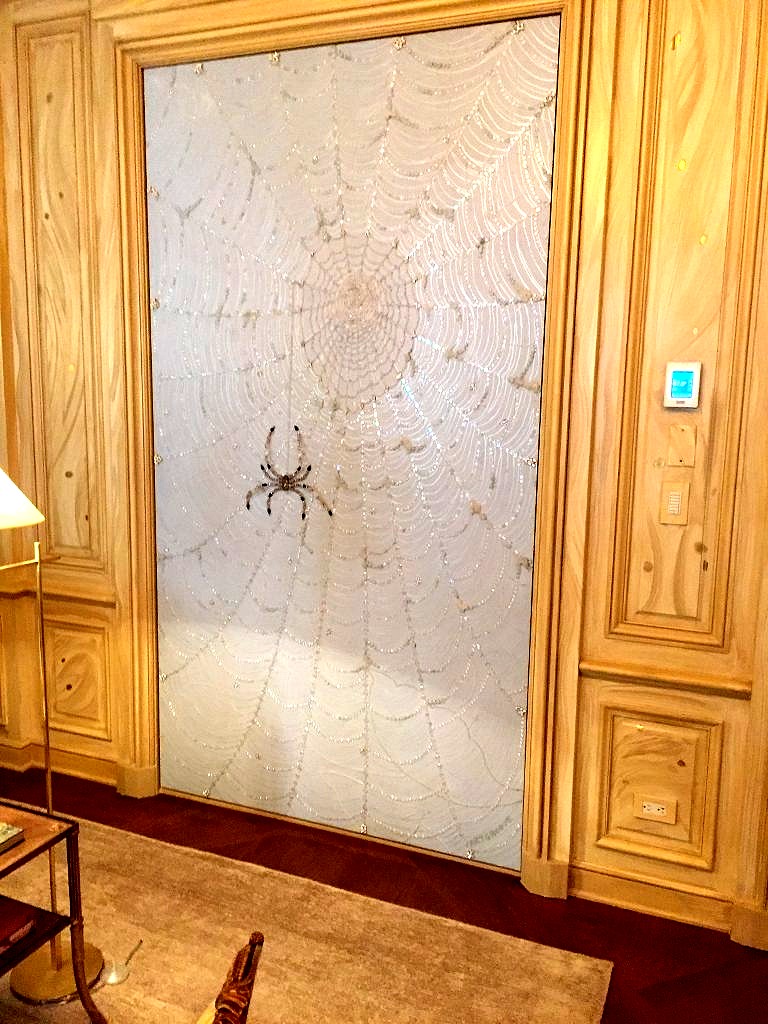 You can read about all the other fabulous Kips Bay Showhouse 2018 rooms here:

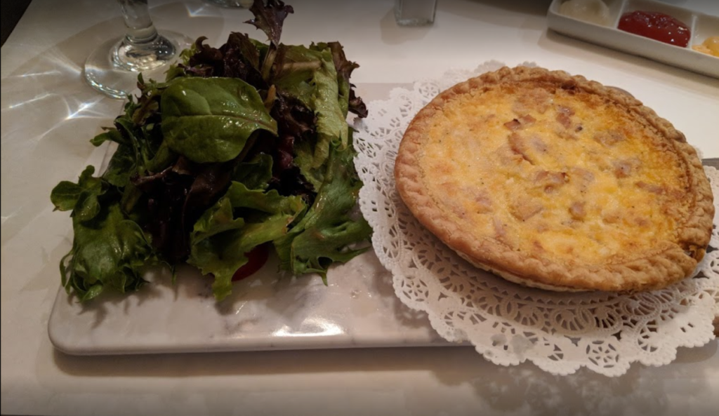
 B.Cafe (Belgian Brasserie)
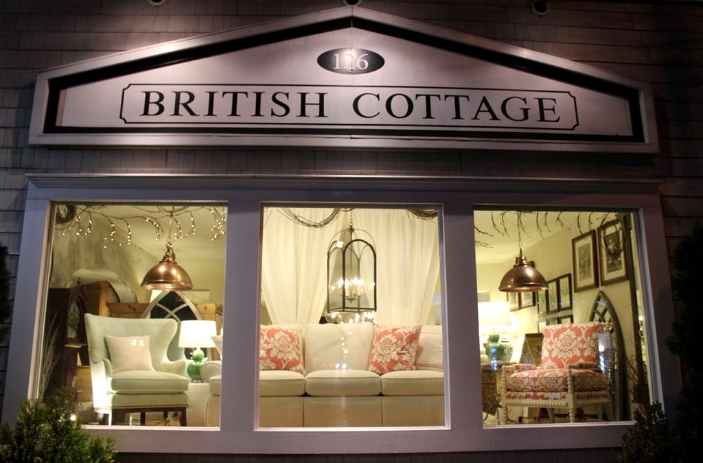
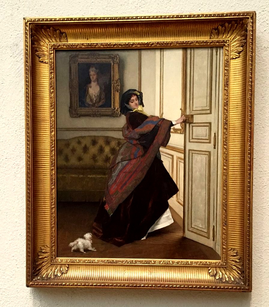 We began 2017 at The Philadelphia Museum of Art, happily wandering through room after room of priceless artwork, and decorative objects from all over the world. Often people remark on how beautiful our store looks, and are amazed that neither Keith nor I have a background in design. Over the years we’ve gotten very good at selecting and presenting the objects we sell basically by just looking at everything, everywhere. Most of the largest museums have several floors filled with completely furnished rooms from different periods and even other countries on exhibit–making it possible to soak up several centuries of interior decorating–in just one afternoon.
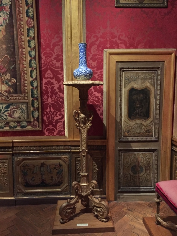 Next up in January was Atlanta and the America’s Mart, literally over a million square feet of the latest and greatest in Home Furnishings and Accessories, and we wandered around there for several days. Besides thousands of vendors and products, America’s Mart featured a series of room-size vignettes styled by a half dozen leaders in American interior design.
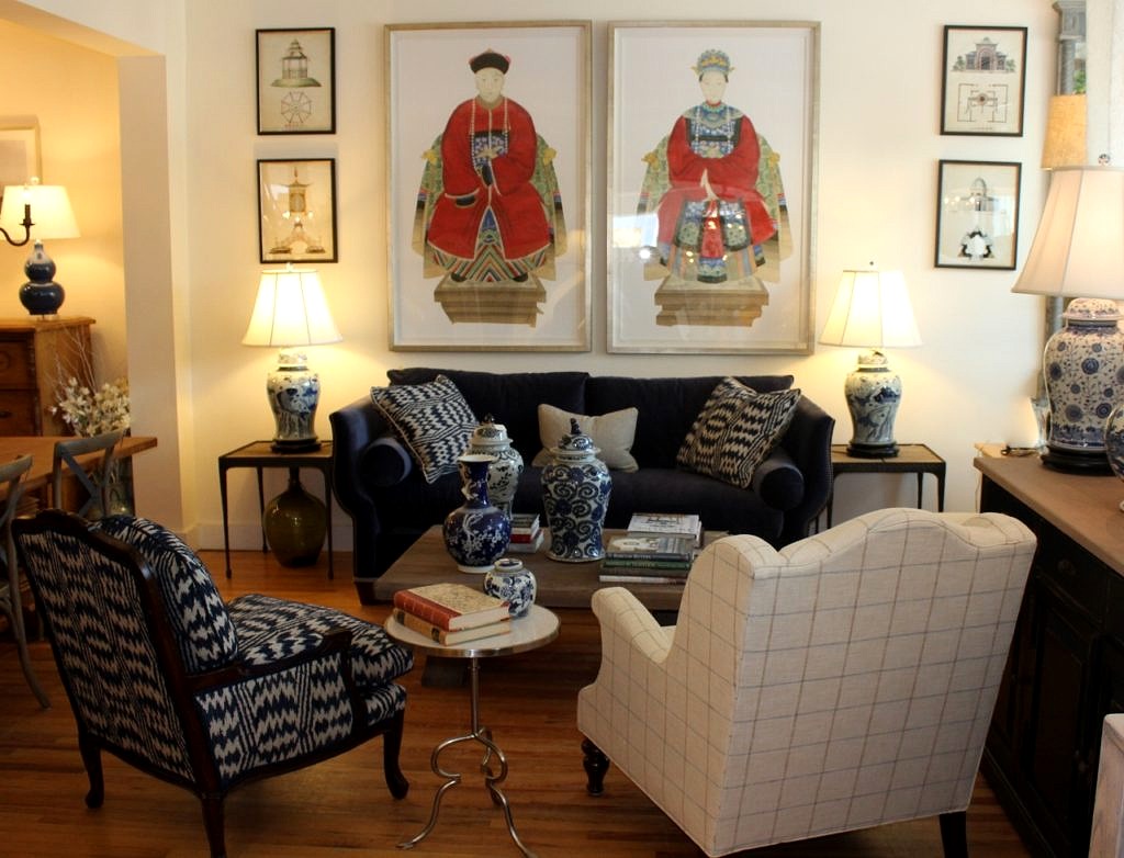
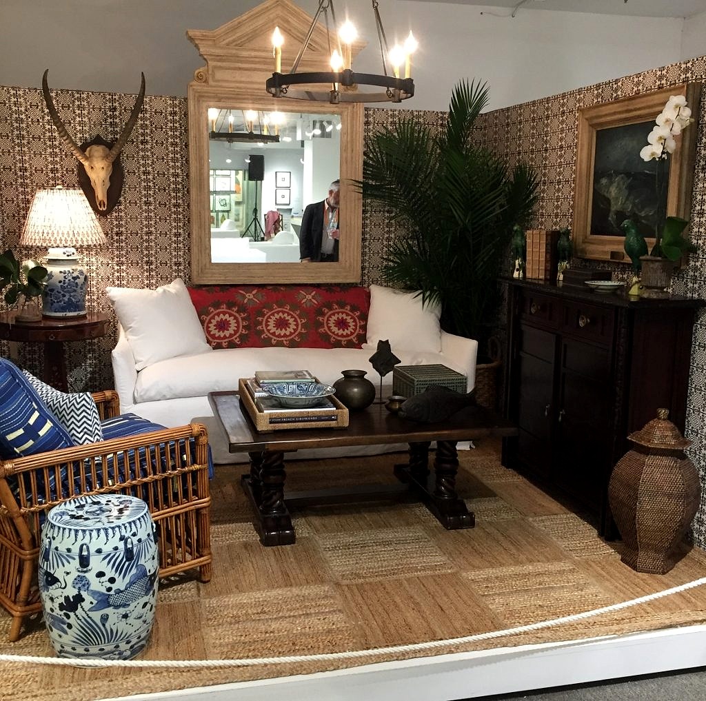 Everything old is new again. While the first interior is from 18th century England, on display at The Philadelphia Museum of Art, and the second by a very 21st century Austin Texas designer, you can see similarities. Pattern, color and texture are blended, not matched. And some objects are simply timeless, like blue and white porcelain, or an architectural mirror. Which leads me to the next bit of wisdom.
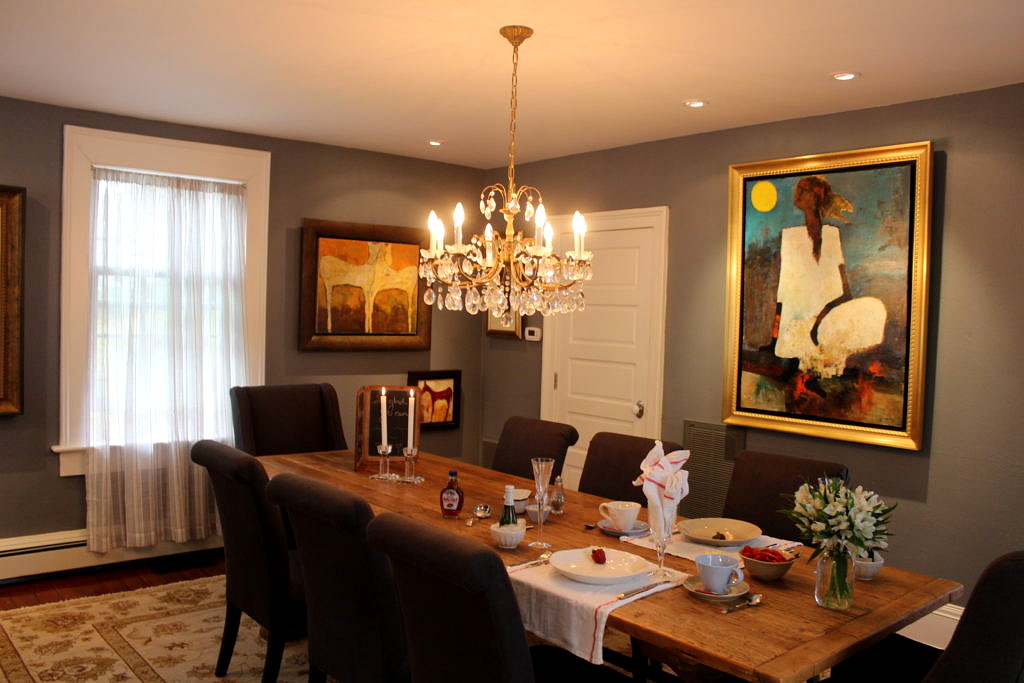
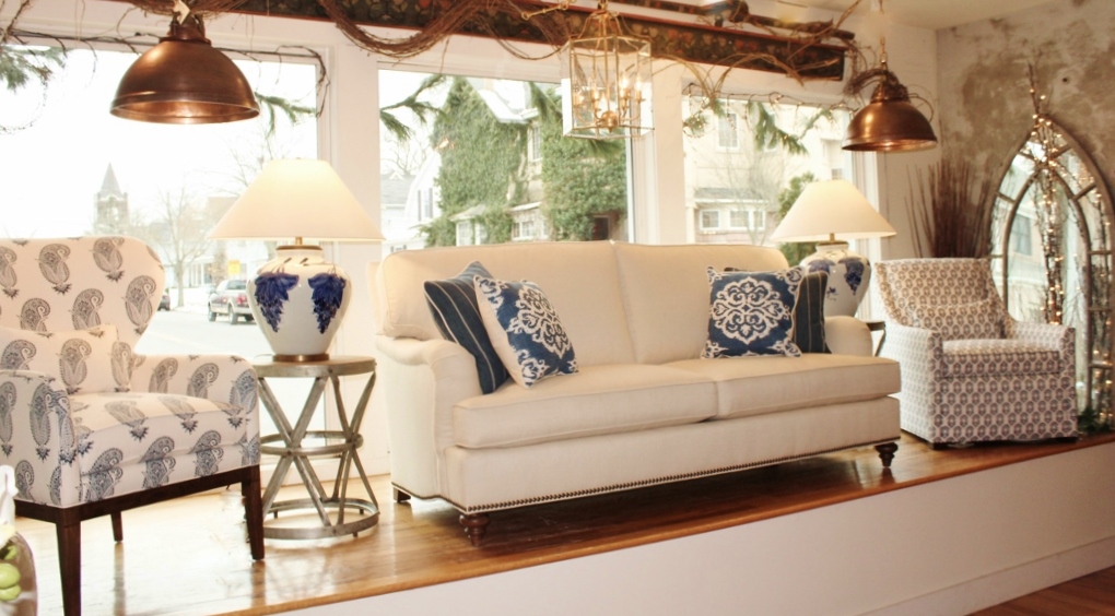
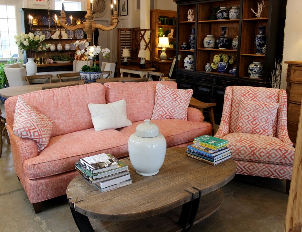
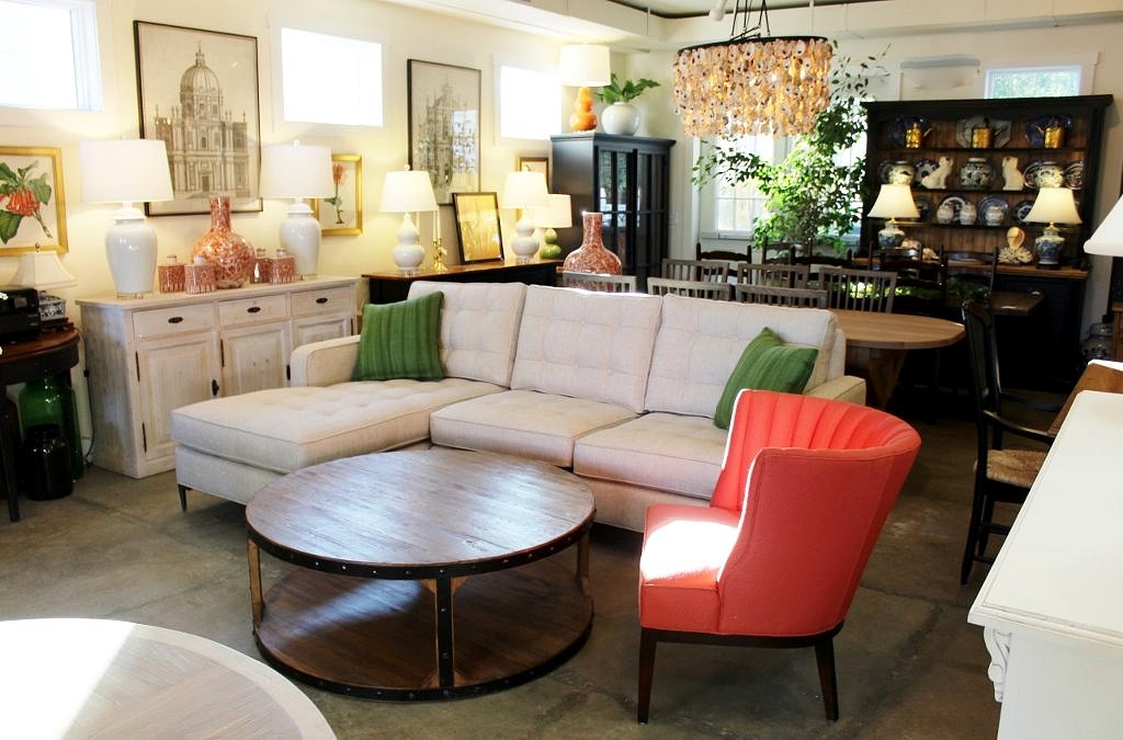
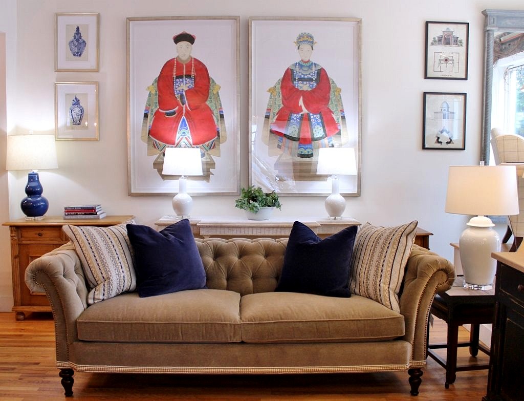 Lastly, have some fun. Decorating is all about making your home, and by extension, your life more enjoyable. It does not have to be perfect; it has to be welcoming. When I grew up in Rumson 1000 years ago many of my friends lived in huge houses with huge rooms with matching carpets and couches and window treatments and guess what? Nobody was allowed in them!
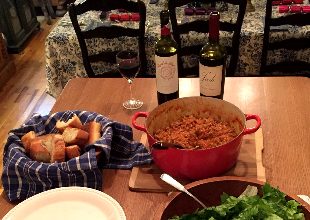

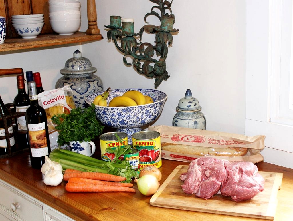 You can do this with lamb shanks but I usually just buy a boneless leg of lamb–it is all in one piece and easier to handle. Salt and pepper then sear on both sides in olive oil in an oven-proof pot.

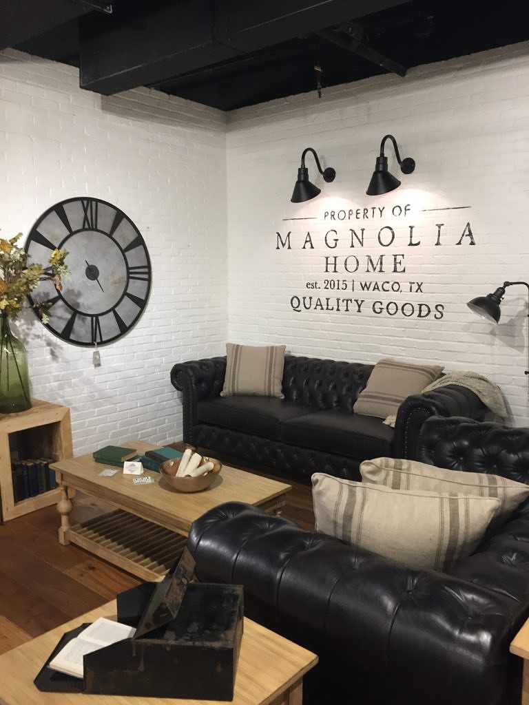 Keith and I are huge fans of the show, Fixer Upper. I confess to having spent countless evenings mesmerized watching to see what a hundred grand could do in Waco Texas–where we live in NJ that’s basically a master bath.
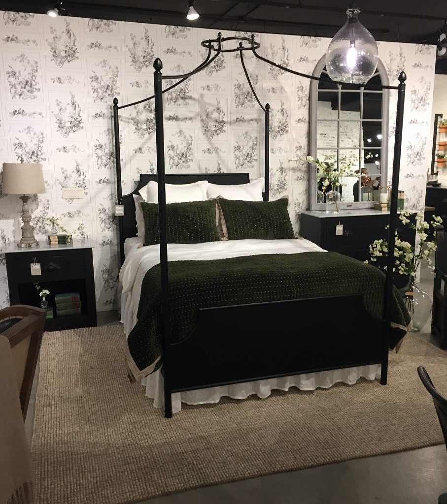 I have a vendor who makes a bed like this and now I just might get it. I just love the iron canopy, the dark hue and the dreamy styling.
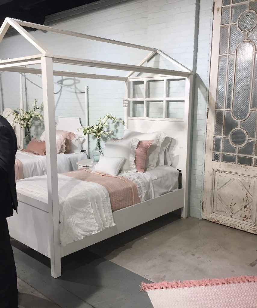 All the bedding was lovely and from a company called Bella Notte Linens. I had just purchased similar bedding for the store from a company called Amity Home so it is nice to know Joanna and I are on the same page.
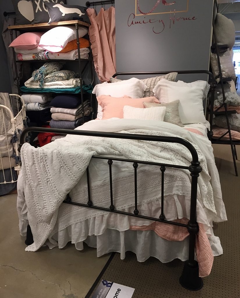
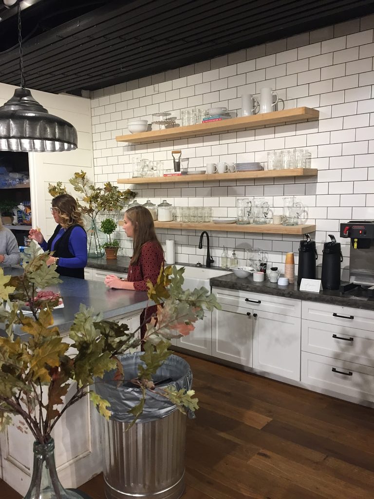

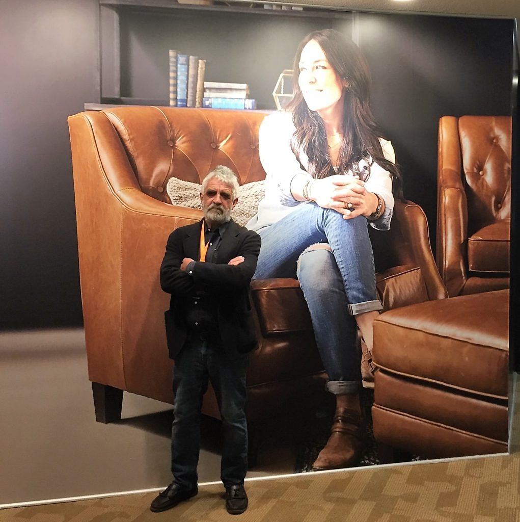 Maybe one of the more famous people we did not meet at High Point, but certainly it felt like Joanna Gaines was everywhere!
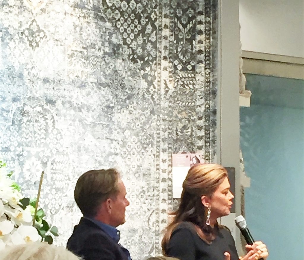
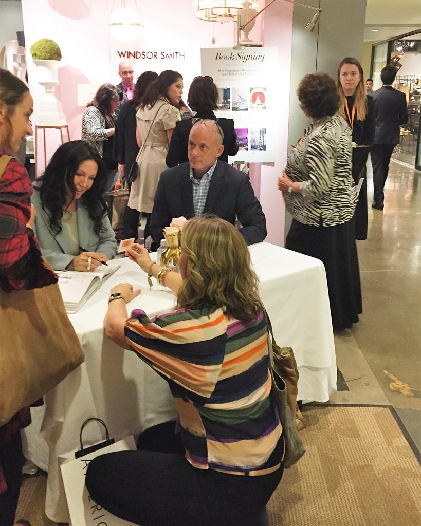 Down a few flights of stairs were Barclay Butera and Kathy Ireland–also powerhouses in the California design world. We have always loved how Barclay manages to meld beach house cool with an English manor house sensibility, and we all know that anything former model, Warren Buffet confident, and entrepreneur Kathy Ireland touches is sheer gold. When she says color is making a comeback; we listen.
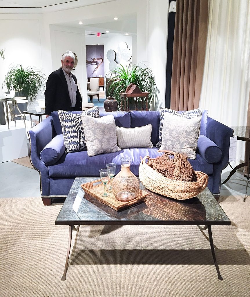
 Fortunately we are so on trend, because we had already purchased this fabulous couch and chair at Hickory White.
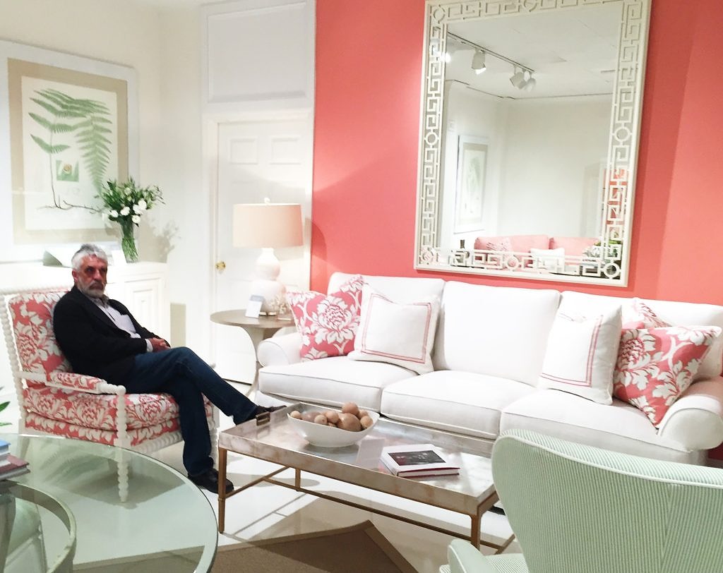 Not sure you will see a salmon pink wall anytime soon at British Cottage, (and I will source the Benjamin Moore color for those of you who have asked), but the couch and two chairs should arrive in a few weeks. We like to buy the Hickory White floor models. Why not take advantage of their professional design savvy and add to our inventory at the same time?
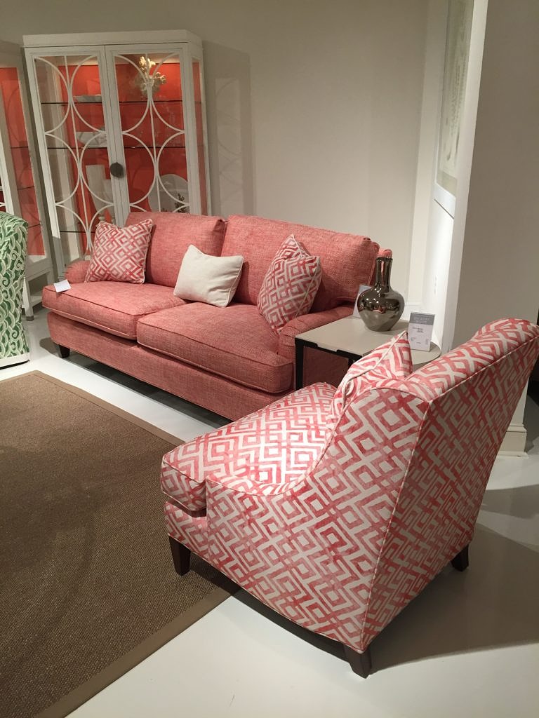 But fear not, we did not go completely pink, we also purchased this lovely, royal blue velvet sofa and two complementary armchairs.